LONDON
Sequences - Luke Stephenson
One morning while eating a bowl of cornflakes I noticed that every cornflake within my bowl was unique some what like a snow flake. I decided to photograph every cornflake within a 500g box to show off their individuality and also answer a nagging question in my mind “ how many cornflakes are in a box of cornflakes?
Over the course of a week I photographed every single cornflake within a 500g box, my original estimate was around 3000 but I soon realised this was way off and the final count came too 7122 cornflakes. Here are a small selection of the cornflakes I photographed, but I created a stop frame animation of all 7122 cornflakes for you to enjoy.
Over the course of a week I photographed every single cornflake within a 500g box, my original estimate was around 3000 but I soon realised this was way off and the final count came too 7122 cornflakes. Here are a small selection of the cornflakes I photographed, but I created a stop frame animation of all 7122 cornflakes for you to enjoy.
Response
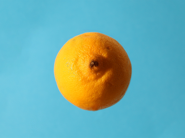
For my backdrop I used an A4 sheet of light blue card and stuck it using double-sided tape to my wall. Next, I grabbed an old shoe box and stuck a screwdriver through the centre of the lid poking out. Finally, I placed the lemon onto the screwdriver by impaling the fruit. I placed my camera on a tripod meaning there would be less changes between images keeping a consistent sequence. I then lit the lemon from the left side in order to allow a shadow to appear on the right of the fruit creating a more appealing image.
When disassembling the fruit i pulled it off the screwdriver onto a cutting board where I then sliced the lemon and placed it back onto the screw driver ready for the next image. I took about 12 photographs which I later reduced to 9 to allow the sequence to fit on a 3x3 grid.
In Photoshop I then removed the screwdriver from all the images using the clone stamp tool. The clone stamp tool is a tool that allows the user to removes objects from within a frame by painting over it with another section of the same image. As my background was relatively simple it wasn't hard to gain good looking result that goes unnoticed unless examined closely. Whilst in photoshop I also altered the transform settings for position, scale, and rotation for certain images to enhance consistency between frames. When creating the GIF I used the same method as response one however this time I added a fade between each frame to give the effect that there were more frames creating a smoother animation.
|
|


Feedback (self)
WWW:
EBI:
- Lemon dissembled in slices
- Fading between frames in GIF - made animation smoother
- Lighting constant
- Lemon remained in a static position
- Tripod used - reduced change between images
EBI:
- Blue background remained constant
- More pictures were taken - smoother GIF
- Clone stamp tool - more precise
RETROSPECTIVE
- CHRIS KILLIP -
GALLERY VISIT
ABOUT THE EXHIBITION
Chris Killip attempted to value and document through photography the lives of those affected by the economic shifts in the North of England, throughout the 1970s & 80s. His sustained immersion into the communities he photographed remains without parallel.
Against the background of shipbuilding and coal mining, he witnessed the togetherness of communities and the industries that sustained them and stayed long enough to see their loss.
Against the background of shipbuilding and coal mining, he witnessed the togetherness of communities and the industries that sustained them and stayed long enough to see their loss.
HOW WAS THE WORK CURATED?
The Retrospective exhibition of more than 140 works was laid out amongst three individual floors. Each floor showcased Killip's work in chronological order allowing the viewer to follow the story of the depressed fishing town.
The photographs were framed in minimalistic white frames drawing the viewer's focus to the different aspects of the photograph challenging them to analyse key themes and relationships.
The photographs were framed in minimalistic white frames drawing the viewer's focus to the different aspects of the photograph challenging them to analyse key themes and relationships.
PERSONAL FAVOURITE WORKS
|
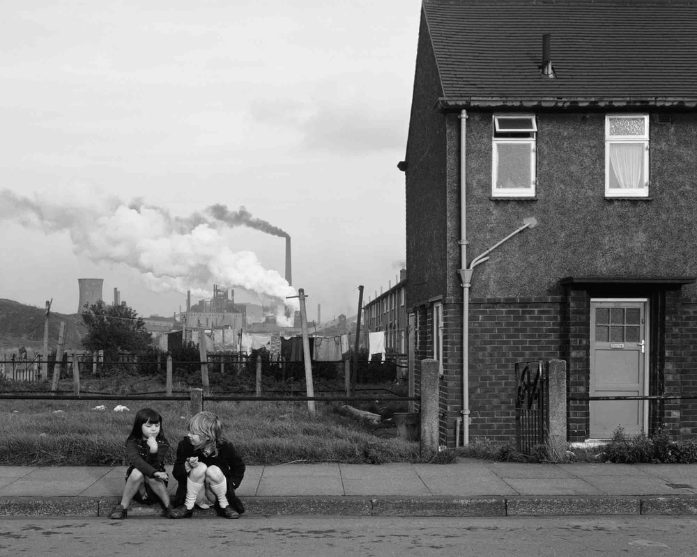
OUR CHILDRENKillip here frames two children to the left of the frame in this wide shot.
The use of balancing the frame with layers by having what is suggested as the children's home with factories in the background highlights the contrast between the children who connote innocence and the factories which are polluting and destroying the world. |
OUTCASTSHere Killip uses negative space to frame the two subjects to the right of the frame to highlight they are not the primary focus of the image.
The buildings in the background symbolise civilisation. The large distance between the subjects and buildings suggests this idea that they feel detached as if 'outcasts' from society. |

|

|
BOYKillip uses this confined framing to create this claustrophobic atmosphere as the boy's expression conveys these emotions of pain, anger and loneliness.
The dark colours and textures within the frame such as the boys clothing and the brickwork mirror the boy's frustrated emotional state. |
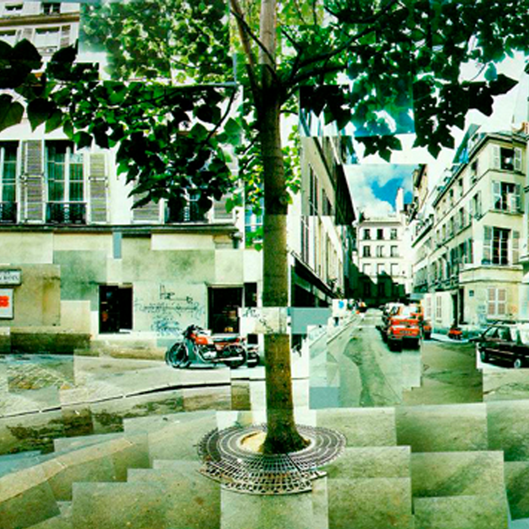
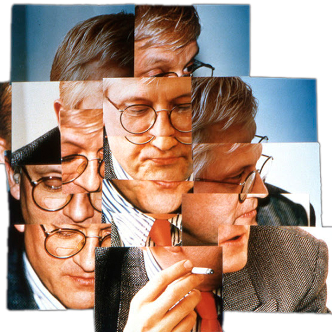
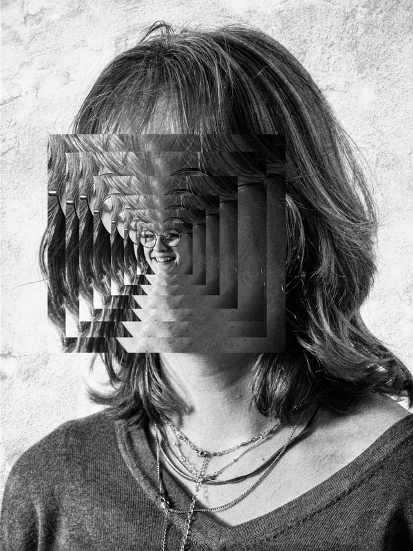
Photo Joiners - David Hockney
David Hockney (born 9 July 1937) is an English painter, draftsman, printmaker, stage designer, and photographer. As an important contributor to the pop art movement of the 1960s, he is considered one of the most influential British artists of the 20th century.
His photo joiners were a famous part of his career as he created many intriguing images. He made these out of mosaics of photographs taken from many different angles of the subject to create a type of 3D effect in a 2D image.
|
|
|
First Response
In this response, I attempted to create a few images in the style of David Hockney in Adobe Photoshop CC. To create a photo joiner in photoshop you must:
I tried this method a couple of different times with photos I had been given, these are the results.
- Open Photoshop
- File > Automate > Photomontage
- Select Collage and then deselect blend image.
- Select your images from the folder and press return
- Move around your layers and place into the right positions
- Add image adjustments
I tried this method a couple of different times with photos I had been given, these are the results.
Feedback (self)
WWW:
EBI:
- Method worked correctly and images blended well
EBI:
- More mosaic images were added
- Looked more stylised - less like the original object
Second Response
In this second response, I wanted to build upon my first response by incorporating the feedback I had given myself aswell as taking the photographs myself.
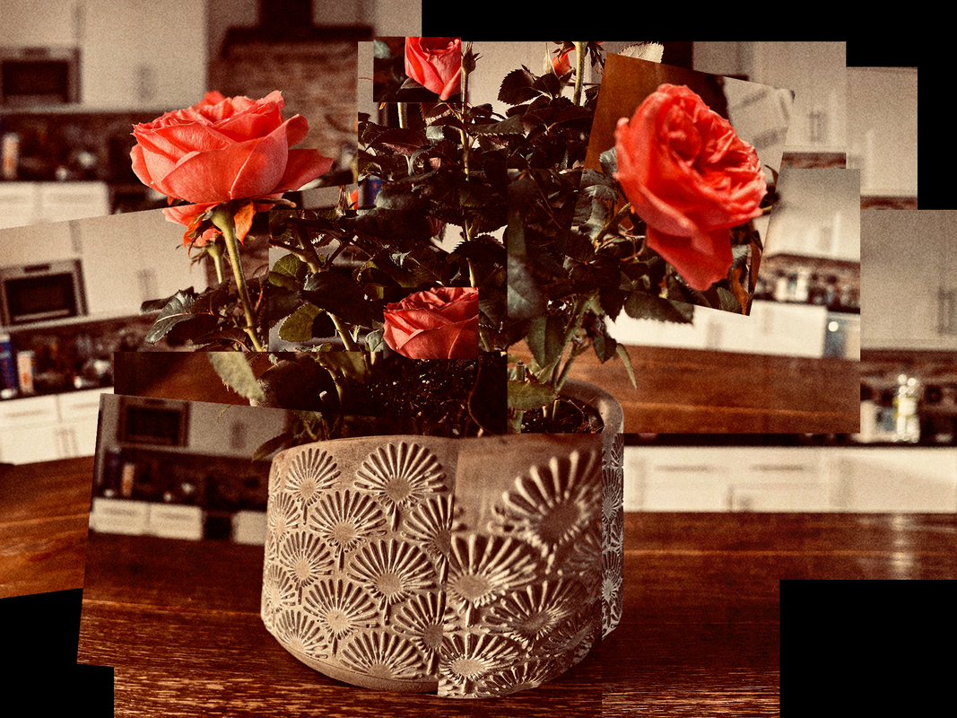
Roses - Photo Joiner
This time around I altered the white balance temperature slightly towards the warmer side to gain a vintage looking image.
I used a range of f-stop values and zoom lengths in order to differentiate the photographs from one another, highlighting that these are individual images placed in a collage format.
Instead of using the automated method I used in the first response, this time I favoured manually transforming the photographs position, scale, and rotation properties as well as cropping for a more authentic looking result.
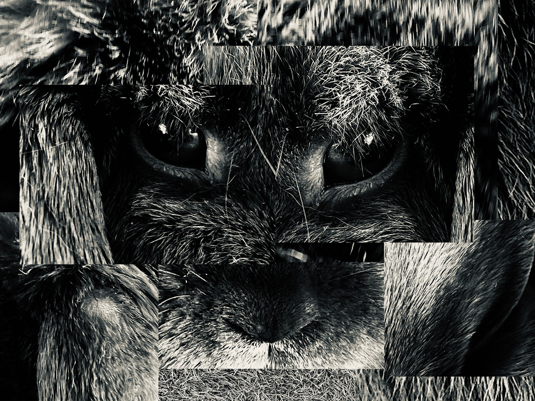
Rabbit - Photo Joiner
In this photo joiner, I wanted to make it less clear what the collage of photographs was really of. Instead, just emote certain feelings and connotations that the viewer may pick-up on.
I decided to shoot in monotone in order to remove the viewer's distraction of colour and truly focus on the contrast between the shades within the image.
I decided to take the photographs with a very high zoom in order to fully see the details within the textures.
Feedback (self)
WWW:
EBI:
- Manually created the collage - more authentic results
- Objects are recognisable yet look different
- Higher contrasts in colours and depth of field - more three dimensional
EBI:
- More mosaic images were added
Ordinary To Extraordinary - Edward Weston
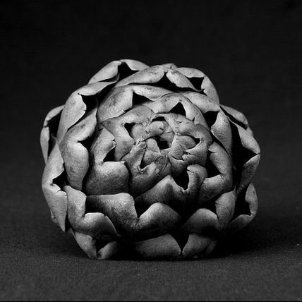
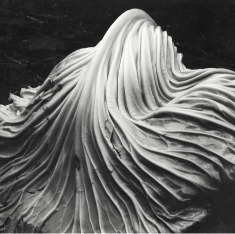
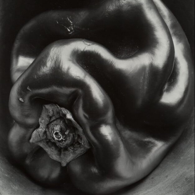
Edward Henry Weston (March 24, 1886 – January 1, 1958) was a 20th-century American photographer. He has been called "one of the most innovative and influential American photographers..."[1] and "one of the masters of 20th century photography."[2] Over the course of his 40-year career Weston photographed an increasingly expansive set of subjects, including landscapes, still-lifes, nudes, portraits, genre scenes and even whimsical parodies. It is said that he developed a "quintessentially American, and especially Californian, approach to modern photography"[3] because of his focus on the people and places of the American West. In 1937 Weston was the first photographer to receive a Guggenheim Fellowship, and over the next two years he produced nearly 1,400 negatives using his 8 × 10 view camera.
Some of his most famous photographs were taken of the trees and rocks at Point Lobos, California, near where he lived for many years. Weston was born in Chicago and moved to California when he was 21. He knew he wanted to be a photographer from an early age, and initially his work was typical of the soft focus pictorialism that was popular at the time. Within a few years, however, he abandoned that style and went on to be one of the foremost champions of highly detailed photographic images.
Some of his most famous photographs were taken of the trees and rocks at Point Lobos, California, near where he lived for many years. Weston was born in Chicago and moved to California when he was 21. He knew he wanted to be a photographer from an early age, and initially his work was typical of the soft focus pictorialism that was popular at the time. Within a few years, however, he abandoned that style and went on to be one of the foremost champions of highly detailed photographic images.
|
|
|
First Response
In this response I was tasked with taking a compilation of photographs inspired by the wonderful Edward Weston.
My goal within this response was to create dynamic photographs of ordinary objects but make them appear differently through the use of close and unique camera angles and high contrast dramatic lighting.
To do this I used a black backdrop to increase the contrast between the foreground and background as well as allowing the objects edges to drop off into the shadows to create a mysterious endless backdrop effect. To light the objects i used a handheld torch from close range to achieve that harsh lighting effect.
Favourites


Feedback (self)
WWW:
EBI:
- Light was angled - more tonal contrast created
- Wide range of objects - wide range of textures
- Certain objects were backlit creating different views of the object that are not usually seen
EBI:
- Objects looked less like their natural forms
- Monochrome picture profile - more true to artist's style
Second Response
In this second response I wanted to integrate my self-feedback from response one as well as exploring what certain objects would appear like under extremely high zoom.
My thought process behind was to give a new appearance to some what ordinary objects by showing their delicate details on their surfaces hopefully making them seem more extraordinary linking back to the theme apparent throughout most of Weston's work which was to give normal, everyday objects another life/purpose/use.
This time round I carefully picked out a selection of objects I thought would appear interestingly under harsh lighting while intensely magnified.
Photoshoot
Favourites


Feedback (self)
WWW:
EBI:
- Monotone picture profile - more true to artist's style
- Extreme zoom lens - less obvious to identify object
- Intriguing textures & marks within objects chosen
- Wide range of angles - different views of objects not usually noticed
- Harsh lighting - contrast increased
EBI:
- Less noise/grain within photographs
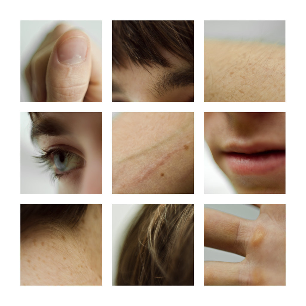
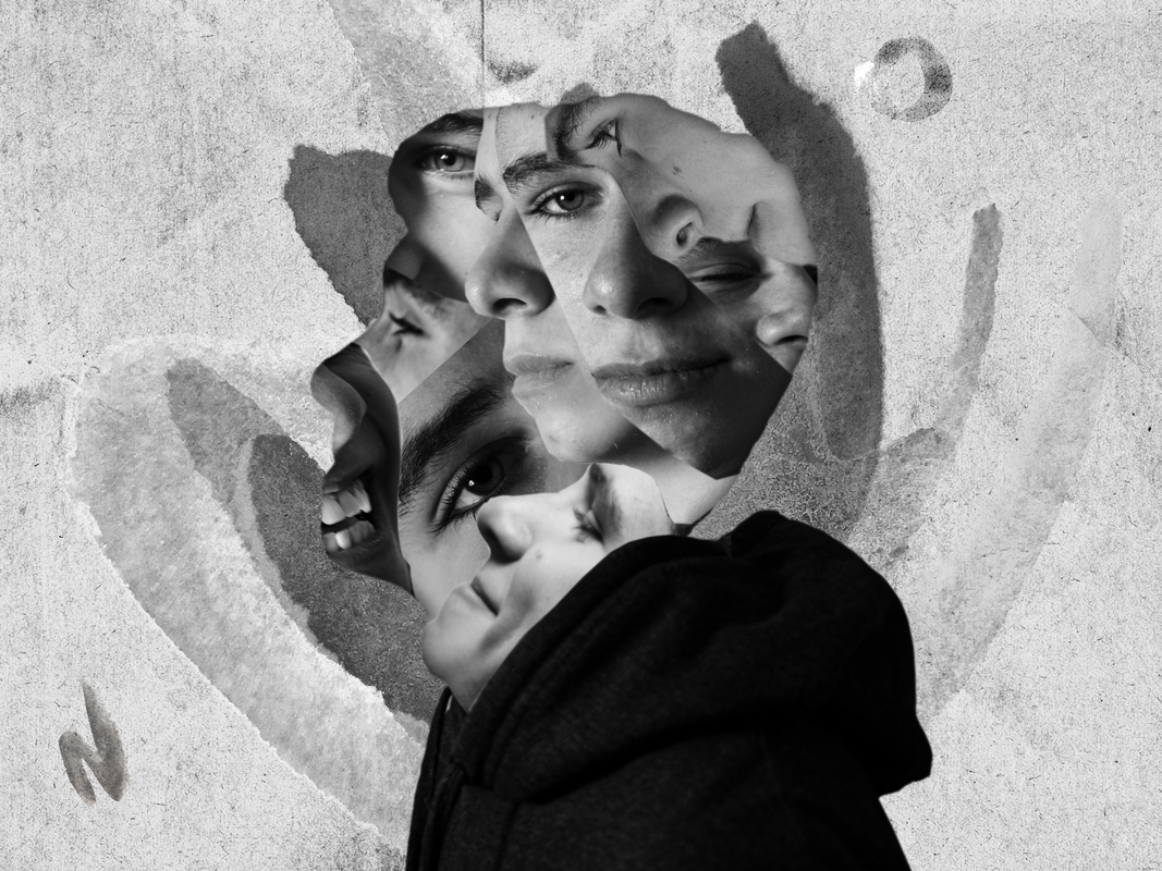
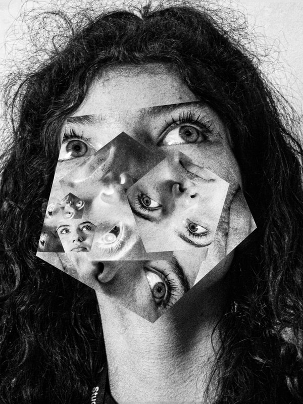
Different Views of a Person - Lauren Marek
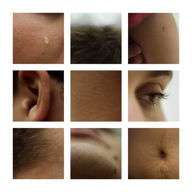
Lauren Marek in her series "Pieces" create's similar work but her work focuses even closer to the person and creates an even more abstract representation of the figure. Inspired by Picasso and his cubism portraits she uses 9 images alongside each other to create her abstract representations of a person.
|
|
Response
In this response, I was tasked with creating a grid of photographs exploring the human body in the style of photographers Lauren Marek.
Their abstract approach to photographing a person allows for the viewer to see many different features of the body in the same image, meaning we can form our own view of the person as a whole and what their past and personality may be like considering what clothing, jewellery, piercings, and scars etc. that person possesses.
When responding to this task, I noticed how similar this type of photography really was to David Hockney's photo joiners. Displaying many different images from many different angles in a collage/grid format to create an in depth 3D view of an object/person is the main characteristics of all these photographers works. By showing something we all find ordinary (a human) and photographing them in such a way that we admire these features and differences between everybody's individual appearance, is something extraordinary.
Before I started to respond, I analysed what I needed to create a successful set of photographs from Lauren Marek's work. The first thing I understood was to use a high zoom lens at about 100mm to get that up close and personal feeling to the photos. I ensured my that my aperture was as low as it could be at about f4.2, this allowed for me to focus on the feature I wanted to focus on and allow the rest of the background to softly roll out of focus. It was also vital for me to use many different angles to allow the face and hands to be viewed as fully as possible.
With all this in mind I started to create my photographs.
Final Edits


Feedback (self)
WWW:
EBI:
- Nine photographs were taken
- No body part shown twice
- High zoom + range of angles - abstract
- Images of features laid out differently to usual face - more abstract
EBI:
- Particular images - sharper focus
- Wider range of body parts and features
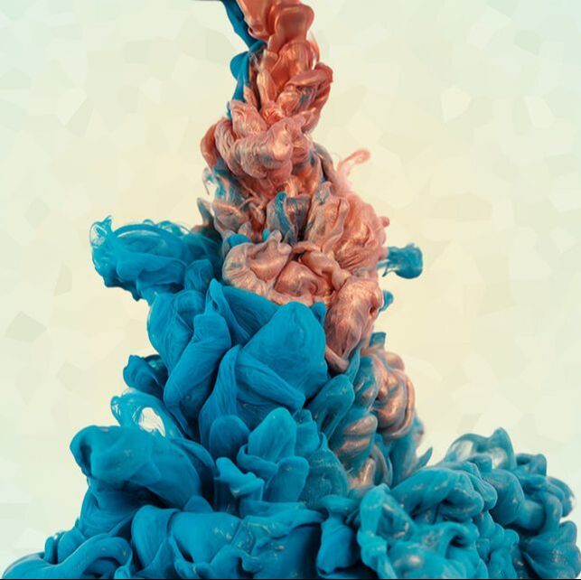
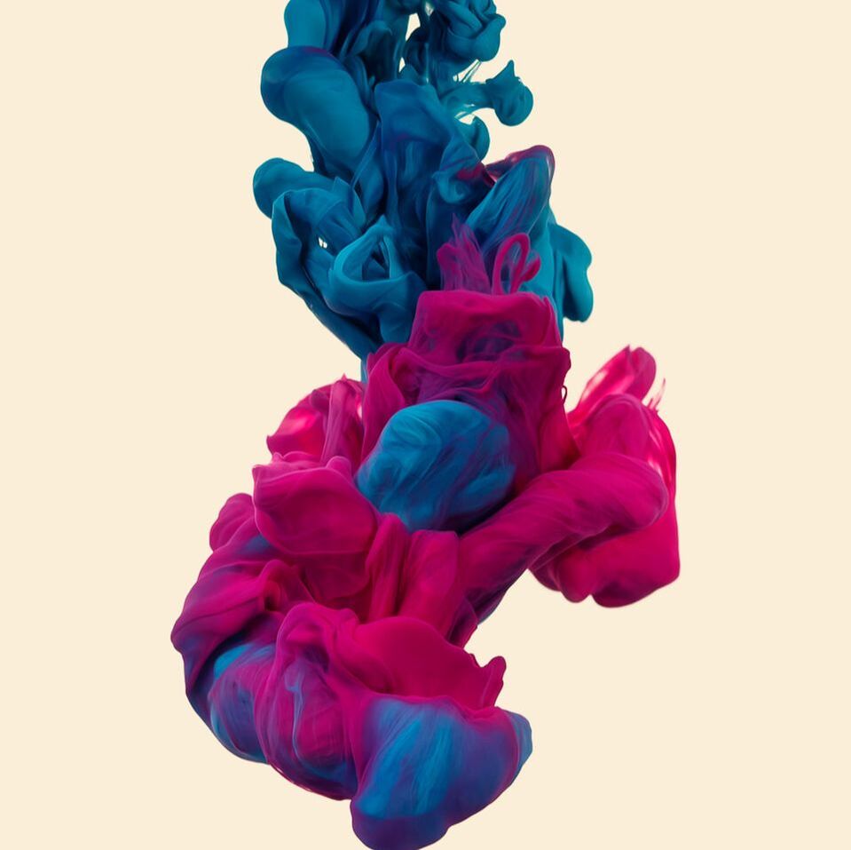
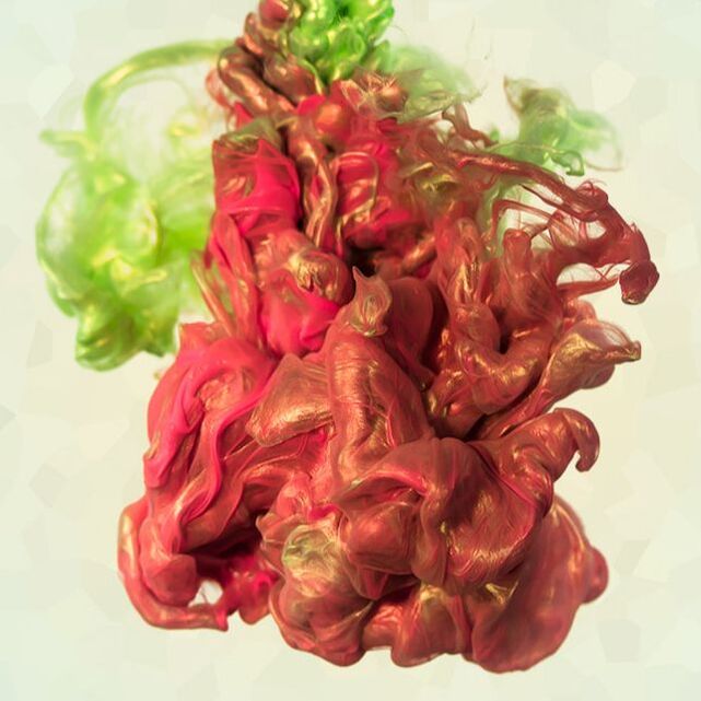
Fireworks in a Jar - Alberto Seveso
illustrator & Digital Photographer Alberto Seveso was born in Milan, he grow up in Sardinia but is now working and living in Bristol (UK) as a freelancer. His passion for graphic art started when he was in a young age and he was really fascinated by the graphic of skate decks and the cover of music CD of metal bands in the early ‘90s. From this passion he started to create his artworks.
|
|
|
Response
In this response, I was assigned with creating photographs inspired by Alberto Seveso's ink in water collection. This collection of photographs include how certain inks, dyes, and colourful paints react with water visually to create unique and fascinating shapes as well as textures.
The setup I used to create these photographs was a transparent glass container, digital monitor as a backdrop, and mixture of vibrant food colourings for the ink. I favoured for this approach as it was much easier to interchange backdrop colours on a monitor as well as the screen adds additional backlight to the ink in the water.
As I began to photograph the ink, it was instantly very hard to gain a balance between my ISO, Aperture, and Shutter Speed. This was due to the fact it was very difficult to achieve a sharp focus on the ink since it was always moving. To counteract this problem I increased my f-stop value on my aperture up to 22 to make the image appear much sharper and focused however and gain deeper depth of field. Another way to help get a sharper focus was to place an object such as a straw into the container before hand to focus on that, therefore when the ink is dropped in it will retain a sharper focus due to the camera already understanding the focal point of the frame.
I also realised that my shutter speed would have to be reasonably high (about 120) if I wanted a clear image, due to the quick movement of the ink.
However, by applying both these steps my image became very dark and underexposed meaning I had to increase my ISO value to about 6400 to increase exposure. However, this created lots of grain within the frame. To resolve this issue slightly I repositioned my light source closer to the glass container meaning I could reduce my ISO value to 3200 therefore reducing grain, but not all of it.
Final Edits
Feedback (self)
WWW:
EBI:
- Wide range of coloured inks used
- Unique shapes created
- High zoom - view details easily
- Increased highlights and whites in Photoshop - background purer white - endless effect
- Removed most bubbles from container surface - cleaner image
- Continuous shooting mode used
- High shutter speed - reduced blur
EBI:
- Higher f-stop used - get focus sharper easier
- Light source intensity increased - lower ISO needed - less noise and grain
- Purer water was used - less visible particles
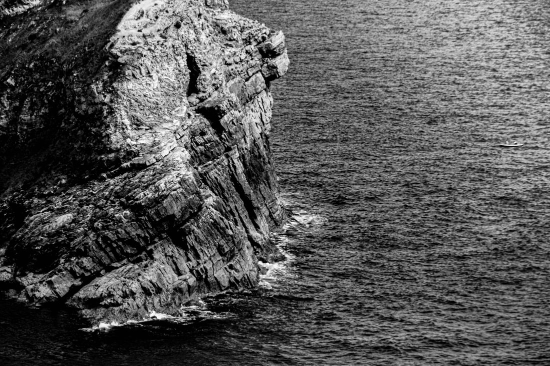
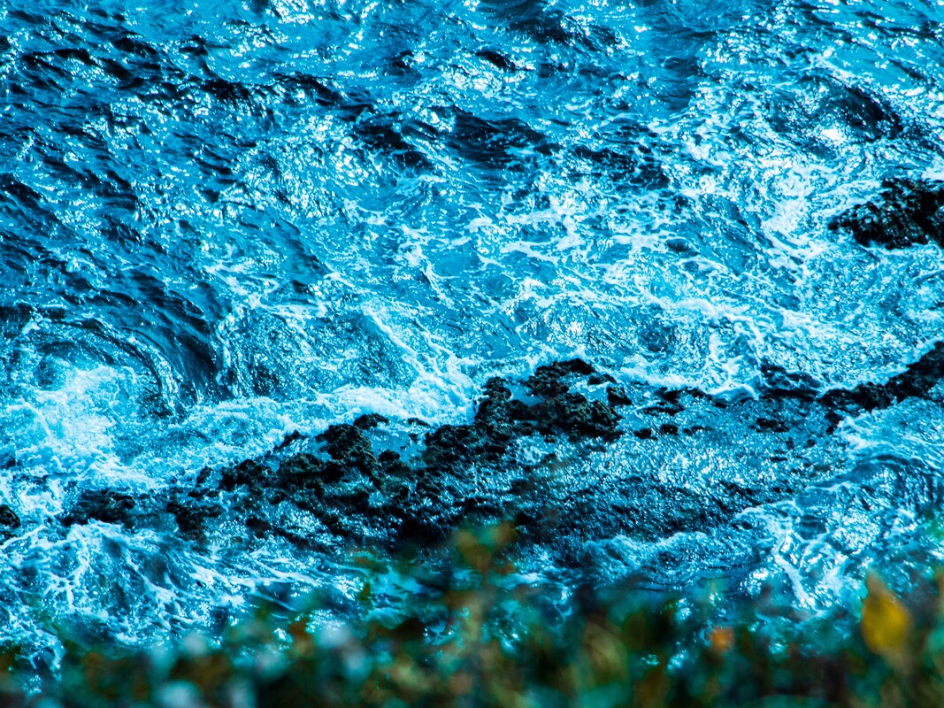
Still Water - Roni Horn
Roni Horn is an American visual artist and writer. The granddaughter of Eastern European immigrants, she was born in New York City, where she lives and works. She is currently represented by Xavier Hufkens in Brussels and Hauser & Wirth.
Roni Horns Still Water (The River Thames, for Example) is a series of fifteen large photo-lithographs of water, printed on white paper. Each of the images focuses on a small area of the surface of the river Thames. The colour and texture of these watery surfaces varies dramatically between images: colours range from black to blue and from dark green to khaki-yellow, and in each case the water’s texture is differently augmented by tidal movement and the play of light. Close inspection of the images reveals that tiny numbers in typeface are dotted like specks of flotsam over the water’s surface. These numbers refer to footnotes printed along the lower edge of each image’s white border. The footnotes present a series of musings and quotations on the significance of the river and the moods and narratives it evokes.

|

|

|
First Response
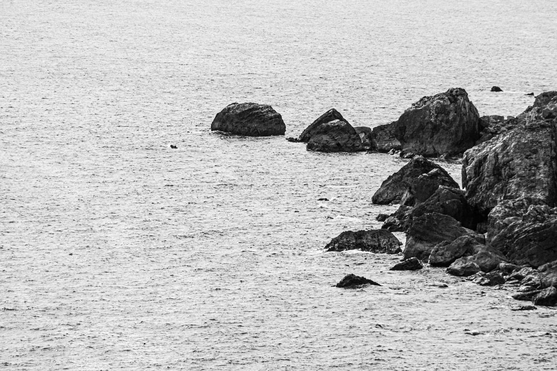
For this set task, I was assigned with responding to the works of Roni Horn and his photography of water and it's movement throughout the natural environment.
Photoshoot
Inspired by Horn, I wanted to examine the waters texture and movement so believed that capturing the water interacting with other objects within a scene further showed how the water reacts in particular collisions. I positioned my camera at a high angle giving a wider perspective over the open water and zoomed in on specific areas around rocks and shrubs to create an interesting frame of moving water.
When shooting, I kept my aperture at f-22 to retain a deep depth of field allowing the entirety of my frame to remain in focus. As it was a bright day when shooting my image was still over exposed, so I increased my shutter speed to over 200.
When shooting, I kept my aperture at f-22 to retain a deep depth of field allowing the entirety of my frame to remain in focus. As it was a bright day when shooting my image was still over exposed, so I increased my shutter speed to over 200.
*IMAGES OUT OF CAMERA*
Final Edits
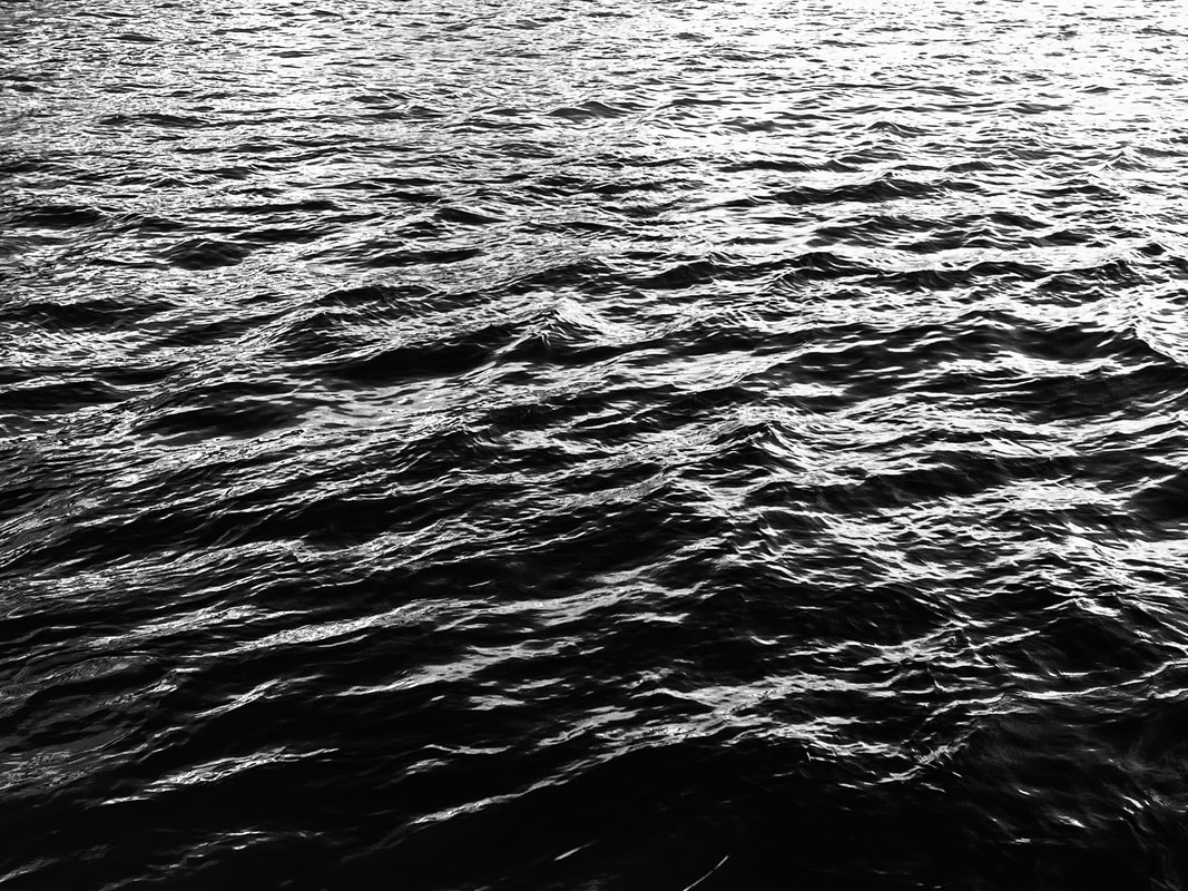
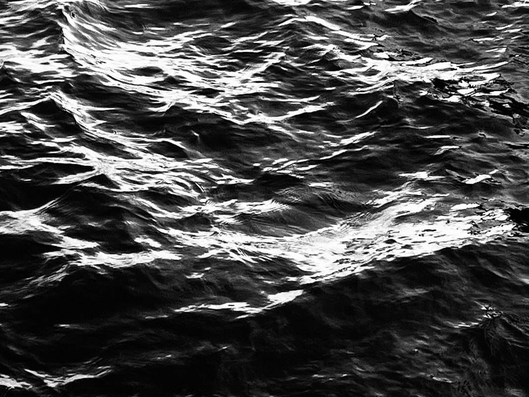
In Photoshop, I increased the texture and clarity values for all my images to increase their visual aesthetic to match better with Horn's style. I then used the levels tool to build contrast within the frame.
For the monochrome photographs, I changed the black point to lower threshold and increased it for particular images to gain differentiation within the brightness and exposure of the water.
For the coloured photographs, I re-opened the images in Lightroom and altered the hue, saturation and luminance values of the blue channel to gain the bright electric blue water that is aesthetically pleasing.
|
|

|
|
Self Feedback
WWW:
EBI:
- Water created interesting shapes and waves
- Water produced unique texture
- Rocks in water helped to create interesting compositions
- Deep contrast
EBI:
- More types of water was photographed - oceans, lakes etc.
- Different coloured water was photographed - fits more with style
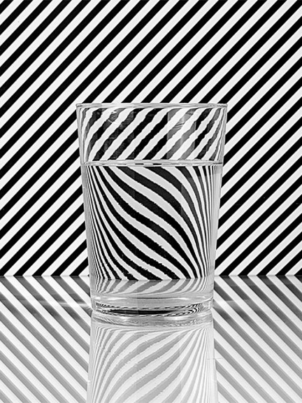
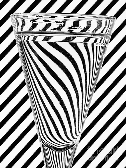
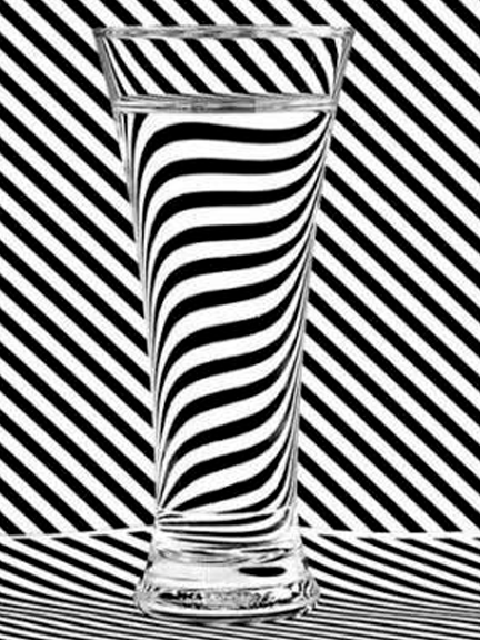
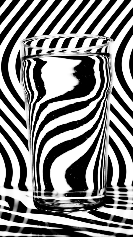
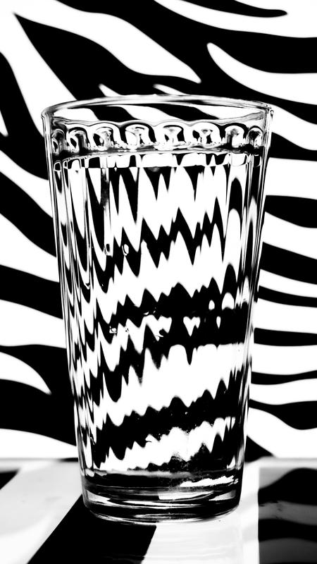
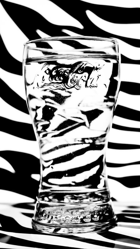
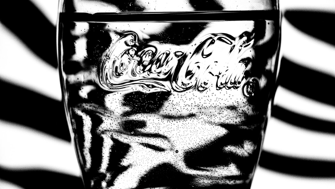
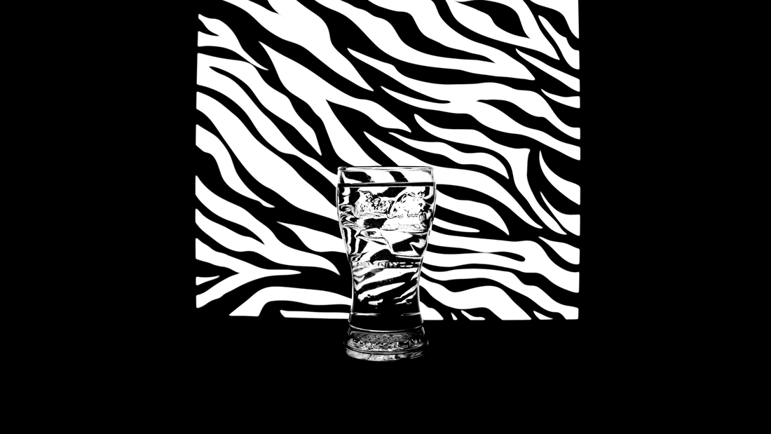
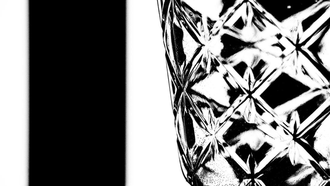
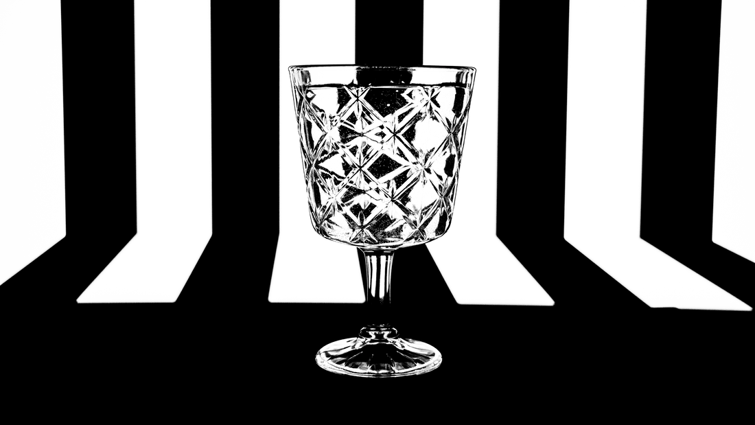
Glass Distortion - Steve Purnell
Steve Purnell is a photographer who explores many different genres of the art form from distortion to landscape and portrait photography. Based in Rhymney Valley in South East Wales, Purnell continues to create stunningly creative shots leaving viewers wondering how he puts these abstract compositions together.
His work with glass distortion is very much inspired by Op art, a movement of visual art that makes use of optical illusions. Within these images he displays said optical illusions and then distorts them through water within a glass or bottle.
His work with glass distortion is very much inspired by Op art, a movement of visual art that makes use of optical illusions. Within these images he displays said optical illusions and then distorts them through water within a glass or bottle.
|
|
|
Response
Within this response, I wanted to create a selection of photographs in the style of Steve Purnell, exploring his work on glass distortion.
When deciding a method to use to achieve this effect, I was instantly drawn towards the idea of using a digital screen as a way displaying the optical illusions for the background. By using this method it was easier to interchange backgrounds along with the fact that a digital screen (monitor) also acts as a lightsource removing the need for additional lighting, this also significantly reduces the shadows produced by the glasses onto the backdrop resolving a major problem I would of had if using printed paper backdrops.
For some of the shots I also placed the glasses onto an IPad also displaying the illusions, this created a more three dimensional image as I was able to photograph the base of the glass yet still make it look part of the scene. The positioning of the glass was also important to create a big enough distortion. I found that the further the glass from the screen, the larger the distortion within the water in the glass.
When choosing camera settings I made sure to keep my aperture value as high as possible to reduce blur of the background and make the transition between the background and distorted water more seamless, making the glass look closer to the screen that it was in reality. This counter acted the cons with moving the glass further away from the screen to increase distortion, allowing me to reap the benefits from both these decisions.
Full Shoot
Final Edits
When editing the images I realised that my images were under exposed, to resolve this issue I added an exposure adjustment layer and heavily increased the exposure values.
I also wanted to increase the contrast between the whites and blacks as much as possible. I added a levels adjustment layer and crushed the whites and blacks to increase the contrast. Through shooting in a monotone picture profile it wasn't difficult to achieve a pure white and black shade to make the backdrop look more like what it it did originally.
By adding all these adjustments the photographs became much more comparable with those of Steve Purnell himself and achieved the effect and look I intented to create.
|
|
|
Development Feedback (self)
WWW:
EBI:
- Monotone picture profile - reduces moire effect
- Glasses distorted illusions well
- Wide range of glasses - different distortions
- Photoshop adjustments - increased contrast, exposure - made pure white
- Use of digital screens - backdrop
- Use of bottled water - less particles in liquid
EBI:
- Coloured lighting uses - alternative style
- Wider range of illusions
- More unique glasses - more unique distortions
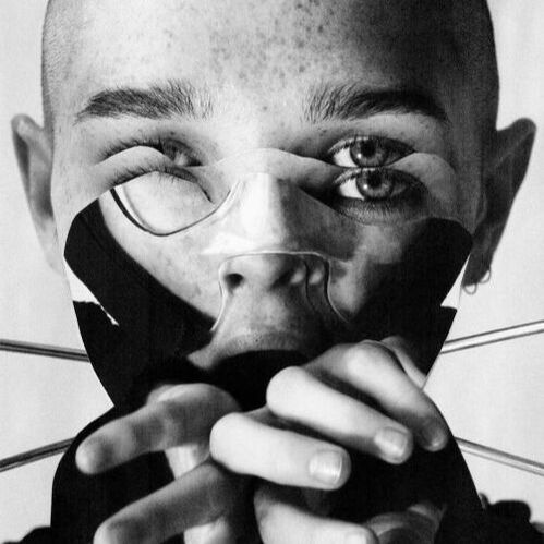
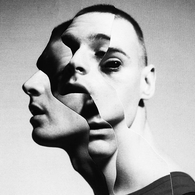
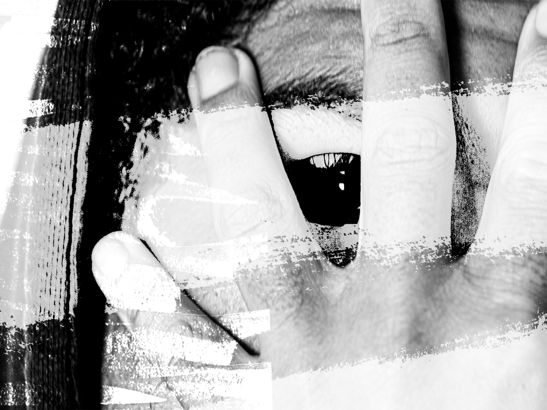
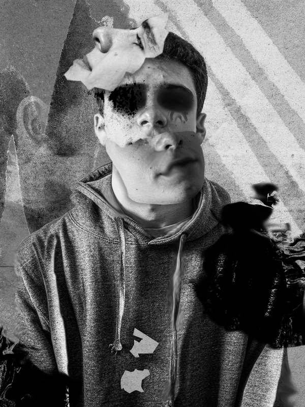
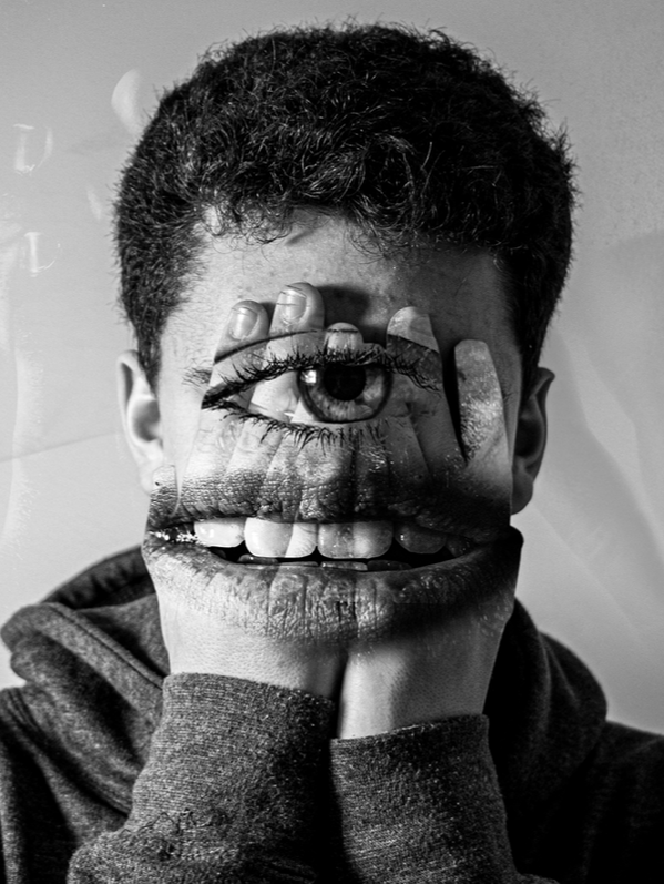
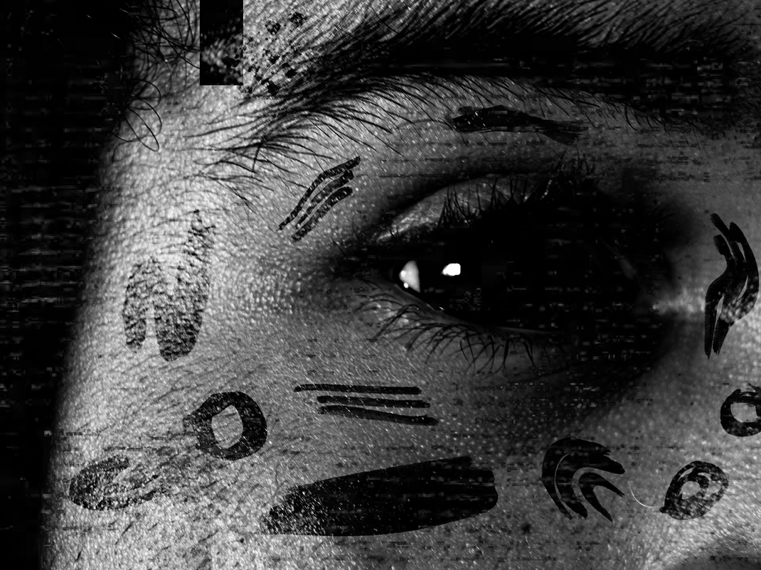
Different Views of a Person - Jesse Draxler
Jesse Draxler is a mixed media and multidisciplinary artist, and his pieces combine painting, photography, collage, typography and digital painting. Among their characteristics are distorting the human form, working in grayscale, and abstract landscapes. Writer Kyle Fitzpatrick described his portrayals as "a person mid-question...
Everything is abstracted just slightly, just enough to unnerve and entrance... [It] feels as if his subjects are slowly focusing and refocusing, trying to become clearer", while artist Mike Carney said that it "is an authentic look into the transitional stasis of a technologically saturated existence, and the lapse of connection, far from bridged within its void."
Everything is abstracted just slightly, just enough to unnerve and entrance... [It] feels as if his subjects are slowly focusing and refocusing, trying to become clearer", while artist Mike Carney said that it "is an authentic look into the transitional stasis of a technologically saturated existence, and the lapse of connection, far from bridged within its void."
|
|

|
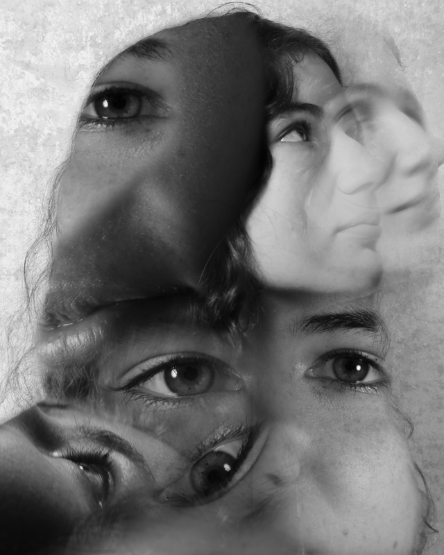
First Response
In this first response, I wanted to explore some of the techniques needed to achieve a photograph/picture in the style of Jesse Draxler.
When Jesse builds the artistic work he physically alters the photographs on a canvas, however, I wanted to take a different approach and channel the digital Adobe Photoshop skills I have learned over the course so far. By creating my work in Photoshop it would be easier for me to edit and reverse adjustments if mistakes are made, making this method more beneficial when experimenting with different techniques.
Before shooting, I positioned the model in front of a white backdrop, this was to increase the contrast between the foreground and background for ease of compositing later. I made sure to set my picture profile to monotone to fit Jesse's style further. Within interviews, Jesse talks about his colour blindness and how it affects him making this black and white style a vital part of his works. When shooting I shot in a RAW format to have additional CR2 files that retained the photographs' original information without a set picture profile allowing me to view them in colour if necessary.
When lighting the model, I positioned my light source so it was facing from the left at about a 45-degree angle (with no diffusion) to cast a large shadow across the right side of the model's face; gaining a mysterious, contrast-packed image adding to the gothic vibe seen within Jesse's photographs.
Once I had achieved this setup, I began photographing.
Full Shoot
Final Edits
When editing the photographs, I scouted through many different artworks Jesse had previously made and attempted to bring across particular elements that intrigued me and place them into my work.
With the first image, I wanted to have a collage of different photographs of the model's face within a constricted outline of the model's head and shoulders, similar to those of Jesse's.
To do this, I opened an image of the model to act as a base layer, I then cut around her with the pen tool and duplicated the mask onto a separate layer. Next, I brought in several other images of the model which I then masked parts out of using the pen tool and set each of the individual layers clipping masks to the base layer cutout. I then altered the blend modes for the other photographs of the model to overlay, multiply, and color, to make the images translucent and interact with each other further.
For the front of the face, I created another mask and duplicated it onto a separate layer. I then positioned it in front of the original face and to add the final adjustments I decreased the opacity and fill values of the layer, as well as adding a radial blur adjustment from the filters panel.
For the background, I found a grungy texture online and composited it into the frame by placing the grunge layer above the original base layer and then changing its blend mode to overlay.
Feedback (self)
WWW:
EBI:
- Monochrome picture profile - true to artist's style
- Background texture - composited
- Clipping mask worked correctly
- Drop shadow on object
EBI:
- Person outline more visible & precise
- More variation between overlayed photographs - less eyes
- Different blend modes used
- Images don't blend together as much
- Masks were not feathered
- More varied photographs were taken
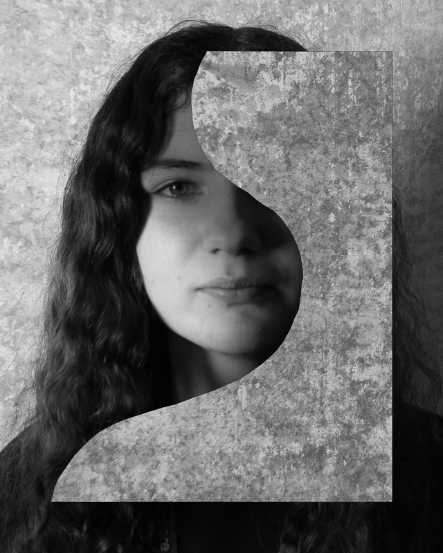
Second Development
Before anything else, I identified the major mistakes I made in my first response. These include the lack of variety of photographs taken when shooting in companion to overusing digital assets such as Photoshop blend modes. Both these mistakes took away from the images visually and didn't add to achieving the results I was hoping for.
When approaching this second development, it was key to incorporate feedback from the previous development, as well as build upon themes with my own personal style.
This time around when shooting, I kept the same basic setup as I did before but instead proceeded to take many more photographs, with the model facing many different angles and directions, expressing a range of different emotions with different body languages. Doing this instantly made the editing process a lot easier as there was much more choice when choosing photographs to composite together.
Full Shoot
Final Edits
|
|
|
The largest part of this assignment is editing, that's why it was apparent to me that this time around I needed to have a clear direction I wanted to follow when editing these images. I settled for a grungy, grainy type vibe making the edits look as if they were created on paper but in reality made digitally. The edits I created in development one were too glossy for Jesse's style, in this development's edits I wanted to add more elements within the frame e.g. paint strokes and splatters, to fit with the style further.
When building up layers, for every new photograph of the model I added to the composition, I increased the clarity and texture values to increase this grungy effect I was going for. The tool I used the most when editing these images was most definitely the pen tool. This again highlighted to me how much this style of art relied on cutting and slicing parts of images together. |
Editing Process Timelapse
|
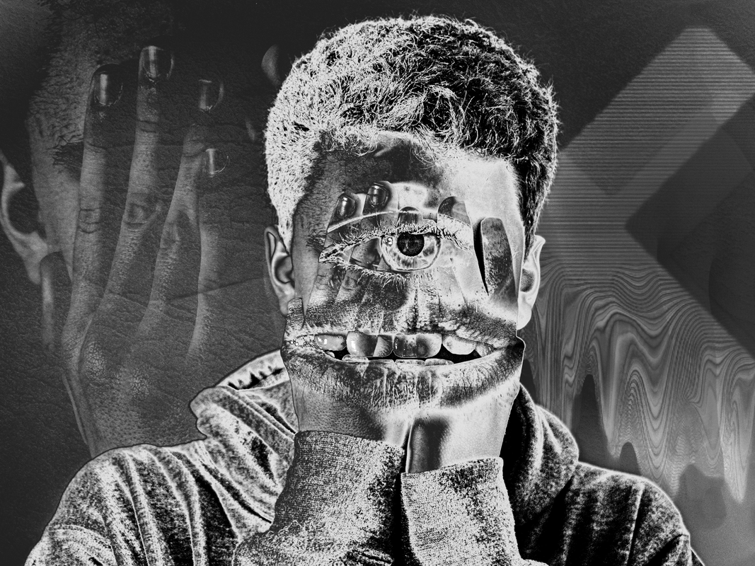
I found myself using the burn and smudge tool much more than in development one, these were key tools in adding to the abstract style of the images and creating mysterious shapes and textures within the frame.
When editing masks of photographs of the models I made sure not to go overboard with the use of blend modes, only using them in situations where necessary such as when I placed the eye and mouth over the front of the hands. However blend modes were a vital part of the editing process for me when layering up backgrounds or making paint markings look realistic for example when I placed them around the outside of the eye in one of the images.
I also used the curves tool frequently in order to add or decrease contrast within images to correct exposure between images as well as giving stylistic effects such as an inverted effect within the first image.
Feedback (self)
WWW:
EBI:
- Monotone picture profile - true to artist's style
- Wide selection of photographs - model facing many angles
- Background textures
- Use of clipping masks
- Drop shadow on objects - three dimensional
- Masks weren't heavily feathered - more precise
- Use of blend modes e.g color, overlay, soft light, multiply
- Increased contrast values
- Increased clarity & texture values
- Photographs shot in RAW - more photo manipulation possible
- Person outlines were precise
- Use of burn & smudge tool
EBI:
- More models were use to expand the diversity of images - allowing for different forms of self expression
The Geometric Portrait - Gordin Magnin
Gordon Magnin is a Nevada based artist who works in photography, scans, collage, and altered found image. Magnin’s interest lies in the inventive use of geometry, pattern, repetition, form, perspective, composition, and systematic operations as methods to distort and challenge the intended objective, interpretation, and significance of consumer based images. Gordon has shown both locally and internationally including a residency and exhibition in Rouyn-Noranda, Quebec. His work has been profiled in numerous print and online publications including; Gestalten’s “Dopplenganger, Images of the Human Being” and “Cutting Edges, Contemporary Collage”.
His work was most recently featured in New American Paintings #102 West. He also completed a cover and opener illustration for Bloomberg Businessweek and the New York Times. Gordon Holds a Masters Degree from the Southern California institute of architecture (SCI_arc) and a bachelors of science in structural engineering from the University of Nevada, Reno. He completed studies at Mountain School of Arts in Chinatown (MSA^), in Los Angeles in 2008
His work was most recently featured in New American Paintings #102 West. He also completed a cover and opener illustration for Bloomberg Businessweek and the New York Times. Gordon Holds a Masters Degree from the Southern California institute of architecture (SCI_arc) and a bachelors of science in structural engineering from the University of Nevada, Reno. He completed studies at Mountain School of Arts in Chinatown (MSA^), in Los Angeles in 2008

|

|

|
Response
In this set task, I was assigned with creating a selection of intriguing photographs in the style of Gordin Magnin using his famous geometric style portraits as inspiration.
Photoshoot
When shooting, I lit my model with a singular light source at a 45' angle to cast harsh shadows onto the right side of my subjects face to achieve that deep, heavy contrast present throughout Magnin's monochrome images. In addition, I made sure to capture a number of different expressions from my models to give me a wider selection of emotions to choose from when editing.
*PHOTOS OUT OF CAMERA*
Final Edits
Inside photoshop, to geometrically fragment my photographs, I used the mosaique tool in a number of different shapes to mask around a particular area, then using the shortcut 'command J' duplicated the mask onto a new layer above. I frequently repeated this process altering the position, scale, and rotation values to create a fractured look. In addition, I used perspective and warp in the transform window to enhance this effect further.
To gain a more textured look, I increased the clarity slider to about 80%. Similarly, I over layed a grunge wall texture over the images on a overlay blend mode in addition to lowering the opacity and fill values to 60% to give this subtle visual addition to the images that I believe fits with Magnin's style very well.
To gain a more textured look, I increased the clarity slider to about 80%. Similarly, I over layed a grunge wall texture over the images on a overlay blend mode in addition to lowering the opacity and fill values to 60% to give this subtle visual addition to the images that I believe fits with Magnin's style very well.
|
|
Self Feedback
WWW:
I believe the harsh lighting helped the photographs to resinate with Magnin's style. As well as this, I used an interesting range of shapes and bend modes to create geometric fragmentations. Overlays and grunge textures added an additional visual intriguement to the image giving it an urban dirty feel.
EBI:
My geometric fragments were more structured like Magnin's, less randomised arrangement and more space in between shapes allowing for more of the unedited face to be viewed allowing the viewer to see the refracted face instead of only masked sections of the face.
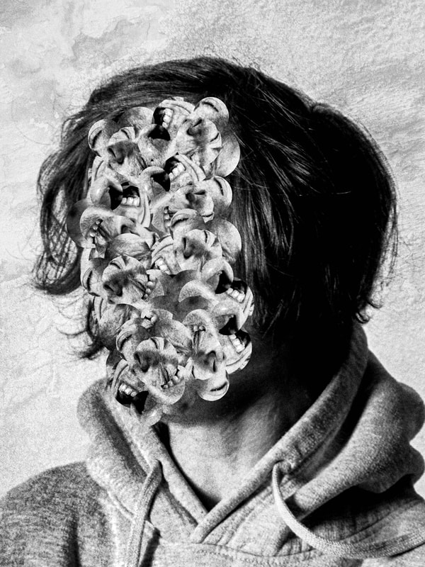
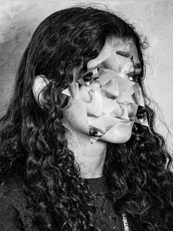
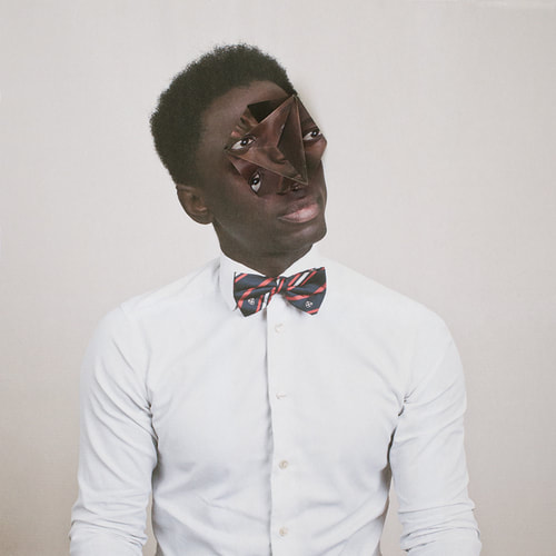
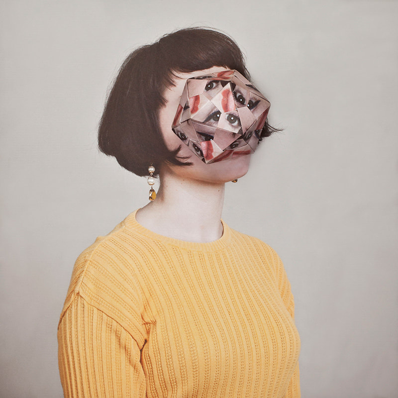
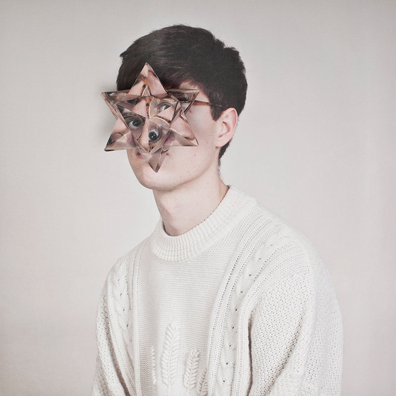
Cosmetic Surgery - Almar Haser
Born in 1989 into an artistic family in the Black Forest, Germany, Alma Haser is now based in London and on the southeast coast. She is known for her complex and meticulously constructed portraiture, which are influenced by her creativity and her background in fine art. Alma creates striking work that catches the eye and captivates the mind.
Expanding the dimensions of traditional portrait photography, Alma takes her photographs further by using inventive paper-folding techniques, collage and mixed media to create layers of intrigue around her subjects; manipulating her portraits into futuristic paper sculptures and blurring the distinctions between two-dimensional and three-dimensional imagery.
Alma has won many awards for her work, including Magenta Foundation's Bright Spark Award in 2013 for her Cosmic Surgery series (also the basis of a successful self-published book project). Her piece The Ventriloquist was shortlisted for the Taylor Wessing Portrait Prize at the National Portrait Gallery in 2012. Alma also won the PDN Photo Annual Award in 2016 for her Eureka Effect series. Her work has been exhibited worldwide and recent venues have included the 2017 Saatchi Gallery show From Selfie to Self-Expression. Examples of her work are currently on show at the Now Gallery in Greenwich, London.
|
|
|
Cosmic surgery is imagined as a medical procedure that people can choose in the not so distant future for aesthetic enhancement, mood alteration, and to thwart increasingly pervasive methods of surveillance. Combining photography with collage and origami, Haser's playfully odd portraits consider the link between identity and image in a culture of visual bombardment. She suggests a fundamental shift in the way we understand ourselves and the world around us, picturing the possibility of a trans-humanist future.
"Experimentation has shaped my identity as an artist. I’m always thinking about different sculptural approaches to photography and how I can build layers into the work. I never know exactly how I’m going to produce the work until I’ve spent hours experimenting. Most of the time it’s a happy accident that shapes the final piece."
"Experimentation has shaped my identity as an artist. I’m always thinking about different sculptural approaches to photography and how I can build layers into the work. I never know exactly how I’m going to produce the work until I’ve spent hours experimenting. Most of the time it’s a happy accident that shapes the final piece."
Response


|


|
Self Feedback
WWW:
The origami portrait added depth to the portrait with its three demential volume. In addition, the abstract shape created absurd refraction of the image adding to Hasar's style.
EBI:
Other more random shapes were used to produce unique shapes and compositions across the subjects face. as well as using a lower aperture value to gain a more shallow depth of field to visually view more depth between the two portraits.
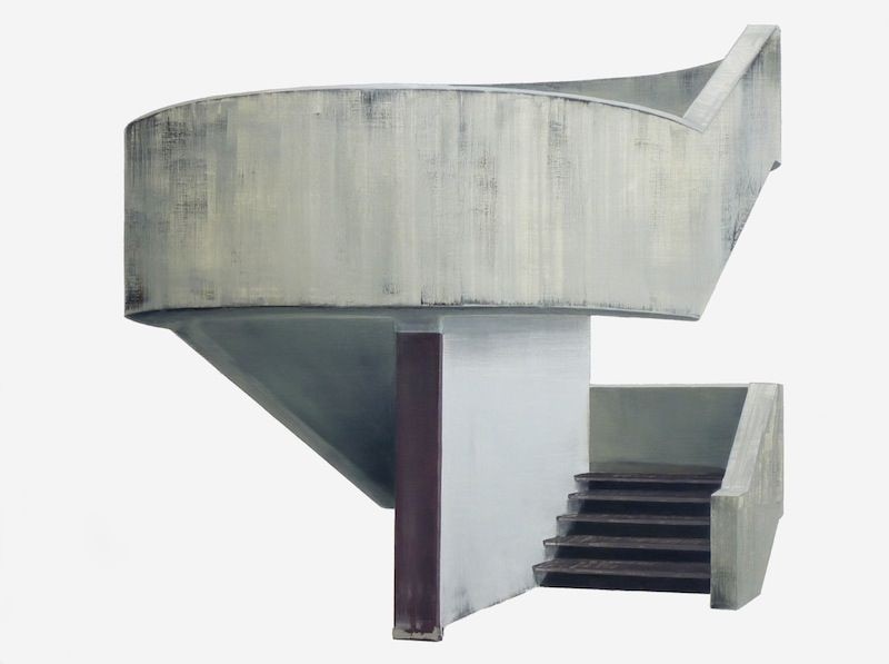
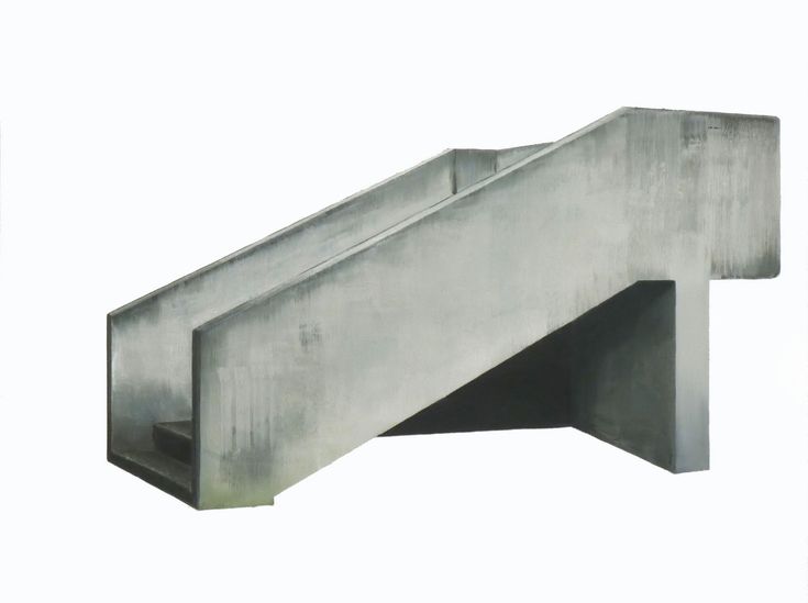
Fragmented Buildings - Patrick Cornillet
Patrick Cornillet is a French architectural painter born in 1968 in France. Cornillet resides and works in Nantes.
His recent work features austere constructions in empty surroundings. Fragments of architecture left in the center of the painting, in suspense by its visitors. His works capture their spectators in an illusory space. Because of this the viewer struggles to give an interpretation to these concrete structures. Unclear is if these structures have ever served a purpose other than confusing its viewers.
Cornillet’s more recent work can be viewed as ‘severe’ or ‘naked’. Similar to his previous work a feeling of motion is perceived in these structures. These images evoke the ruins of a fallen society, standing as naked as fragmented.
|
|

|
First Response
In this first response, I was tasked with developing a selection of photographs inspired by the minimalistic works of artist Patrick Cornillet and the underlying themes behind his art.
Photoshoot
Final Edits

|


|
Self Feedback
WWW:
I successfully masked out and selected specific architecture in photographs to stay true to this brutalist type structure that Cornillet focuses on. I sustained a white background throughout my images to again highlight the part of the structure in frame.
EBI:
A larger range of perspectives were used to create a more intriguing selection of simplified photographs
FRAGMENTED ARCHITECTURE
DEVELOPMENT PROJECT
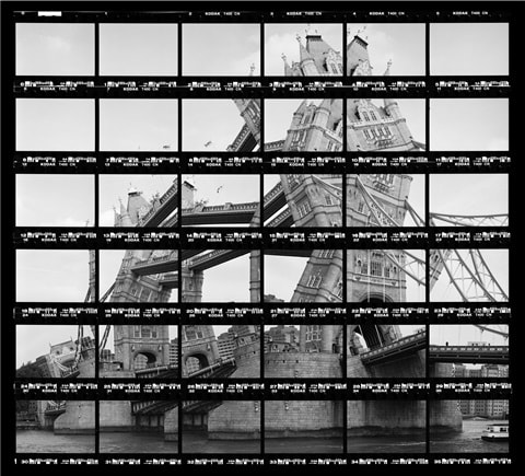
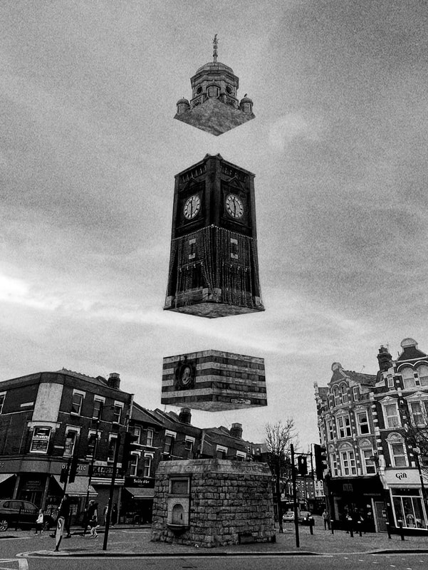
[D1] Thomas Kellner
Thomas Kellner's fine art photography changes the object of the image and questions what we see. This continuous reinvention of himself and of the formal method always leads to new options for interpretation.
A selection of Thomas Kellner's work shows analog compositions from the period of 1997 to 2021. Beginning from the idea of Cubism after Delaunay, he transfers the international movement of Deconstructivism from architecture to photography. He photographs buildings, fragments them and assembles them into a heterogeneous conglomerate of forms. And yet, his famous montages of contact sheets are just one type of his multifaceted works. He uses to change our perspective and link art to our thinking. Prof. Irina Chmyreva from the Academy in Moscow defined his work as "visual analytical synthesis".
A selection of Thomas Kellner's work shows analog compositions from the period of 1997 to 2021. Beginning from the idea of Cubism after Delaunay, he transfers the international movement of Deconstructivism from architecture to photography. He photographs buildings, fragments them and assembles them into a heterogeneous conglomerate of forms. And yet, his famous montages of contact sheets are just one type of his multifaceted works. He uses to change our perspective and link art to our thinking. Prof. Irina Chmyreva from the Academy in Moscow defined his work as "visual analytical synthesis".
|

|

|
Artist Analysis
Kellner uses a wide range on unique shot sizes and angles to represent structures in their three dimensional forms. His array of different images connote this idea of viewer perspective, suggesting that we are all different and view the same simple subject matter but all in our own unique manners.
First Response
Photoshoot
Final Edits

HMS BELFAST
 TOWER BRIDGE
Self Feedback
WWW:
When shooting I captured my images in RAW as well as in a monochrome picture profile in order to view photographs in black and white so I could understand what my final image was going to look like after desaturation in Lightroom. I made sure to capture range of different angles of the particular structure to gain a wide range of different perspectives. To enhance this further, in photoshop I used the warp and perspective tool to alter the dimensions of my images to enhance the effect further. I believe I captured the style of Thomas Kellner's work through my grid layout of photographs containing each image within it's own frame.
EBI:
I cultivated more photographs from further varied perspectives to fit better with Kellner's style and create a larger scale canvas with more frames generating a larger view of the structure as a whole.
Ideas for Development
Throughout the creation of this work I found a strong liking for the act of photographing structures from different angles, viewing different parts of buildings that wouldn't usually be seen creating this intriguing arrangement. For my next development, I want to continue experimenting with this idea however performing some kind of deconstruction of buildings, pulling them apart revealing there otherwise unseen attributes.
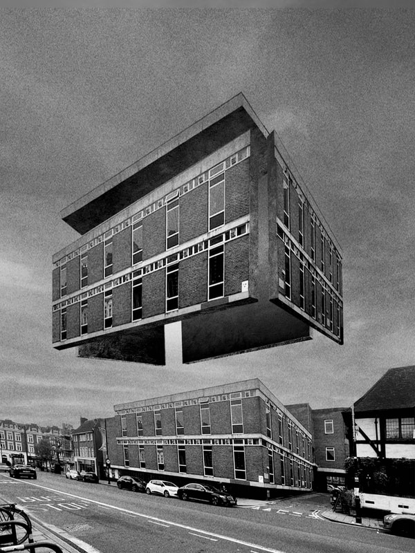
[D2] Fragmented Architecture - Espen Dietrichson
Espen Dietrichson is a Norwegian artist. He lives and works in Oslo, Norway. Dietrichson was educated at Oslo National Academy of the Arts. He is working mainly within the field of sculpture.

|

|

|
Artist Analysis
Dietrichson very interestingly fragments his work by enlarging each face of a three-dimensional structure allowing the viewer to see the full net shape of the building itself. This decomposition intrigues the viewer as it gives this strangely deep perspective and large scale representation of the original structure itself.
Photoshoot
When shooting, I used a wide-angled lens allowing me to gain a larger field of view even when the subject of my frame was particularly close. Dietrichson's work is all about scale meaning the wider the perspective the better. I also made sure to photograph the buildings from an angled perspective in order to gain the depth of the building allowing me to later fragment all four sides and keep them in vision.
Final Edits
When editing, I firstly removed unwanted objects within my frame using the content aware fill tool allowing me to gain a plainer more minimalistic environment similar to Espen's. I then cut out each face of the structure using the magnetic polygon lasso tool. From here I created another mask using the same tool this time outlining the building cutout then set the mask to colour fill.
I then altered the blending settings by adding a hard chisel contour and textured overlay to emulate the effect of concrete/brickwork. To enhance this further I opened images of these material textures altered their clarity, saturation and exposure values in addition to reducing the opacity and fill slightly then set them as a clipping mask over the fill mask. I repeated this process for every face of the building before then opening up the transform settings and using the perspective and distort settings to match the angle better.
I then altered the blending settings by adding a hard chisel contour and textured overlay to emulate the effect of concrete/brickwork. To enhance this further I opened images of these material textures altered their clarity, saturation and exposure values in addition to reducing the opacity and fill slightly then set them as a clipping mask over the fill mask. I repeated this process for every face of the building before then opening up the transform settings and using the perspective and distort settings to match the angle better.

|
|
|
Self Feedback
WWW:
I experimented with a range of different styling tools such as exposure, shadows, textured overlays and more, to create a further realistic fragmentation. I was able to dissect each face of the structure and proportionally increase their scale with angle and distance. I successfully created a three dimensional look to each wall by producing an extrusion of the inner wall.
EBI:
I was able to correctly distort the walls/faces of the structures to match the perspective of the camera better, therefore increasing realism and this effect of pulling the building apart in pieces in the same position.
Ideas for Development
When creating these photographs, I enjoyed texturing the structures; creating this framework around the buildings. For my next development, I wanted to develop this idea of outlining structures highlighting their figures.
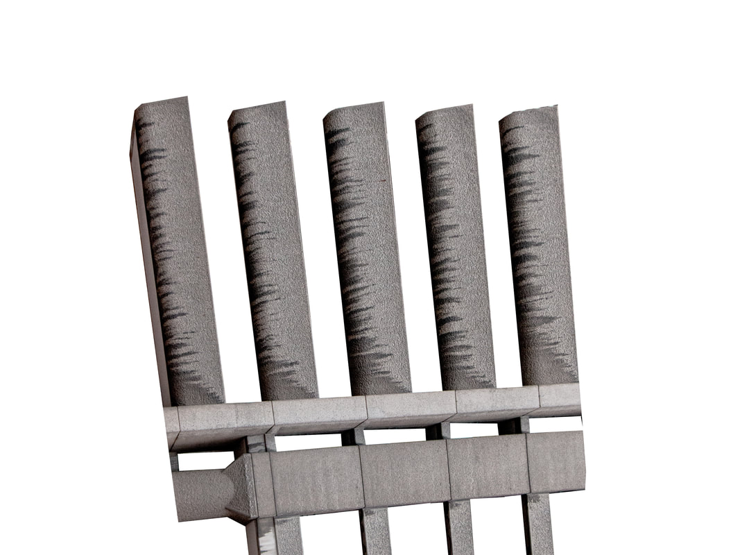
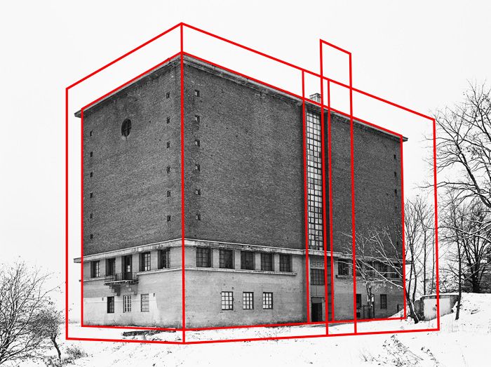
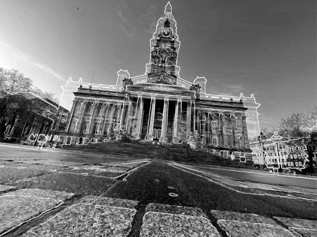
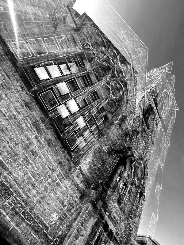
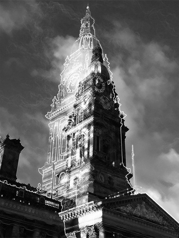
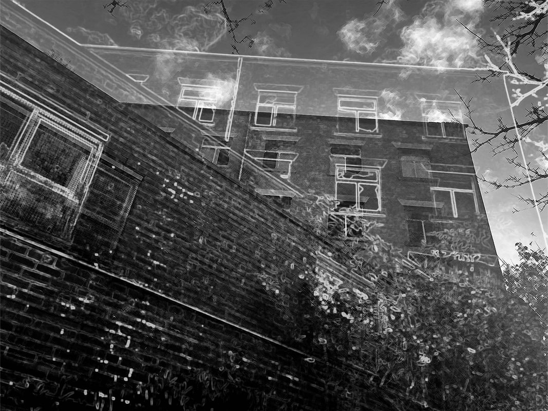
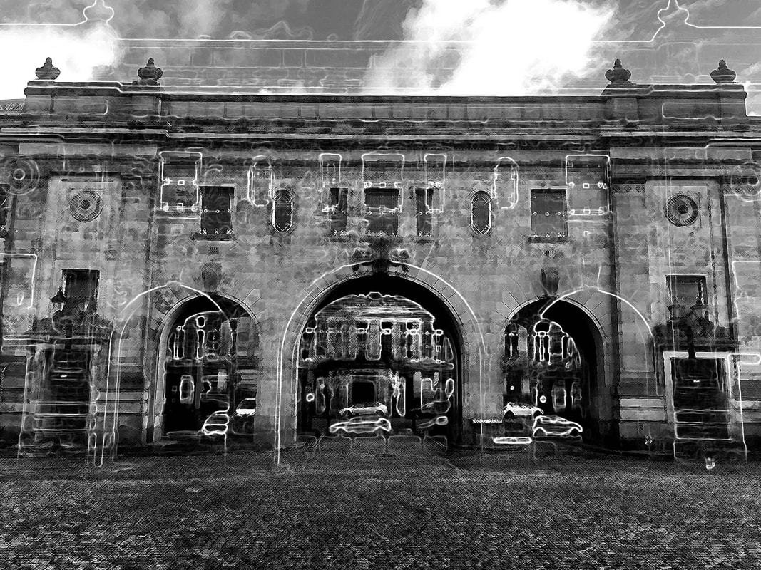
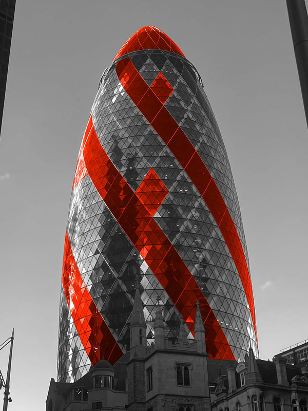
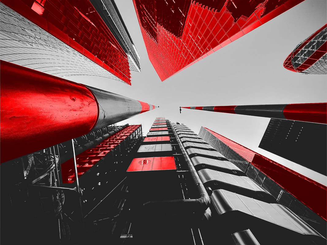
[D3] Outlines - Alexey Bogolepov
(b.1985) Alexey Bogolepov is an artist currently living and working in Saint Petersburg, Russia. His work comprises architectural photography, sculpture, video and installation in a broad exploration of modernism both in the post-Soviet states and worldwide. He is interested in making analytic art that produces political commentary on the subjects of power structure, ideology of space, planning practices and systemic vision.
|

|

|
Artist Analysis
Bogolepov uses red to outline the structures in his photographs to illustrate their importance. Buildings that would otherwise go unnoticed, taken for granted are outlined to give them an alternate aesthetic in this architectural map or red.
Photoshoot
Final Edits
|
|
|
|
Self Feedback
WWW:
I continued with the similar themes behind Bogolepov's work however altered the look and feel of his work to a more stylised approach. I was able to produce an outline through the glowing edges effect within the filter gallery, set to a screen blend mode to cancel out the pure black. I used the filter gallery once more to texture the original photograph to give it a charcoal almost brushstroke feel adding to the depth of the images.
EBI:
For particular photographs the outline was more defined, allowing the viewer to easily see it and understand the themes behind the photographs.
Ideas for Development
For my next development, I want to build off this idea of outlining buildings instead however highlighting specific areas of structures to create a pleasing composition. To develop further I wanted to use skyscrapers to make my images vaster and visually pleaing.
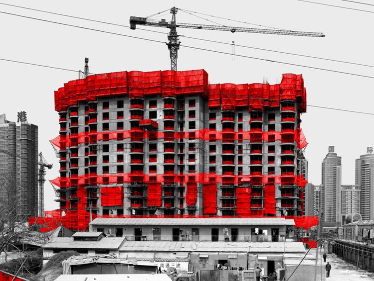
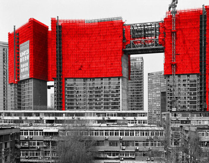
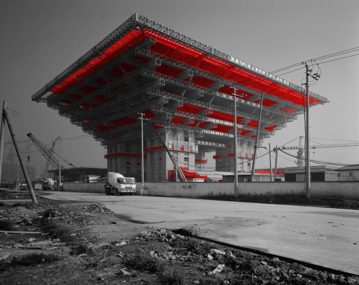
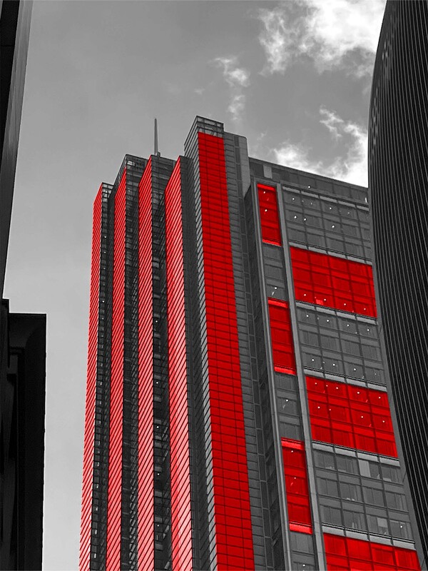
[D4] City and Reconstruction - Zhou Jun
Born in 1965 in Nanjing Province, Jun Zhou is a fine art photographer who has spent the last few years documenting important buildings in construction for his photographic series, City and Construction, an expressive response to experiencing his fast changing environment.
|
|
|
Artist Analysis
Jun uses the colour red in his photography to highlight specific parts of his images. These highlighted regions dissipate different responses in people from different countries and cultures - even having somewhat opposite effects on viewers. What makes his work so fascinating is it's ability to emote it's watches in a cultivation of different manners depending on their personal symbolic connection with the colour red.
Photoshoot
Final Edits
|
|
Self Feedback
WWW:
I highlighted areas of buildings red, using the overlay blend-mode to enhance the realism.
EBI:
My masks were more clean and positioned better. As well as this my highlighted areas had more motivation and were less randomly placed, more like Jun - who highlights only the scaffolding on the structures.
Ideas For Development
From here, I want to develop my idea of highlighting a specific area of a building to focus the viewer's attention, however so it through fragmentation possibly digitally enhancing the photographs through manipulation with different shapes such as circles.
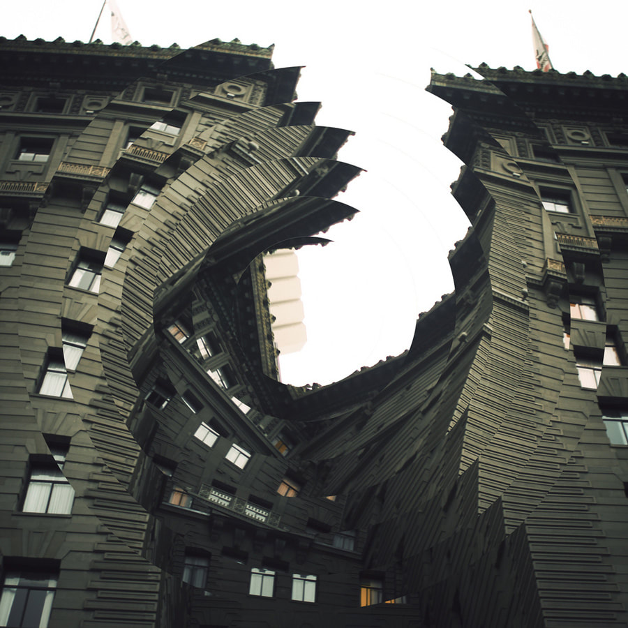
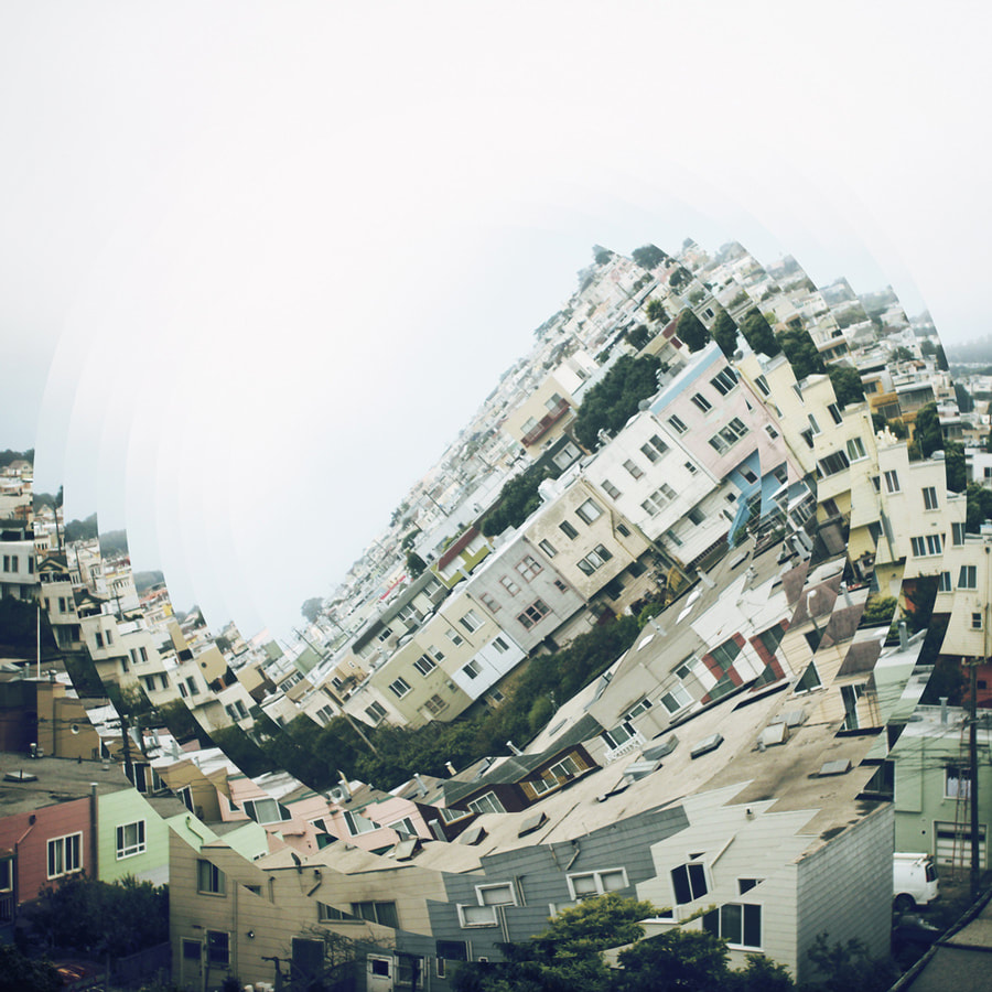
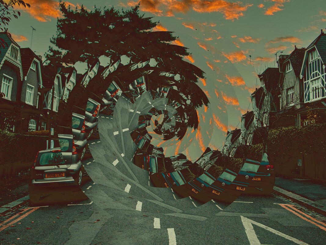
[D5] Architecture Manipulation - Nicholas Kennedy Sitton
Nicholas Kennedy Sitton is a San Francisco-based photographer who uses a technique to digitally manipulate and shape his photographs into absurd abstract scenes, bending buildings causing them to appear deformed. This effect creates a interestingly odd atmosphere dissipating a dream like almost simulation esque environment.
|
|

|
Artist Analysis
The idea of twisting and manipulating buildings as if collapsing in on themselves creates this warped perspective effect channelling the viewer's focus into the centre of the frame. The abstract orientation of elements within the frame position the viewer's attention on specific structures creating theoretical lines; guiding the viewer's eyes.
First Response
Photoshoot
Final Edits

|

|
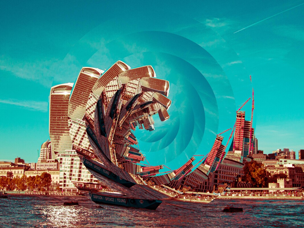
WWW:
I fragmented the photographs in spirals descaling the image each time to create this gradual gradient of size - almost like a wave.
EBI:
I didn't displace the circles rotation as much in order to keep the realism of the manipulation; do more circles with less rotation each time. I was also able to add more circles in order to reduce the rotation movement between each duplication therefore making the distortion look more natural and fit better with Sitton's style.
Ideas For Development
For my final development, I want to create a practical piece. I want to cultivate a number of photographs I have already taken continuing with this idea of spherical fragmentation and developing them into a tangible three dimentional model.
[D6] Spiralling City (Final Piece)
Following from this original idea of wanting to make a physical model, I concocted this interactive piece of photography continuing with the dominant theme throughout this development project; viewing buildings from unique and unusual perspectives. The piece allows for viewers to physically alter the positions of the spherical cutouts themselves to create their subjectively pleasing model allowing for an infinite number of different positional setups highlighting the difference between viewers, allowing them to involve themselves in the work.
To create the model, I took one of my photographs from my previous development and started by alerting the colour hue values to change the look and feel of the photograph. I then printed both the original and edited photograph, sticking them back to back. I then cut the images into equal sized circles threading a thin wire between the centre to create these moveable spherical cutouts. The model represents my precious work in this three dimensional form concocting this interesting contrast between the two images.
To create the model, I took one of my photographs from my previous development and started by alerting the colour hue values to change the look and feel of the photograph. I then printed both the original and edited photograph, sticking them back to back. I then cut the images into equal sized circles threading a thin wire between the centre to create these moveable spherical cutouts. The model represents my precious work in this three dimensional form concocting this interesting contrast between the two images.


|

|

|


|

|
WWW:
EBI:
- Circles pass through each other allowing them to be span and view the other side with a different colouration.
EBI:
- Circles were cut better - sharper more rounded edges as well as if circles could be repositioned easier
- Model was made from wood
- Model was motorised so circles span automatically without physical interaction
