Looking Up - Andy Yeung
Andy Yeung is a keen landscape, architecture, and aerial photographer from the urban jungle of Hong Kong. Being brought up in a city he learned to cull inspiration and creativity from his familiar environment.
He first started photographing his journey back in 2005 and since then has captured great moments transforming his city into something new and artistic gaining attention from many big brands and media platforms such as the BBC, The Guardian, and PBS Newshour. He's also cultivated a great understanding of his craft winning awards for his work from the National Geographic in addition to Sony World Photography Awards.
He first started photographing his journey back in 2005 and since then has captured great moments transforming his city into something new and artistic gaining attention from many big brands and media platforms such as the BBC, The Guardian, and PBS Newshour. He's also cultivated a great understanding of his craft winning awards for his work from the National Geographic in addition to Sony World Photography Awards.

|

|

|
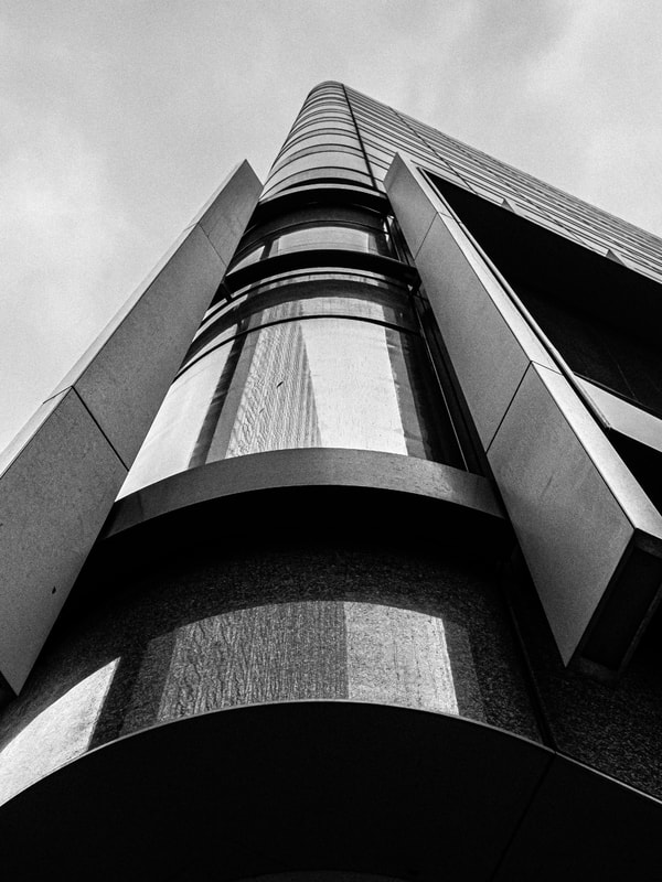
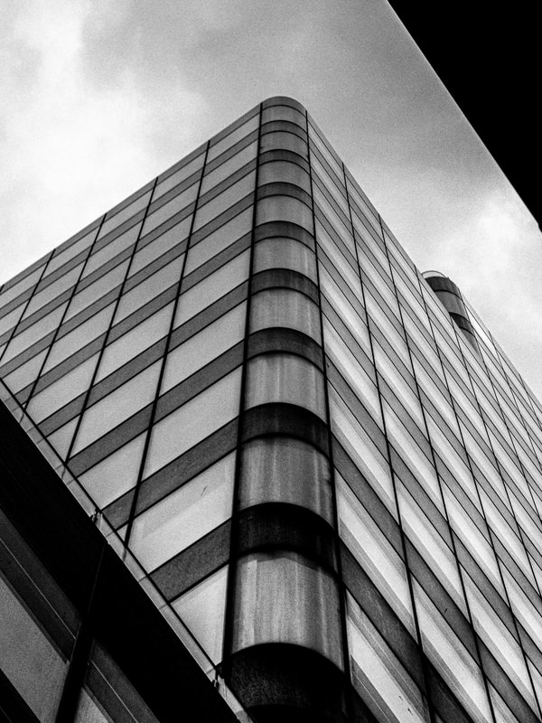
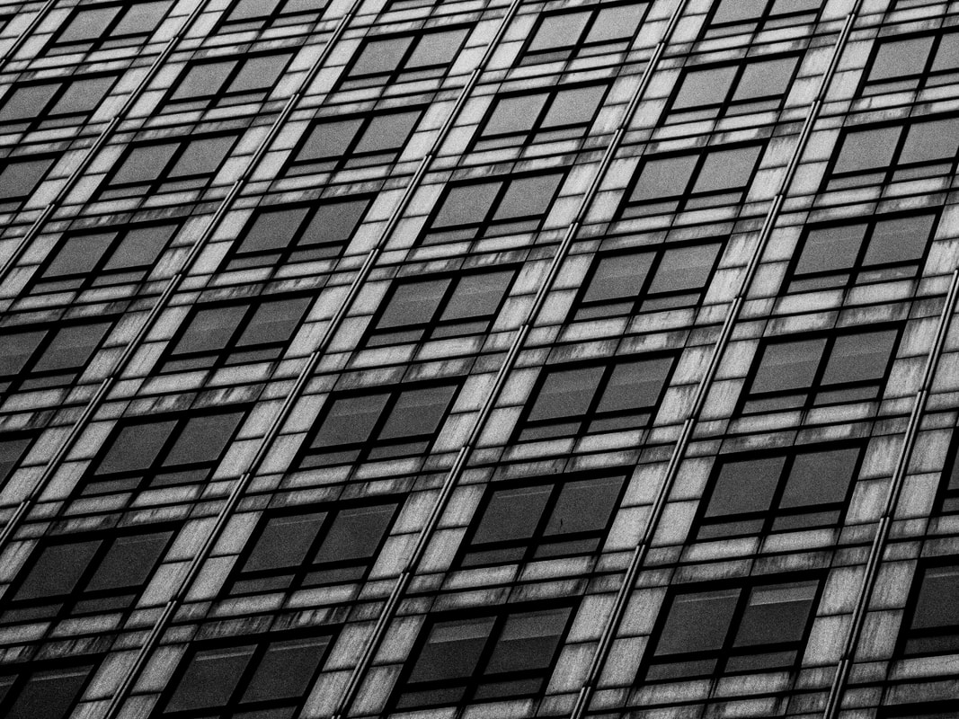
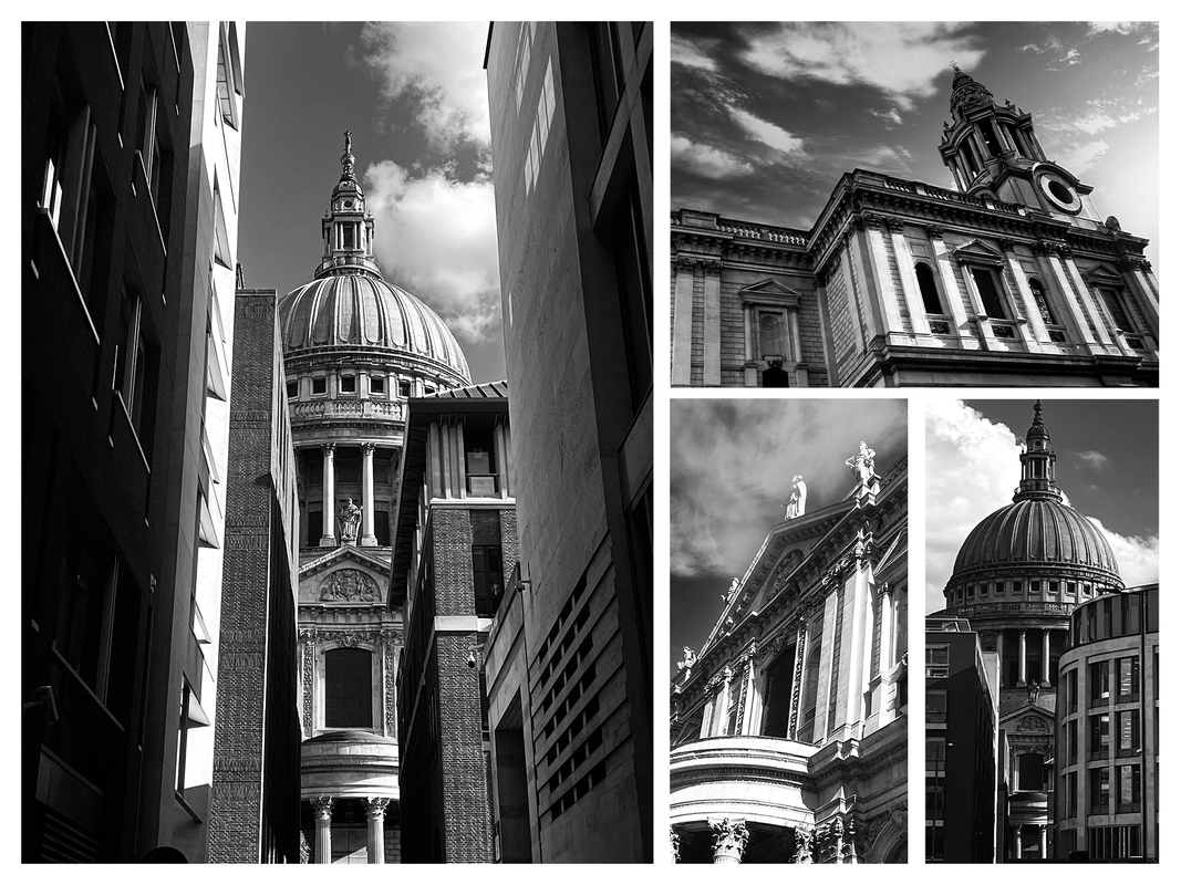
First Response
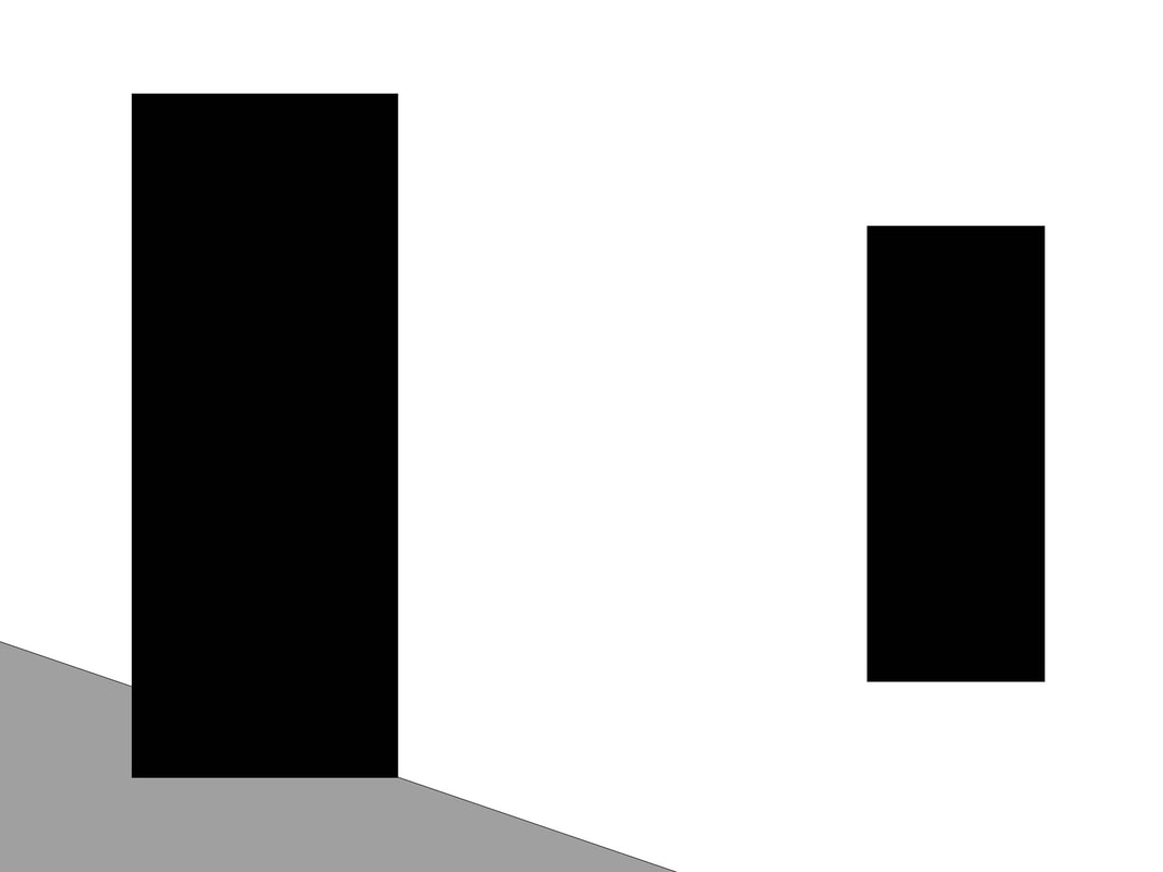
In this first response, I was tasked with creating a selection of photographs in the style of Andy Yeung and his work on photographing urban skyscrapers from a worm's perspective.
Full Shoot
I choose to photograph buildings in central London within the Canary Wharf district as many tall skyscrapers and unique looking architecture is located there.
Once I started photographing I quickly ran into a problem. Due to the bright white sky on the day of shooting many of the glass structures blended with the sky causing difficulty viewing where the building's outline ended. To resolve this issue I decreased my ISO value down to 200 as well as increasing my shutter speed value from 240 to 500. I didn't increase my aperture further as I still wanted to keep that shallow depth of field look within my images.
Once I started photographing I quickly ran into a problem. Due to the bright white sky on the day of shooting many of the glass structures blended with the sky causing difficulty viewing where the building's outline ended. To resolve this issue I decreased my ISO value down to 200 as well as increasing my shutter speed value from 240 to 500. I didn't increase my aperture further as I still wanted to keep that shallow depth of field look within my images.
Final Edits
I shot my images in a CR2 Raw format so they could easily be manipulated later in Lightroom.
The first thing I did to all my images when editing was brought down the highlights and whites significantly to gain further detail within the sky, I also decreased the exposure slightly without underexposing the buildings too much again to retain details within the images.
I decided to make this selection of photographs monotone removing the colour aspect and allowing the viewer to focus further on the positioning of the camera angles. To do this I decreased the saturation levels down to 0 as well as vibrance.
For further effect, I increased the contrast values to about 80% as well as increasing the clarity and texture values to give this grunge vibe to the images.
Finally, I added a linear gradient started from the sky down towards the bottom of the frame, I again decreased the highlights and whites values more to bring further detail into the sky.
|

|

|

|

Response Feedback (self)
WWW:
EBI:
- Unique camera angle choices
- Decreasing highlights and whites in Adobe Lightroom - regain overexposed areas
- Increasing clarity and texture in Adobe Lightroom - grunge texture
- Monotone style
EBI:
- Drab sky was replaced
- Colour was introduced
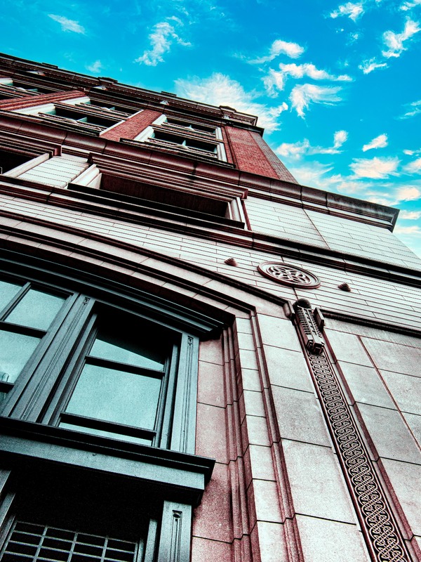
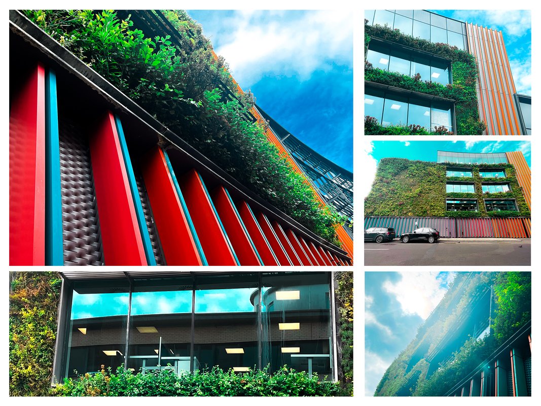
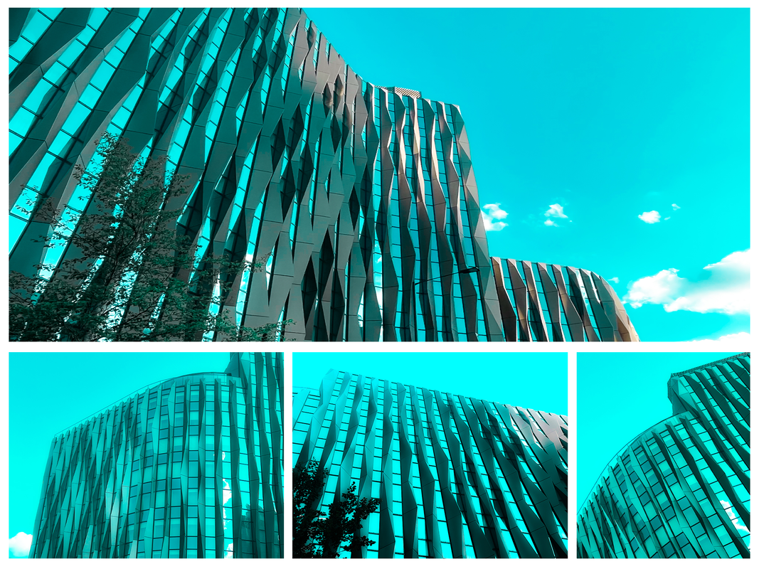
Second Response
In this second response, I want to incorporate my self-feedback from response one in addition to making my photographs more vibrant and bright.
Full Shoot
I photographed these images later on the same day, sustaining similar camera settings.
Final Edits
I again opened up the photographs CR2 Raw files in Adobe Lightroom, however, this time around I focused on making sure the building itself was exposed correctly by altering the exposure, highlights, and whites values not bothering too much about the sky as I was going to replace this later. I again used a linear gradient to bring down the exposure in the upper parts of the buildings as they were still blending with the sky.
Whilst in Lightroom, I moved across to the colour panel and changed the hues, saturations, and luminance values for each colour that appeared within the image. Once this was to my liking I increased the sharpness value to about 125 to give the appearance that the image was higher quality and sharper focused than in reality.
I then exported the image from Lightroom over into Photoshop where I proceeded to mask out any unwanted objects from the frame such as the edges of intruding buildings.
I then used the sky replacement tool to remove the current grey sky and replaced it with a more vibrant intriguing one. I altered the brightness and warmth values of the sky to match the individual images further. I then used other adjustments such as curves, gradients, gradient maps, photo filters, and hue and saturation layers with a variety of different blend modes and fill values to match the colour of the building to the sky.
At this point I then added any additional elements such as lens flares before playing with the overall hue, saturation, and contrast values of the entire document until I achieved a pleasing Image.

|

|


|

|

Response Feedback (self)
WWW:
EBI:
- Images were vibrantly coloured
- Sky replacements
- Use of adjustments such as gradient maps, photo filters, hue and saturation, curves, gradients
- Use of blend modes such as color, soft light, overlay, multiply
- Unique camera angles
- Decreasing exposure, highlights, and whites values
- Masking out unwanted objects
- Additional elements such as lens flares
EBI:
- Compositions were more symetrical
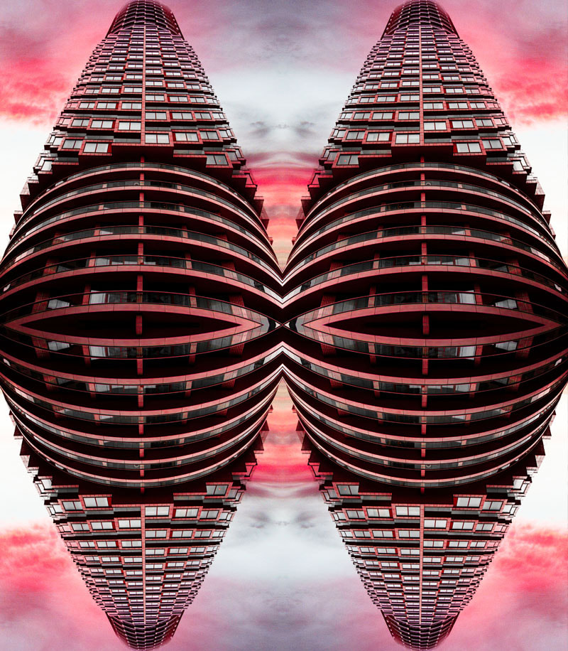
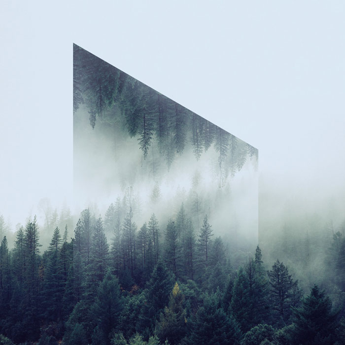
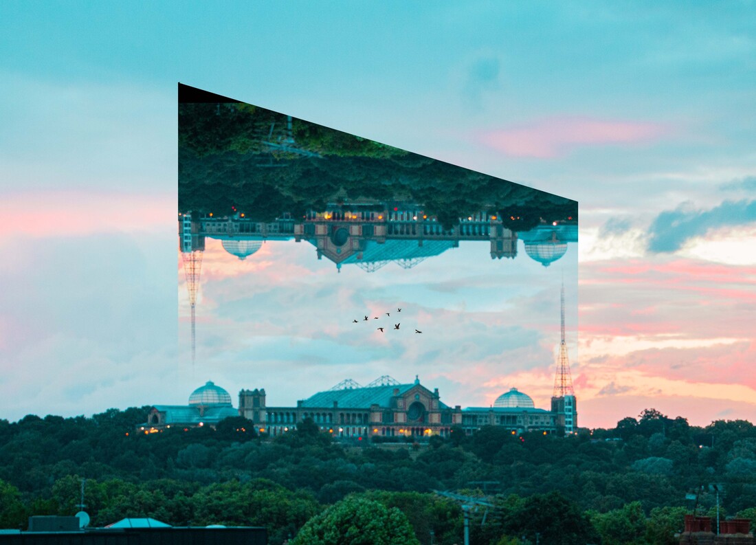
Reflection Effect
Andy Yeung creates his symmetrical reflected photographs in camera, I was tasked with trying to recreate this effect within Adobe Photoshop. This is how I achieved this look.

|
|
GIF

Response Feedback (self)
WWW:
EBI:
- Images reflected nicely
- Interesting shapes created
- GIF reverses
EBI:
- Photographs were more symmetrical
- More buildings within each frame
Composition
Rule of Thirds

|
|
Layers
|
|
Balancing
|
|
Triangle
|

|
Framing the Environment - John Divola
John Divola (American, b.1949) is a photographer who influenced changes to the Contemporary style of art. Divola was born and raised in the Los Angeles area, and graduated with a BA from California State University in 1971. He studied at the University of California and completed an MFA degree in 1974.

|

|

|
First Response
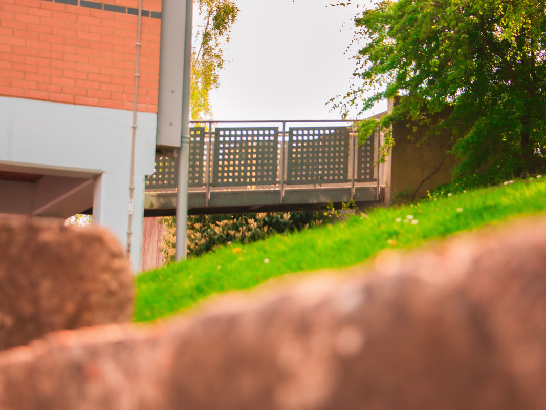
In this first response, I was briefed with creating a selection of pairs of photographs that show a landscape or object from a wide angle and then from a close up. This was to show how many minor details there are within a frame that we don't regularly notice within the bigger picture, elements that make an image that are not noticed individually. We were tasked with framing these close up images within a frame to highlight further the compositional choices made.
Full Shoot
Final Edits


|


|
Response Feedback (self)
WWW:
EBI:
- Frame highlights specific part of frame
EBI:
- Frame was more visible within the frame
- Composition was more interesting
- Framed parts of frame have more meaning
Second Response
In this second response, I decided to scrap using a frame and develop my work further honing in on key details. I didn't like the look of the frame within my first response that's why I decided to no longer use it, although I liked the idea that is showed compositional values clearer and followed in the style of John Divola's work.
Through this development I was able to focus further on the process of imaging a landscape/object at a number of focal lengths.
Through this development I was able to focus further on the process of imaging a landscape/object at a number of focal lengths.
|

|
|

|

|
Response Feedback (self)
WWW:
EBI:
- Shallow depth of field
- Deep colour contrast
- Anchor point of zoom remains the same
- Shadow gradient draws attention to focus of image
EBI:
- developed and merged into a single image
Third Response
In this third response, I wanted to develop my final photographs further by presenting my wide angled photograph and my close up photograph within the same frame. This allows the viewer to see both images at the same time and attempt to spot the smaller detail that is zoomed in on in the wider shot.

|
|

Response Feedback (self)
WWW:
EBI:
- colour overlay layer on blend mode overlay blended images further
- colour stripe joins photographs well
- both photographs are visible in the same frame
EBI:
- More images were blended within the same frame
- Larger range of focal lengths used
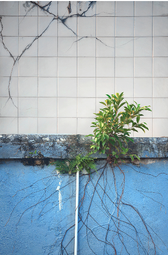
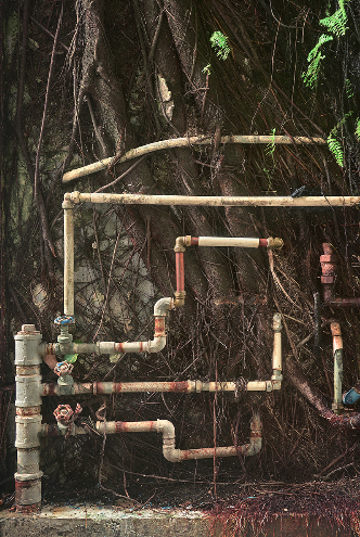
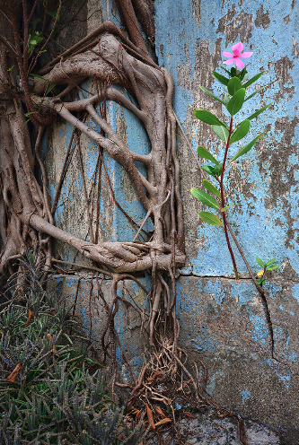
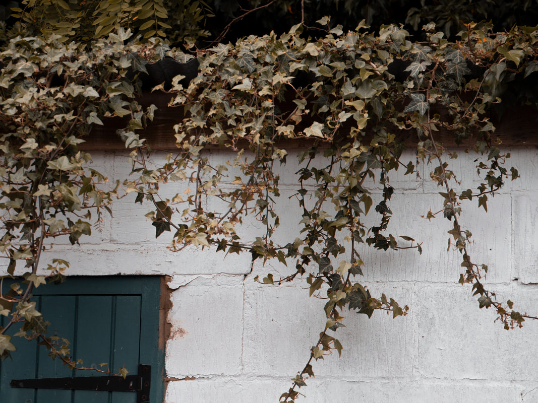
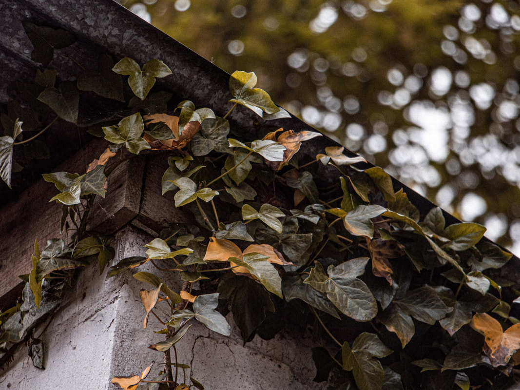
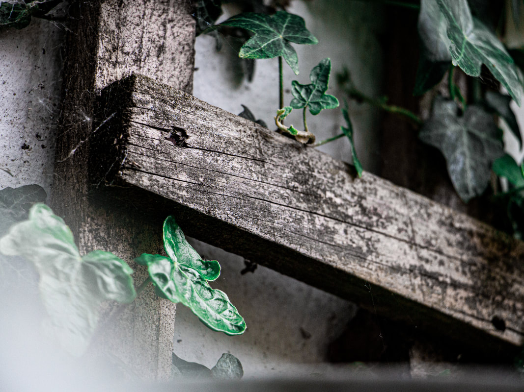
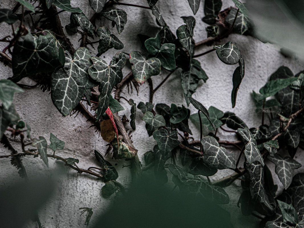
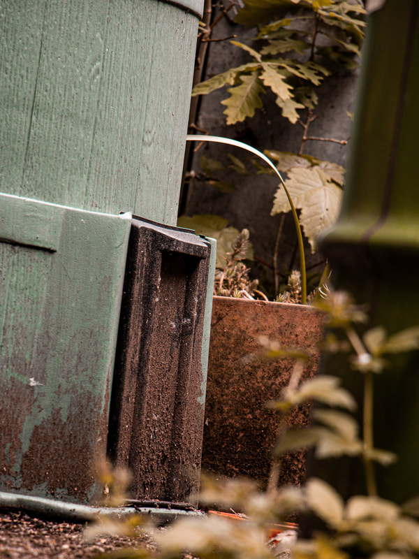
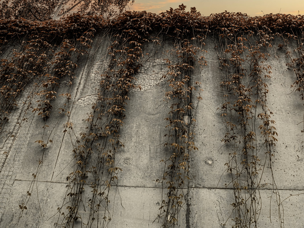
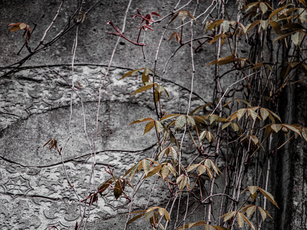
Wild Concrete - Romain Jacquet-Lagreze
Romain Jacquet-Lagreze is a French photographer based in Hong Kong where he moved in 2009. Since 2010 he has been pointing his camera on his new home to document the different aspects of this city. Four of his photographic series were published as photo books by Asia One Publishing: Vertical Horizon (2012), Wild Concrete (2014), The Blue Moment (2016) and Concrete Stories (2018). His photographic work is represented by Blue Lotus Gallery, 28 Pound Lane, Sheung Wan where he has been exhibiting all his series.
|
|
|
First Response
In this first response, I plan to create a selection of photographs inspired by the works of Romain and his series on 'Wild Concrete'
Upon viewing of his photographs for the very first time, I was entertained by the idea of having a man made structure overgrown with natural elements as both juxtapose each other in the common world. The actions and developments of of structures and technology is also a prime factor in the reasoning behind why the natural environment is dying. Thats why I was intrigued about photographing both of these components in the same image as the man made parts are metaphorically the reason why the nature is so shrivelled and broken.
Upon viewing of his photographs for the very first time, I was entertained by the idea of having a man made structure overgrown with natural elements as both juxtapose each other in the common world. The actions and developments of of structures and technology is also a prime factor in the reasoning behind why the natural environment is dying. Thats why I was intrigued about photographing both of these components in the same image as the man made parts are metaphorically the reason why the nature is so shrivelled and broken.
Full Shoot
When shooting I made sure to photograph from a range of interesting angles to create compositional lines and shapes within my images. As always, I made sure to photograph in RAW to gain my images in a CR2 format for enhanced manipulation when editing. I photographed from a range of focal lengths to gain different depths of field for a larger range of different photographs to choose from when editing. I tried my best to balance out the natural elements and the man made components within each image to gain a further sense if equality to highlight this idea of a fight between both.


Final Edits
When editing in Adobe Lightroom, it was my primary goal to enhance the dominant contrast of the environment against the manufactured structures. I achieved this effect by decreasing the saturation levels of individual hues that appeared in the synthetic environment while increasing the saturation and luminance values of the bright colours apparent in nature to further convey this contrast.
For other specific photographs, I exported the images into Adobe Photoshop and composited different elements into the background to increase the depth of the image. I also masked around particular natural components with the pen tool, duplicated, flipped, and. repositioned them to give a sense there were more natural elements than in reality. I also composited particular glows and flames into certain photographs to further highlight how artificial manufactured structures and objects are burning (killing) the environment slowly through issues such as climate change and global warming.
For other specific photographs, I exported the images into Adobe Photoshop and composited different elements into the background to increase the depth of the image. I also masked around particular natural components with the pen tool, duplicated, flipped, and. repositioned them to give a sense there were more natural elements than in reality. I also composited particular glows and flames into certain photographs to further highlight how artificial manufactured structures and objects are burning (killing) the environment slowly through issues such as climate change and global warming.
|
|
|
|
Response Feedback (self)
WWW:
EBI:
- Colour contrast between natural and synthetic environment
- Balancing of natural and synthetic elements within photographs
- Foreground elements add to the visual aesthetic of the photographs
- Composited backgrounds and components
- Increased saturation and luminance of nature
- Decreased saturation of synthetic environment
EBI:
- Further variation of angles - wider shots
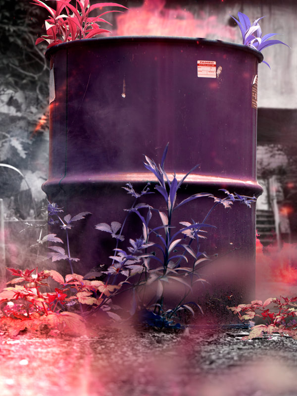
Second Response
Full Shoot
I then continued photographing with similar camera settings at a different location, attempting to find more unique angles and further intriguing compositions.
Final Edits
This time around, as well as highlighting the difference between the synthetic and natural environment I wanted to make my images feel more epic and extreme.
Once I had colour corrected in Lightroom, I then brought my images across to photoshop. To stylise them further I used the sky replacement tool to add a heavy sunset into the background giving the frame more depth. I then added a gradient map adjustment layer on a soft light blend mode to achieve a desaturated red or orange tone within the image.
Once I had colour corrected in Lightroom, I then brought my images across to photoshop. To stylise them further I used the sky replacement tool to add a heavy sunset into the background giving the frame more depth. I then added a gradient map adjustment layer on a soft light blend mode to achieve a desaturated red or orange tone within the image.
|
|

Response Feedback (self)
WWW:
EBI:
- Unique low angles
- Sky replacement - added scale & depth
- Gradient maps - altered colouring
EBI:
-
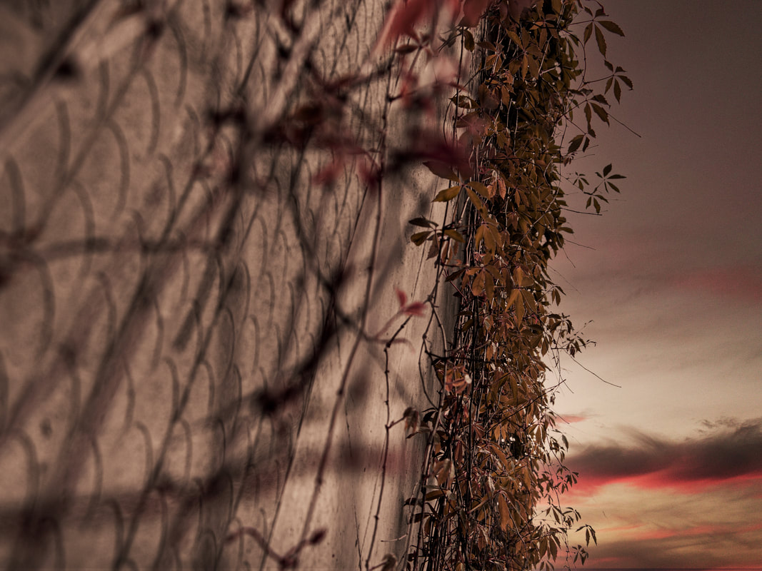
Third Response
In this third response I wanted to develop the concept further by combining it with the theory behind John Divola's work and the act of zooming in on a smaller part of an image to highlight it's relevance.
Full Shoot
I remained with similar camera settings, however I lowered my aperture slightly to gain a shallower depth of field highlighting the focal point of my image further.
Final Edits

|

|
Response Feedback (self)
WWW:
EBI:
- Photographs zoomed correctly
- Increased texture and clarity values
- Increased luminance values contrasted the de-saturated image
EBI:
- Camera angle remained static in the second image - sustained anchor point
INDUSTRIAL SUBLIME
- MAURICE BROOMFIELD -
GALLERY VISIT
ABOUT THE EXHIBITION
The exhibition showcased the extraordinary works of revolutionary photographer Maurice Broomfield (1916-2010) who snapshotted the rapidly changing face of industry in the 1950s and ‘60s.
His images consisted of proud men and women at work in factories across the UK creating dramatic, romantic, sublime and an almost surreal outlook on the qualities of industry. Broomfield’s approach was to generate this dramatic contrasting light between the whites and the blacks in the image highlighting the extraordinary nature of the subject matter.
He intended to show the importance of workers in factories and elsewhere in the industry and that they cannot be replaced.
HOW WAS THE WORK CURATED?
There was a simple arrangement of the photographs, most in large frames that highlighted the monochrome images. As the photographs were organised according to when they were taken, the viewer could see how the industry progressed over the life of the photographer, making it easy to follow and understand what to look for next. As a result, every image and caption disseminated snippets of history implementing an additional interest to the viewer.
PERSONAL FAVOURITE WORKS
|
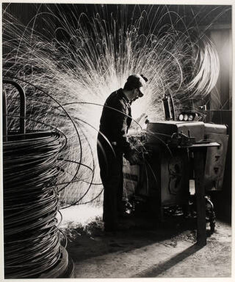
WIRE MANUFACTURERYEAR: 1964
I really enjoyed the hyper fast shutter speed used and how the sparks almost make the subject look super human. Potentially representing the importance of workers in the industry at that time.
|
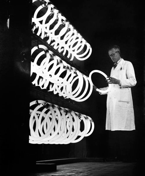
WIRE MANUFACTURERYEAR: 1964
I was intrigued by this photograph as a man tests the fluorescent lightbulb for one of the first times.
The high contrast within the frame the black vs white generates this visually pleasing image that catches eyes. |
|
|
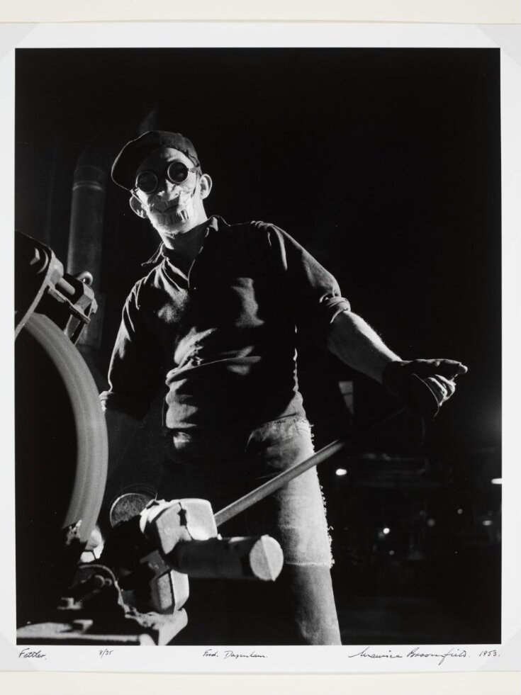
WIRE MANUFACTURERYEAR: 1964
The somewhat dramatic menacing look of the subject interested me. The deep contrast in lighting created a mysterious atmosphere as the subject is also masked and unknown.
This highlights that workers usually go unknown and uncredited for the work they do suggesting Maurice's criticism on those who look down on the working class as lesser. |
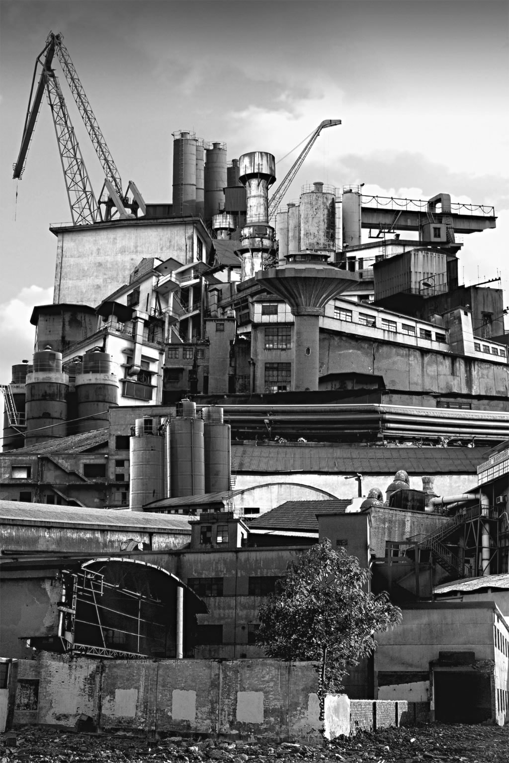
Fragments of a City - Sun Ji
Sun Ji, a Shanghai-born artist whose photo collages suggest a nuanced view of the city’s past and present. A curator says the 29-year-old artist’s two-part “Memory City” series is “part cubist collage and part hyperreal landscape.” In one work from his “Memory City I” series, Sun juxtaposes black-and-white photographs of factories, smokestacks, and industrial errata.
Glimpsed from across an art gallery, the kitchen-window-sized collage resembles a real photograph. But move closer, and the skewed lines of perspective and improbably dense arrangement of buildings reveal a whimsical critique of China’s late-twentieth-century economic “miracle.”
Glimpsed from across an art gallery, the kitchen-window-sized collage resembles a real photograph. But move closer, and the skewed lines of perspective and improbably dense arrangement of buildings reveal a whimsical critique of China’s late-twentieth-century economic “miracle.”
|

|

|
First Response
In this response, I was assigned with creating a layered landscape image in the style of Sun Ji.
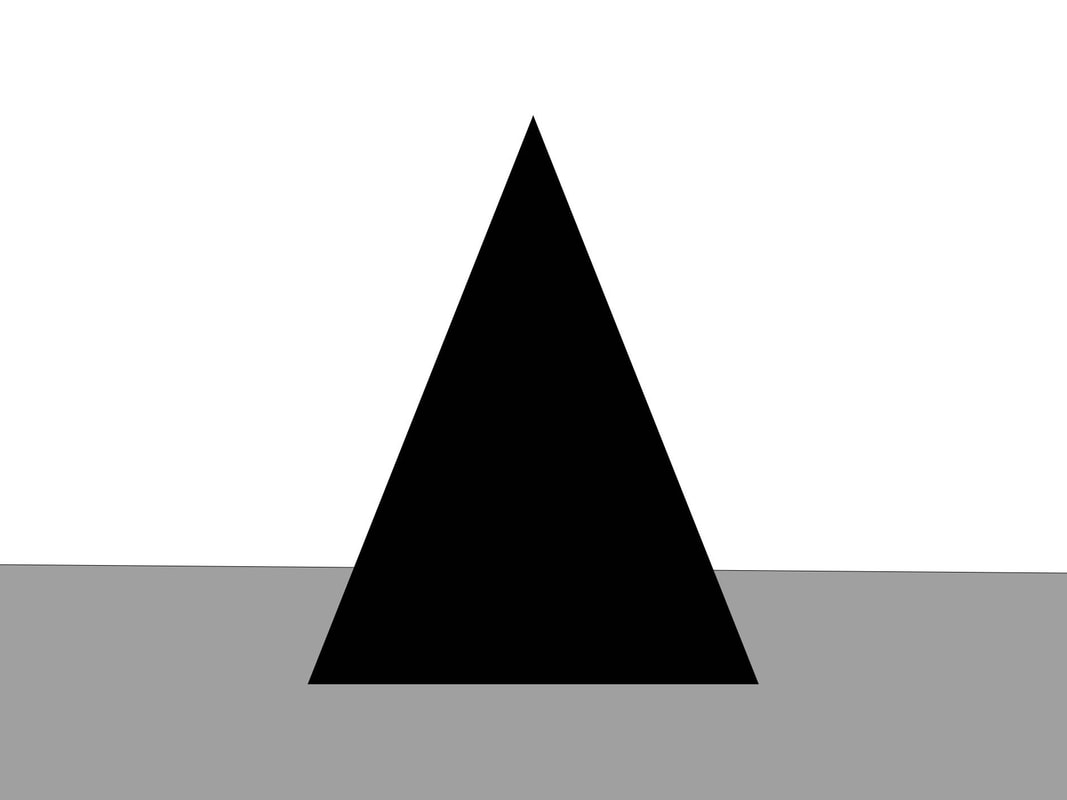
I instantly drew a liking to Ji's work after being perplexed by the sheer amount of components within her images. This chaos of buildings adds to the industrial atmosphere of the art and helps convey the densely packed environment. Throughout most of her images the idea of a pyramid shape is dominant as the structures all build towards a middle point, creating compositional lines for the viewer to be guided by. The monotone colouring also enhances the gritty grungy vibe of the pieces and expresses the style further.
I instantly drew a liking to Ji's work after being perplexed by the sheer amount of components within her images. This chaos of buildings adds to the industrial atmosphere of the art and helps convey the densely packed environment. Throughout most of her images the idea of a pyramid shape is dominant as the structures all build towards a middle point, creating compositional lines for the viewer to be guided by. The monotone colouring also enhances the gritty grungy vibe of the pieces and expresses the style further.
Final Edits
After finding the images online that I wanted to arrange in my layered landscape, I filtered through and selected my favourites. I then opened these images in a default size photoshop canvas.
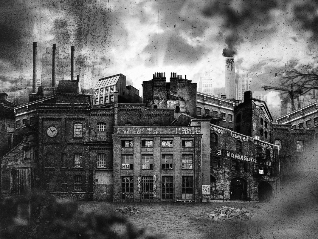
Buildings & Environment
As this was an editorial task, there was a large amount of compositing involved. I first added a hue and saturation adjustment layer above all my building layers and reduced the saturation value to zero to make the images monotone. Next I resized, repositioned, rotated, and re ordered my layers to create a bass wireframe of where i wanted my components to be placed. After that, I added individual curves adjustment layers as clipping masks over specific building layers to correct the exposure and colour values to match the buildings with each-other better. I then altered and lowered the opacity of some of the far background elements to create a sense of scale and depth. Next, I composited in my sky and further adjusted the curves layers clipped to the buildings to make them fit with the environment better. Finally I added drop shadows at different intensities and angles on a multiply blend mode to enhance the depth and order of building to create a fuller chaotic image.
Foreground Elements
For the foreground components, I added a textured dirt floor and changed its perspective with the warp tool to act as if it was being viewed from straight on. Next I added rubble and foliage around the edges of the frame with a gaussian blur adjustment to again enhance the depth within the image.
Overlays & Textures
For the final touches, I composited over a range of grain, dust, scratches overlays to enhance the dirty, industrial, grunge feel to the image in addition to giving it an aged and used look.
Second Response
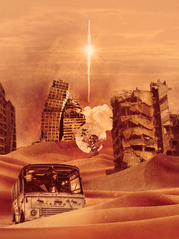
In this second response, I was tasked with creating another layered landscape in the style of Sun Ji.
Final Edits
|
|
Response Feedback (self)
WWW:
EBI:
- Image contained many layers - increasing depth
- Overlapping sand created depth and increased realism
- Orange tone gradient map stylised the image further
- Grunge overlay set to a soft light blend mode added texture
EBI:
- More buildings were added
- Further foreground elements were integrated to increase layers
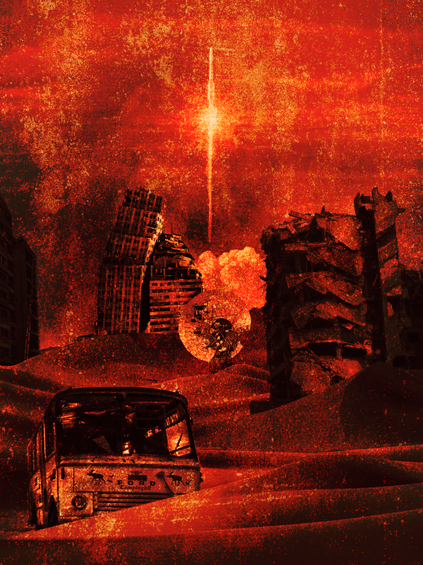
Third Response

|

|

|

|

|

|
Response Feedback (self)
WWW:
EBI:
- Pop-up element added a unique quality to the collage
- Ripped texture around edges highlighted the grungy urban theme
- Abstract positioning of buildings
EBI:
- More collage elements were added
- Buildings were arranged more symmetrically
Forms of Architecture
First Response
In this set task, I was briefed on capturing different aspects of architecture. I was informed to take a selection of photographs that highlight the diversity and differences between specific buildings through their colours, unique design and age.
Full Shoot
I decided to shoot in Central London as it provided a range of different architectural styles all mixed together.
Final Edits
I decided to organise my final edits into grids representing the different structures to allow the viewer to see the building from a number of different angles.
Response Feedback (self)
WWW:
- Different angles highlighted the buildings detail
- Grid format allows for multiple perspectives to be viewed
- Less distracting reflections in glass windows
- Perspective of building - buildings were less warped
REFLECTIONS
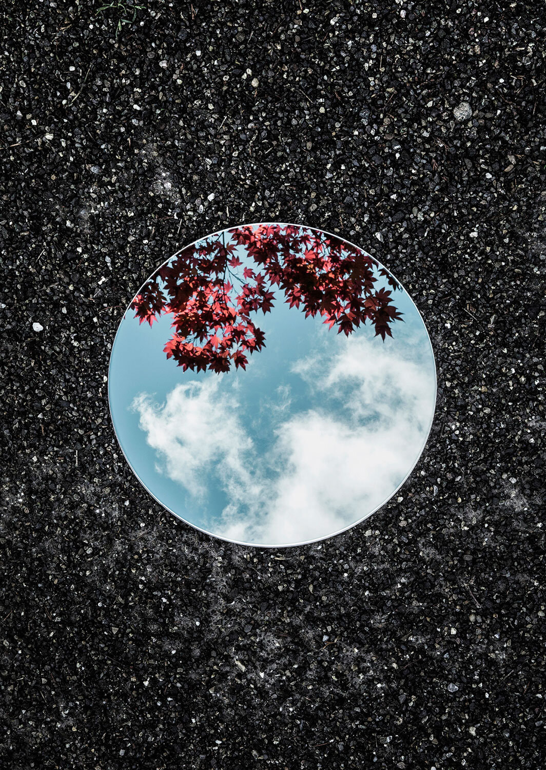
DEVELOPMENT PROJECT
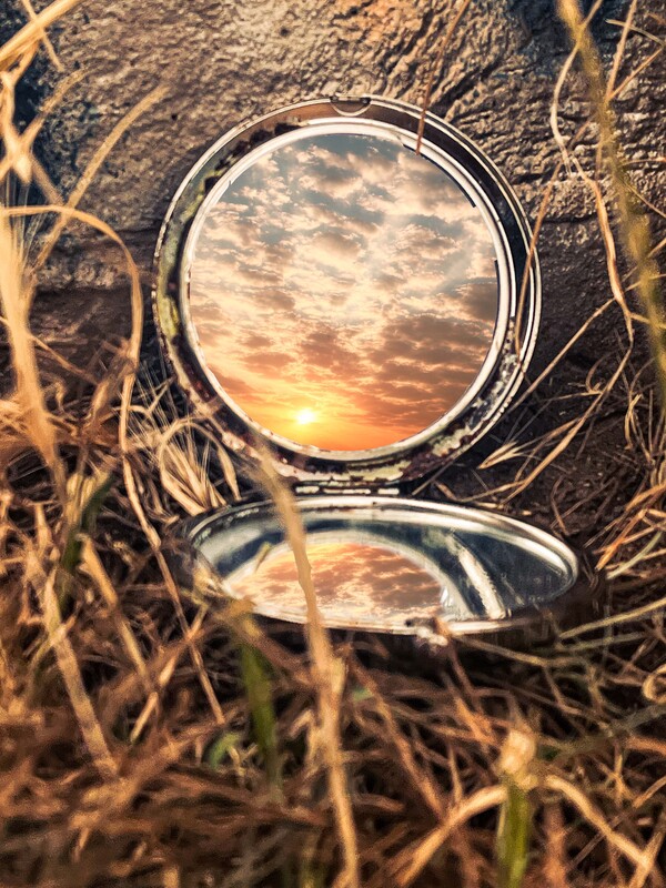
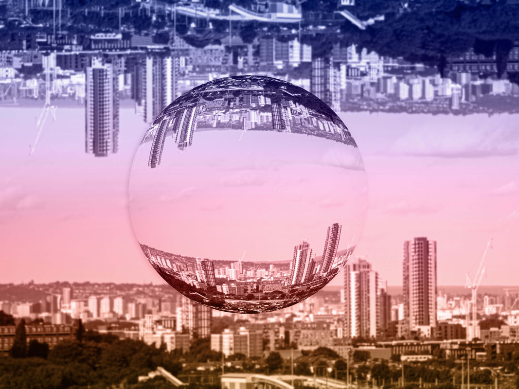
Over the course of this project, I want to create a selection of photographs that clearly highlight the themes and messages behind reflection images and the feelings they emote and express to the viewer through their deeper denotations. I want to learn and develop my ideas as well as become inspired and respond to talented photographers in this particular field of photography.
First Development
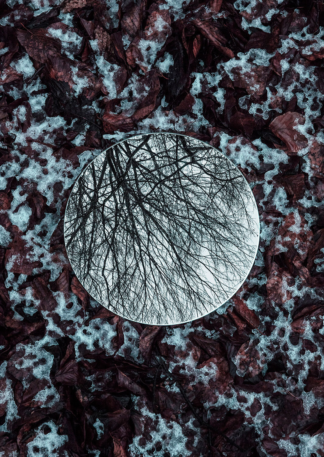
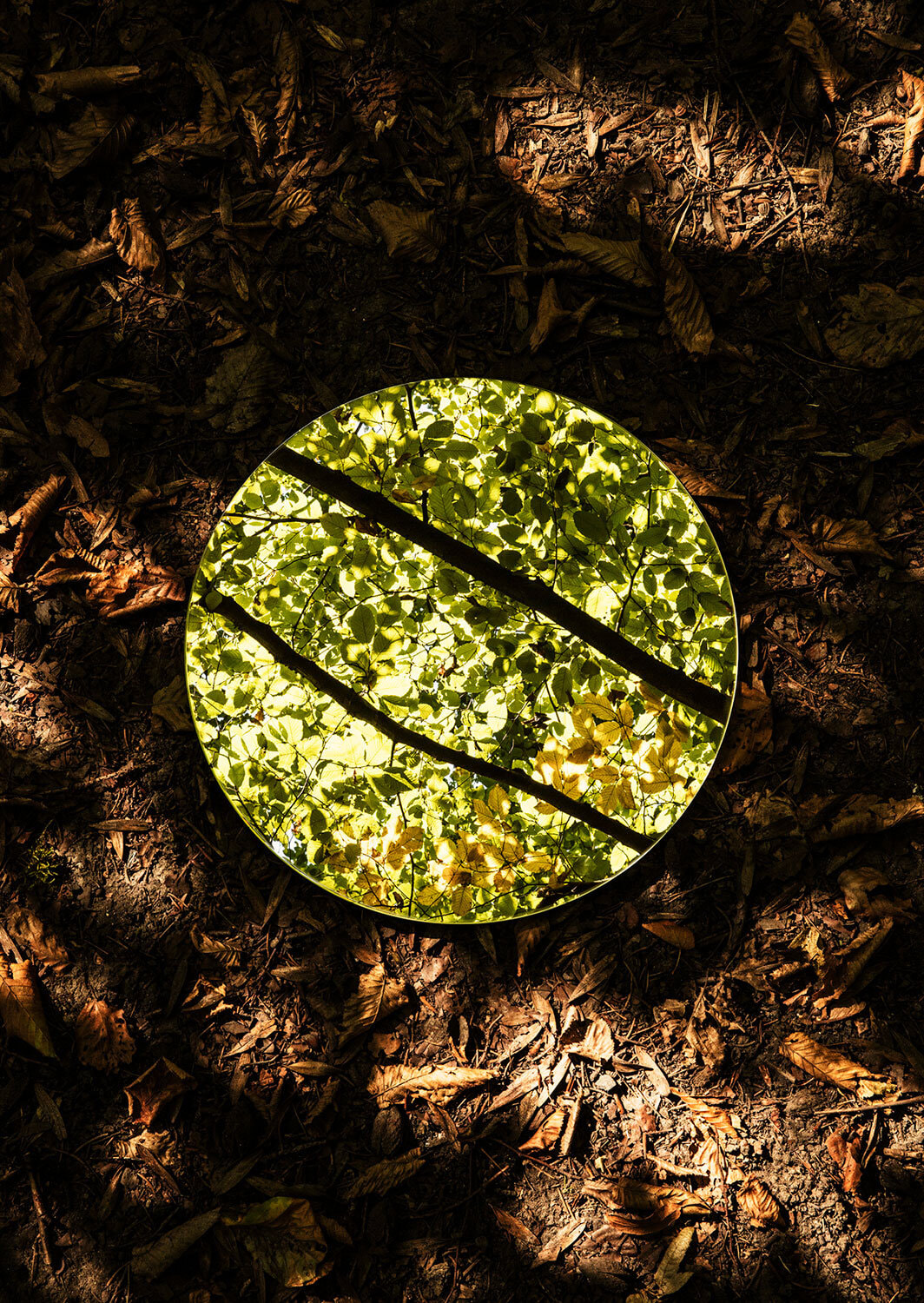
Sebastian Magnani - Photographer
Photographer Sebastian Magnani carefully positions round mirrors in outdoor settings to capture two landscapes at once: the ground below and the sky above. In the ongoing series Reflections, some compositions reflect connected imagery, like blossom-covered grass and a flowering tree
|
|
|
The photography of Sebastian Magnani and his compelling reflection images piqued my interest in this first development. With his photographs, I was intrigued by the concept that I could point the camera one way and see another world of colours and textures in the other.
The darker floor contrasts perfectly with the brightly reflected nature, creating an abstract effect that complement each other perfectly. As it allows for flexibility as well as creativity, I believe this is a great starting point from which to develop my ideas.
The darker floor contrasts perfectly with the brightly reflected nature, creating an abstract effect that complement each other perfectly. As it allows for flexibility as well as creativity, I believe this is a great starting point from which to develop my ideas.
Full Shoot
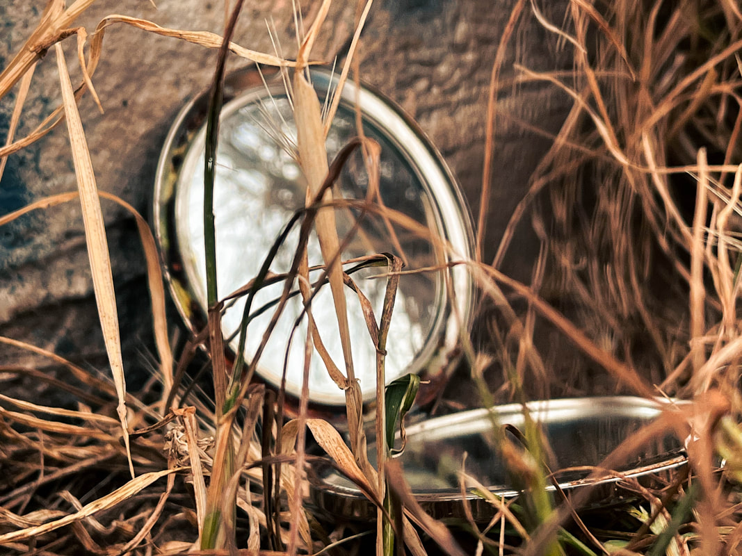
Keeping the main concept of seeing a world behind the camera that would not usually be viewed, I experimented with different camera angles, mirror types, and shapes to create different genres of reflections.
I experimented with different foreground elements to increase the layers in my photographs, for example, foliage. I wanted to make the mirror apart of the image rather than just a reflection tool to add to the atmosphere and style of the images.
When shooting I ran into a few issues. In particular, I found that focusing on the reflection in the mirror as well as the background simultaneously was very tricky. To counteract this problem I increased my aperture to an f-stop of 22 and therefore had to increase my ISO and reduce my shutter speed values to properly expose my Image, however by doing so I removed the shallow depth of field effect I was enjoying within my images. After analysis, I decided to continue photographing however just focusing on the reflection in the mirror as that was my primary centre of attention.


Final Edits
Once I had taken my photographs, It was time for the editing process.
I started by colour correcting then grading my images in Adobe Lightroom CC. I used the 'basic' panel to correct my photographs exposure and contrast with help from the histogram. I then opened the 'colour balance' panel and altered the hues to my personal liking. Following this, I went to the 'colour grading' panel and for most of my images placed my shadows and highlights values in the teal tone and the midtones into the pale orange.
I started by colour correcting then grading my images in Adobe Lightroom CC. I used the 'basic' panel to correct my photographs exposure and contrast with help from the histogram. I then opened the 'colour balance' panel and altered the hues to my personal liking. Following this, I went to the 'colour grading' panel and for most of my images placed my shadows and highlights values in the teal tone and the midtones into the pale orange.
|
For some of the photographs, I wasn't happy with the bleak reflection that was viewed in camera. To get a more compelling image I brought those photos into Adobe Photoshop CC and started to composite a new reflection onto the mirror. To do this I used the magnetic lasso tool for ease of use when masking around the mirror's surface area. I then applied this mask onto a sky layer that I had previously photographed and ramped up the feathering values. To gain a more realistic reflection effect, on particular images I duplicated the sky layer and set the blend mode to overlay and then turned the opacity and fill values of both layers to about 60%. This allowed for reflections already in the image to slightly seep through allowing the reflection to fit with the original environment further.
|

|

|
|


|
|

Development Feedback (self)
WWW:
EBI:
- Theme of pointing the camera one way and viewing a different range of colours and textures in the other achieved
- Range of angles and focal lengths
- Range of mirror types
- Composited reflections fit with environment
- Mirrors feel apart of the environment, e.g. within foliage
EBI:
- Natural reflections were improved
- More overhead angles - links to artist further
Ideas For Next Development
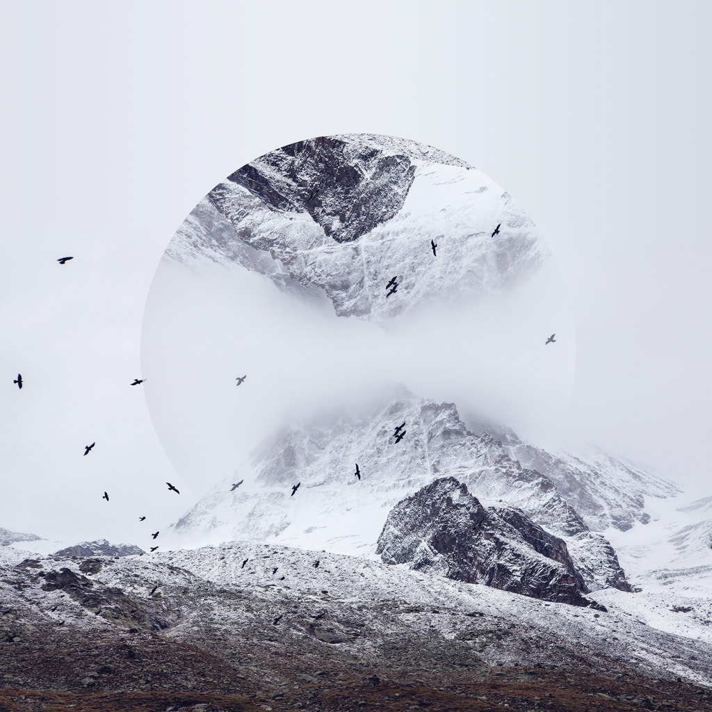
Based off the work I have produced in this development, I believe that composited digital reflections work really well within this type of photography. I want to develop my photographs but this time removing the mirror all together and solely relying on creating the reflection later in Adobe Photoshop CC.
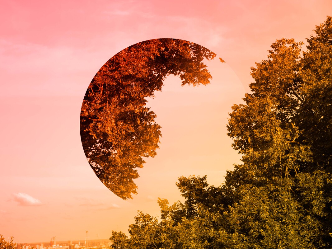
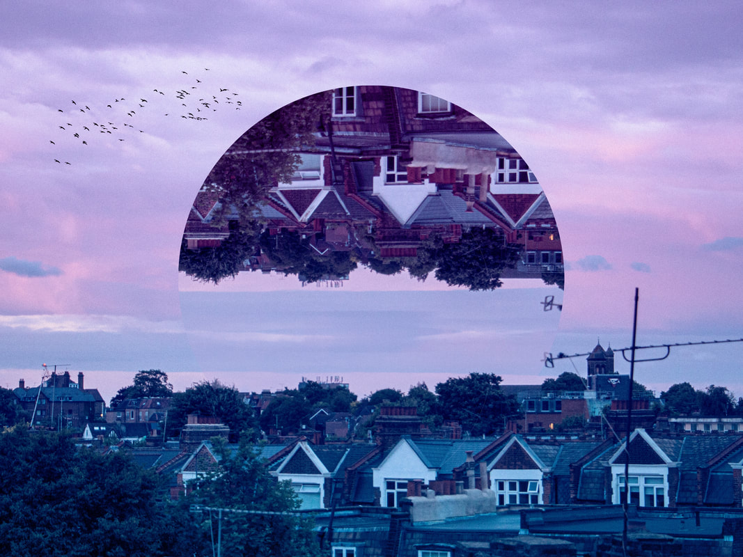
Second Development
Victoria Siemer - Photographer
Victoria Siemer (a.k.a. Witchoria) is a Brooklyn-based American graphic artist who focuses mainly on photo manipulation using Photoshop. She goes by the moniker "Witchoria" because "digital manipulation has given me the ability to create my own alternate realities where anything is possible. Sometimes it feels like magic.
|
|
|
Following my first development, I was searching for a photographer who manipulates their reflected images digitally in post. Upon first glance of Victoria Siemer's works I was instantaneously drawn towards her abstract reflections and interesting compositional shapes. Once researched, I was also captivated by the deeper connotations and messages behind her art. Siemer stated that her photos were inspired by the idea of "emotional fragmentation or 'fragmentation of the self". I believe this theme resinates with reflection photography as a whole, and is a very intriguing concept to play with, thats why I chose her work as a foundation for my second development.
Full Shoot
I tried to photograph at a range of different focal lengths allowing me to experiment later with different reflections. Most of my photographs were taken during a sunset making it difficult to expose for my foreground as well as the sky. To resolve this issue I reduced my aperture value/f-stop to to 4.5 as well as my shutter speed to 60. I also shot in RAW as I usually do to gain that extra CR2 file with a higher quality with more colour information available. It was also important when shooting to leave about 2/3 of the image as pure sky to allow a composited reflection later.


Final Edits
The first step of the editing process was to correct the basic exposure and colours of my photographs. I did this within Adobe Lightroom CC in addition to changing the saturation and luminance values of particular hues.
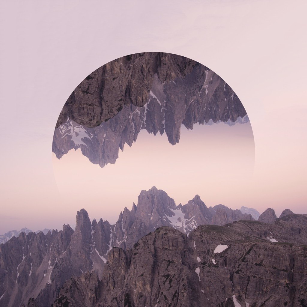
I then brought the images into Adobe Photoshop CC and began to create my reflection effect. To do this I first duplicated my background layer and flipped it vertically in the transform window. Next, I created a mask using the shape tool and then set my duplicated layer as a clipping mask (for more complex shapes I used a shape layer and then created additional masks using the polygon lasso tool, then rasterized it) Finally, In the mask selection part of my layer I drew out a monotone gradient to fade the opacity of the shape slowly to blend it further with the original landscape. For specific images I also masked around the tops of buildings on the original landscape layer to allow the reflection to drop off behind the buildings creating a sense of perspective.
For an extra touch on the images I added a gradient layer and placed it above all the other layers, I then set the blend mode to 'color' and turned down the opacity and fill values slightly to reduce the intensity. This increased the vibrancy of my images as well as created a stylistic feel to the photographs.
For my final edit, I experimented with the sphererize effect from the filter gallery. I applied the effect twice at a hundred percent intensity to give a three dimensional feel to the shape. This created an interesting reflection as it warped the clipping mask set to it.

Response Feedback (self)
WWW:
EBI:
- Variation of reflection shapes e.g. circles, triangles, quadrilaterals
- Gradient overlays complimented landscapes nicely
- Gradient opacity helped blend photographs together
- Sphererised landscape layer added an extra dimension
- Extra elements (e.g. birds) increased visual interest
EBI:
- Further variation of landscapes
Ideas For Next Development
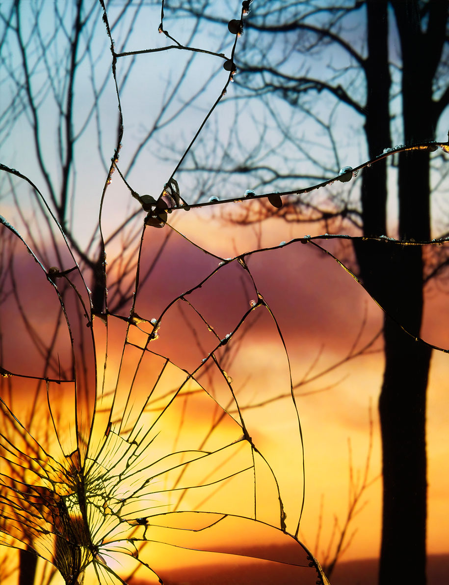
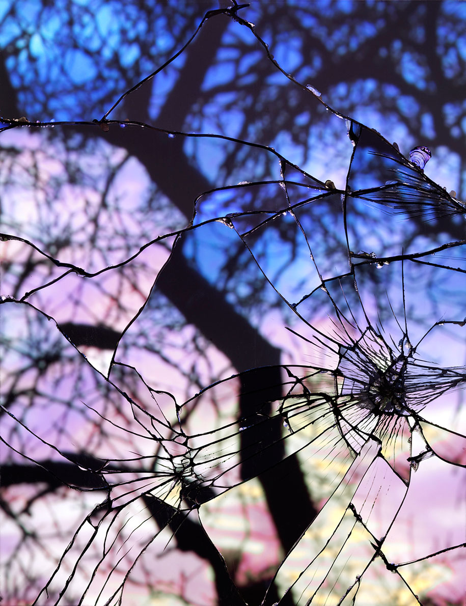
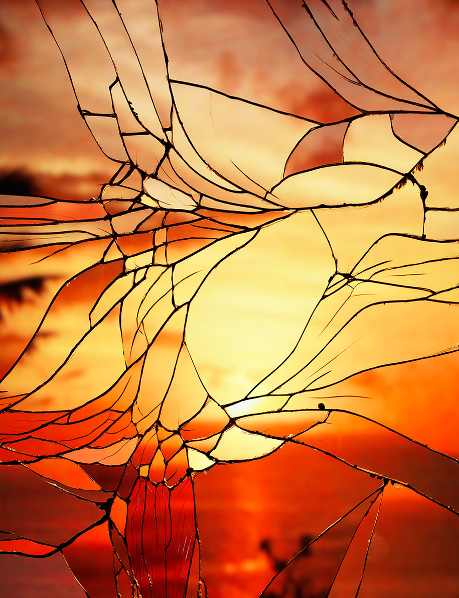
Building off the theme of reflecting a landscape, I was intrigued by developing my images to look like a physical mirror, possibly broken or cracked, creating abstract reflections with a textured glass feel.
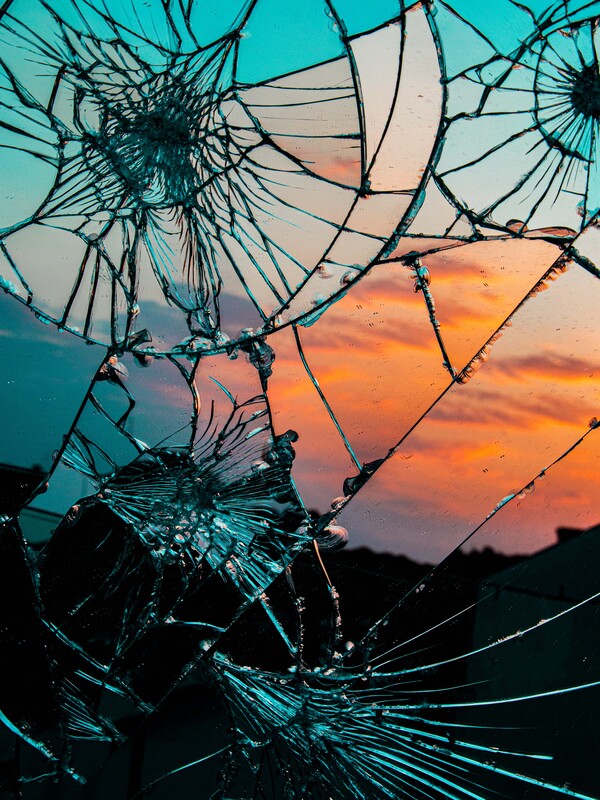
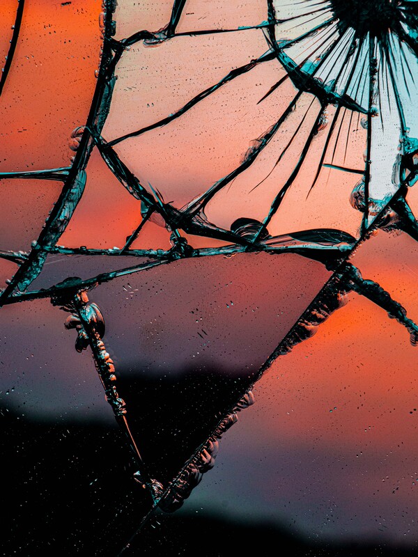
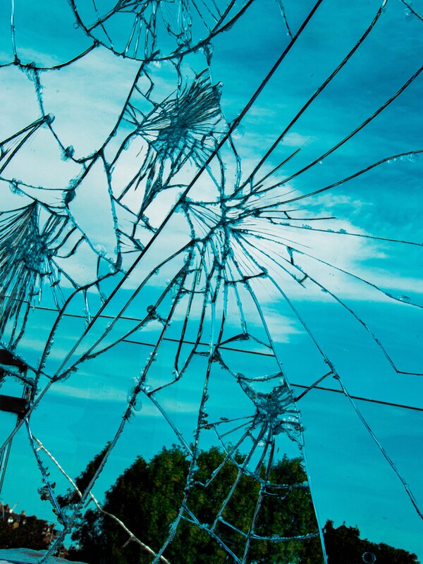
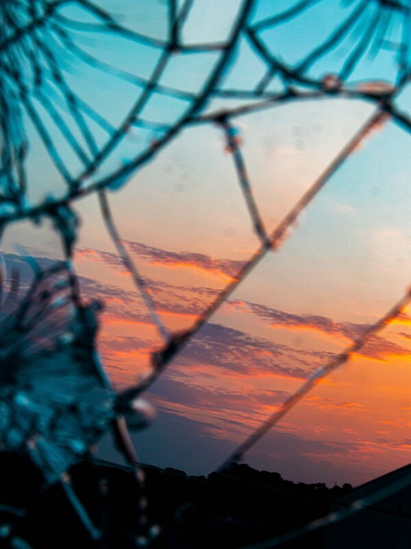
Third Development
Bing Wright - Photographer
Bing Wright was born in Seattle in 1958 and received a BA in Art History from Columbia University in New York. His work been shown in exhibitions at the New Museum in New York, White Columns in New York, the Queens Museum of Art in New York, and the Tang Museum and Art Gallery in Saratoga Springs, among others. His work is in several public collections, including the Museum of Modern Art in New York, the Portland Art Museum, the Seattle Art Museum, Goldman Sachs, JP Morgan Chase Bank, and Citigroup. Wright recently curated an exhibition of 1970s photography from the collection of the Washington Art Consortium. He lives and works in New York City.
|
|
|
For this third development I was set on continuing creating my reflections practically. I was entertained by the photographs of Bing Wright and her work on creating these cracked mirror refraction images. The idea of taking a landscape and refracting light in different directions intrigued me.
Full Shoot
Learning from development one, I knew I had to set my camera to a higher aperture in order to make it easier to focus on the cracks within the mirror as-well as the image it was reflecting. I took a range of images at different times of the day to produce a wide selection of photographs all interestingly different.
Final Edits
I didn't edit these images a great deal other than playing around with the basic settings within Adobe Lightroom to make sure my images were properly exposed and had a deep contrast about them. I also increased the texture and clarity values as-well as increasing the sharpening to 80% to get a more textured mirror. I also altered the hue values of the blue and orange tones to make them more apparent as they are contrasting colours and added a deeper visual integument to the photographs.
|
|

|
|
Response Feedback (self)
WWW:
EBI:
- Mirror cracked and refracted reflections interestingly
- Colours contrasted nicely
- Increased texture, clarity, and sharpening values - added texture to mirror
EBI:
- Elections where of something other than the sky
Ideas For Final Development
In my final development/piece I want to continue with the idea of practically reflecting images with a broken mirror potentially in a more stylised monochrome style, with a model instead of the sky.
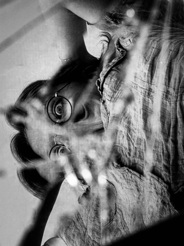
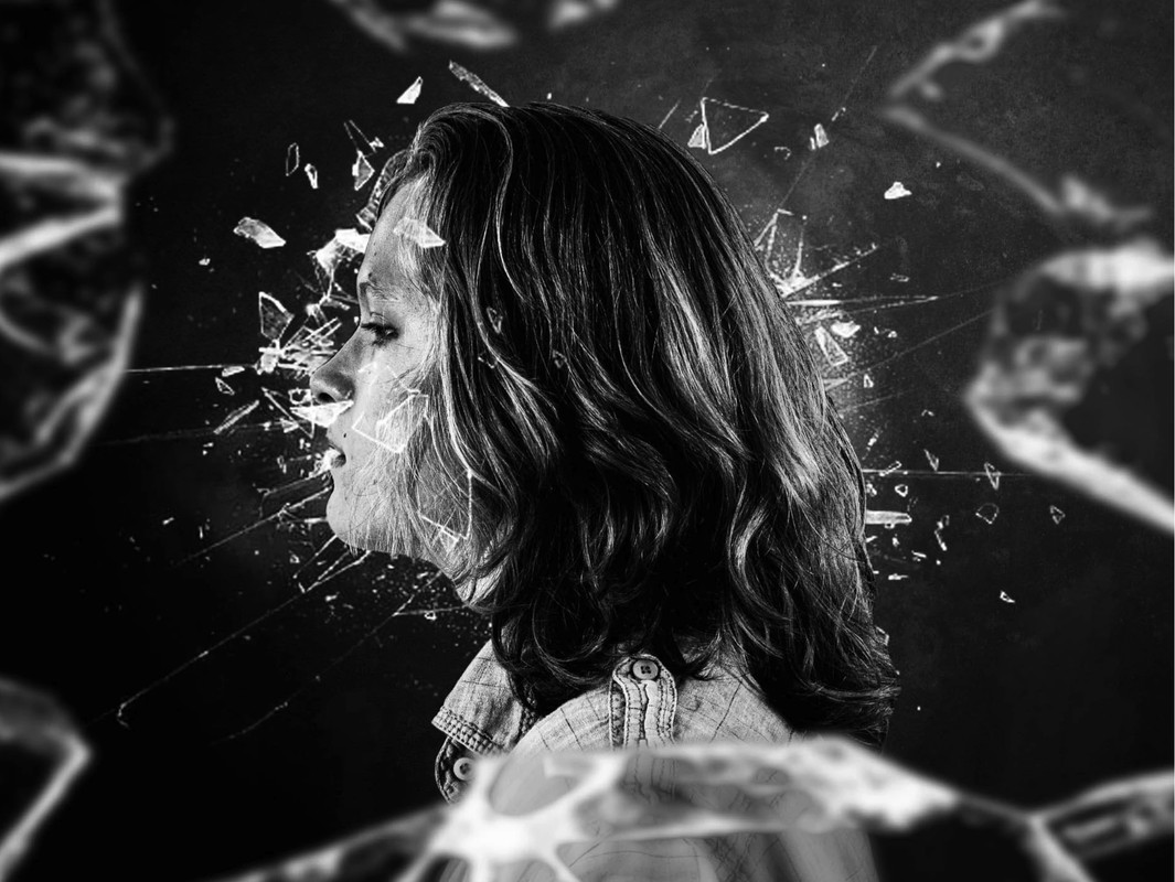
Fourth Development - Final Piece
For my final piece I wanted to cultivate and expand all the developments I have created so far and combine their visual ascetic and key themes to produce a selection of photographs that express my reflections project as a whole. I wanted to combine a mixture of digital and practical assets to create stylistic reflections with deep contrast in a monochrome format.
Full Shoot
When shooting I decided to to lower my aperture, different to my other responses, to focus primary on my model and gain a shallower depth on field which I enjoy more within my photographs. I experimented with a wide range of different camera angles to gain a selection of interesting reflections and fragmented images.
I then took another selection of photographs with my model holding up a shard of the mirror in front of her face, the idea being to composite her eyes onto the shard later to get and abstract digital reflection. To enhance the images further I projected a dark texture behind my model to prevent me from needing to mask around my model later and instead just adjust the contrast values to gain a grungier looking frame.
Finally I experimented with taking photographs with a rose flower this time in a standard picture profile so that I could digitally colour select later and gain a monochrome image with a vibrant red rose centred.


Final Edits
When editing, I rapidly increased the contrast and decreased the shadow brightness values of my images in addition to increasing the texture, clarity and gamma quantities to gain a grungier image. I then added additional grunge overlays to most of my images in order to create a more stylised photograph.
For the image where my model holds the shard in front of her face, I masked around the glass and composited another photograph onto the shard, duplicating the layer lowering the opacity then altering the blend mode of the original layer to soft light in order to gain a slight texture from the mirror.
For select images, I added shattering glass overlays behind and in front of my model to create depth as well as give the effect that the image was taken with a very high shutter speed.


|

|

Response Feedback (self)
WWW:
EBI:
- Reflections created unique fragmentations within the frame
- Dramatic lighting created contrast across the subjects face
- Additional Photoshop elements elevated the visual meaning of the photographs
EBI:
