
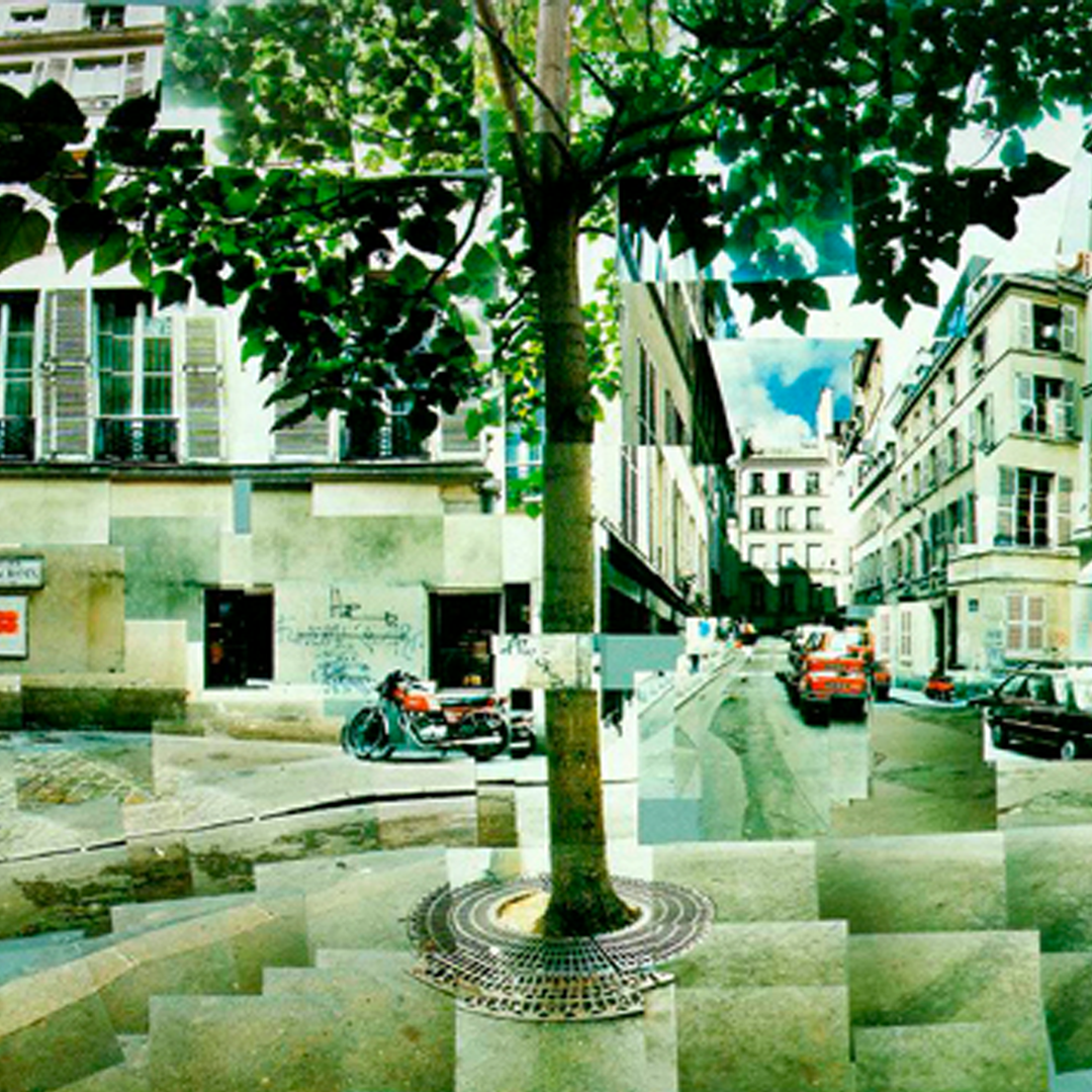
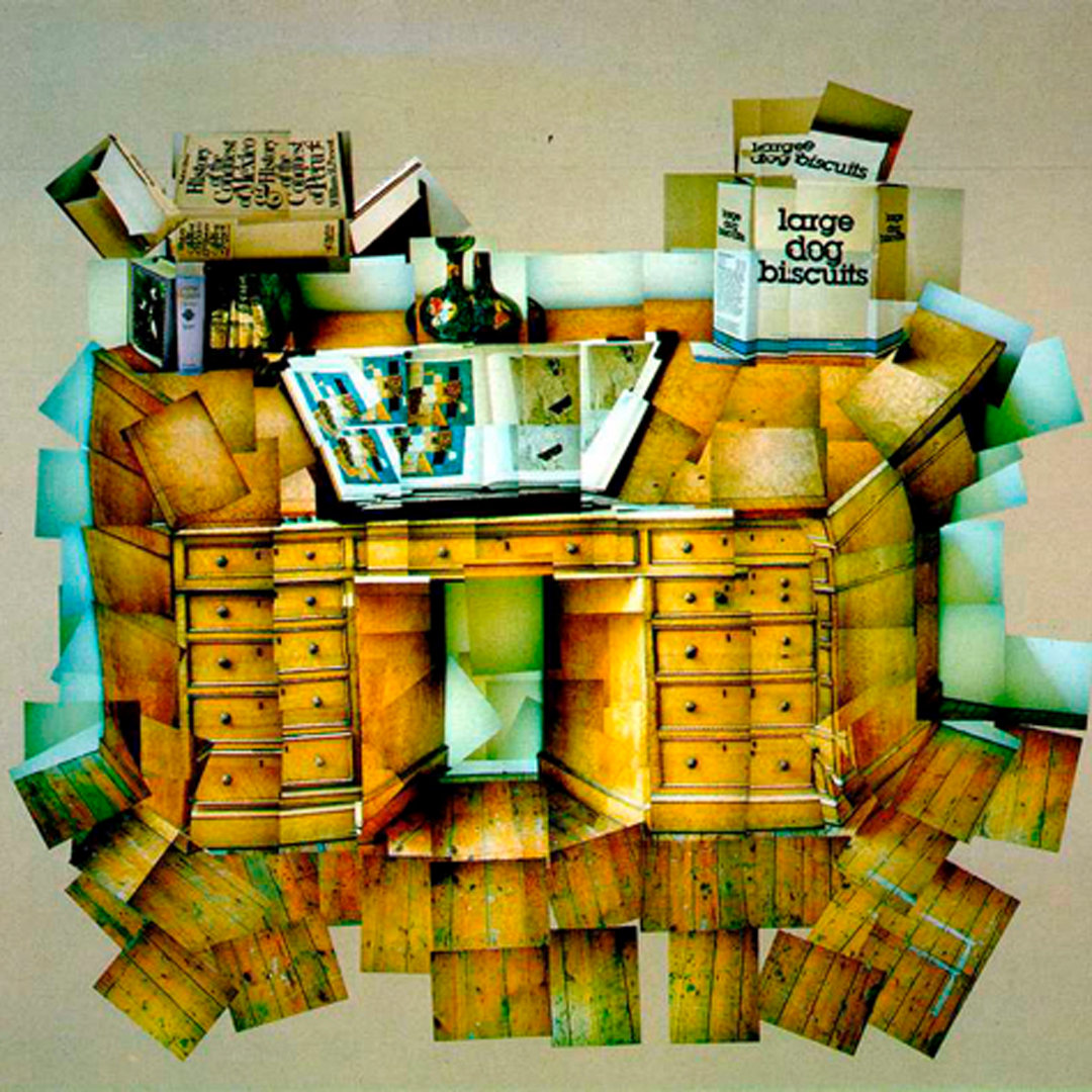
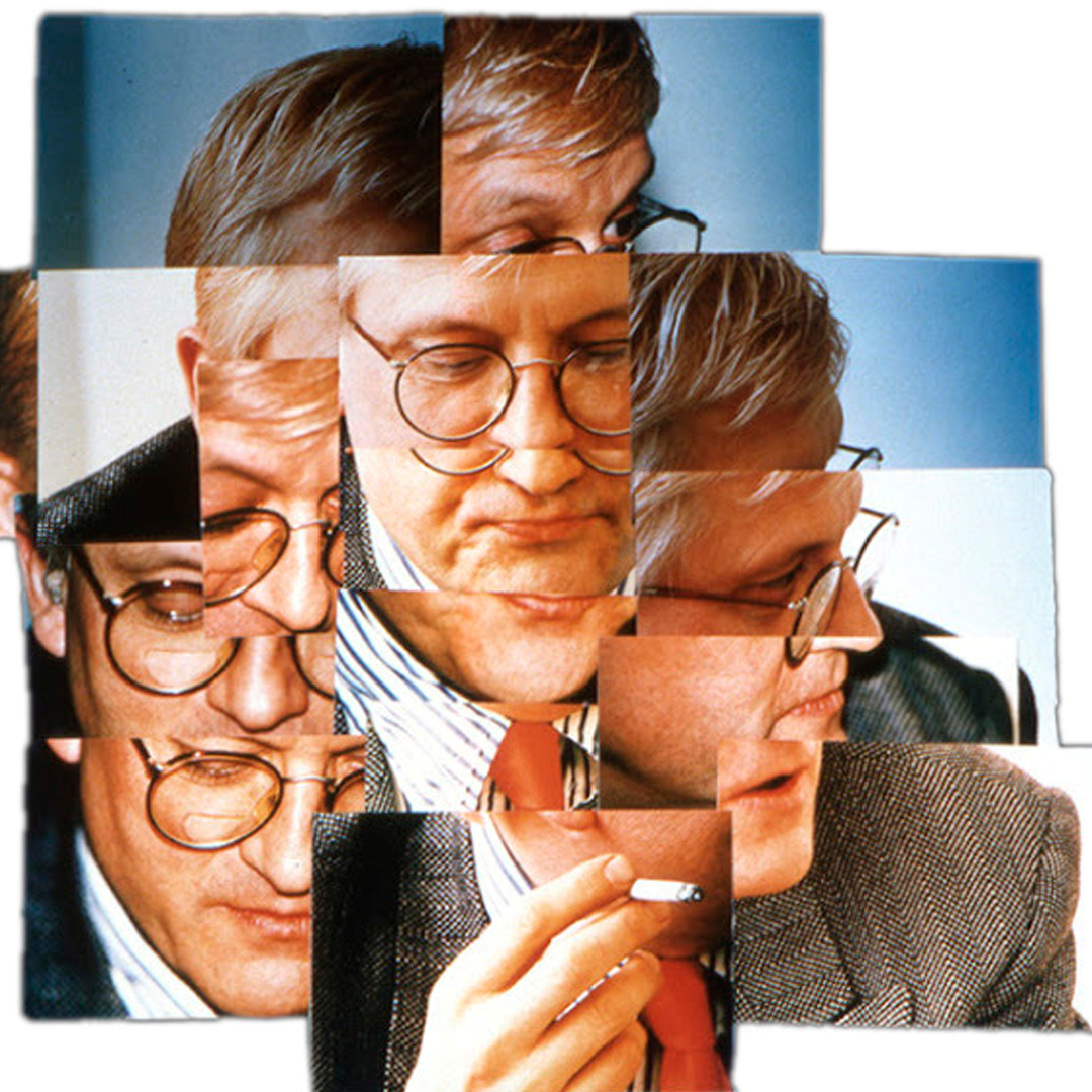
Photo Joiners - David Hockney
David Hockney (born 9 July 1937) is an English painter, draftsman, printmaker, stage designer, and photographer. As an important contributor to the pop art movement of the 1960s, he is considered one of the most influential British artists of the 20th century.
His photo joiners were a famous part of his career as he created many intriguing images. He made these out of mosaics of photographs taken from many different angles of the subject to create a type of 3D effect in a 2D image.
|
|
|
First Response
In this response, I attempted to create a few images in the style of David Hockney in Adobe Photoshop CC. To create a photo joiner in photoshop you must:
I tried this method a couple of different times with photos I had been given, these are the results.
- Open Photoshop
- File > Automate > Photomontage
- Select Collage and then deselect blend image.
- Select your images from the folder and press return
- Move around your layers and place into the right positions
- Add image adjustments
I tried this method a couple of different times with photos I had been given, these are the results.
Feedback (self)
WWW:
EBI:
- Method worked correctly and images blended well
EBI:
- More mosaic images were added
- Looked more stylised - less like the original object
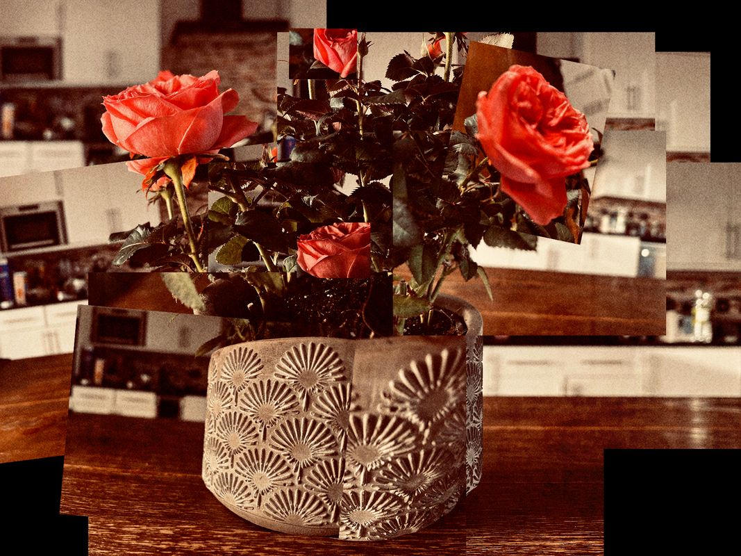
Second Response (home)
In this second response, I wanted to build upon my first response by incorporating the feedback I had given myself aswell as taking the photographs myself.
Roses - Photo Joiner
This time around I altered the white balance temperature slightly towards the warmer side to gain a vintage looking image.
I used a range of f-stop values and zoom lengths in order to differentiate the photographs from one another, highlighting that these are individual images placed in a collage format.
Instead of using the automated method I used in the first response, this time I favoured manually transforming the photographs position, scale, and rotation properties as well as cropping for a more authentic looking result.
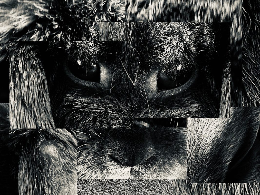
Rabbit - Photo Joiner
In this photo joiner, I wanted to make it less clear what the collage of photographs was really of. Instead, just emote certain feelings and connotations that the viewer may pick-up on.
I decided to shoot in monotone in order to remove the viewer's distraction of colour and truly focus on the contrast between the shades within the image.
I decided to take the photographs with a very high zoom in order to fully see the details within the textures.
Feedback (self)
WWW:
EBI:
- Manually created the collage - more authentic results
- Objects are recognisable yet look different
- Higher contrasts in colours and depth of field - more three dimensional
EBI:
- More mosaic images were added
Mixed Architecture - Paul Eis
Eis is a German architectural student and photographer who reimagines dull grey cityscapes to be filled with whimsical, colourful buildings with his Formalismus series.
|
|
|
First Response
In this response I was tasked with creating a mixed architecture photograph in the style of Paul Eis in Adobe Photoshop CC. To achieve this I used the method below:
- Open Photoshop
- File > Open image
- Using the quick selection tool select the area of the building you want coloured
- Click CMD J to duplicate the masked section of building onto a new layer
- Create new solid colour - above mask layer
- Set clipping mask between solid colour and masked section of building layer

Feedback (self)
WWW:
EBI:
- Use of colour gradient adds to colour depth
- Colour contrast between foreground (orange) and background (blue)
EBI:
- Use of blend mode (color) on masks to enhance realism
- Inside of building less visible
Second Response
(In this second response I wanted to again build upon my first by incorporating my self-feedback. I wanted to enhance the realism of the building by increasing the texture within objects to make it more believable that this could be a real existing building while still keeping the fun, colourful vibrance of Eis's photographs.
To do this however, I had to add an extra step to method I used In response one which is to select the blend mode (color) on the solid colour layer. The color blend mode is also very beneficial due to the fact it does not alter the brightness values of the layers below.
To do this however, I had to add an extra step to method I used In response one which is to select the blend mode (color) on the solid colour layer. The color blend mode is also very beneficial due to the fact it does not alter the brightness values of the layers below.

Feedback (self)
WWW:
- Use of blend mode (color) to enhance texture on masks
- Choice of contrasting colours
- Maks were more precise - less feathering on stairs
- Photograph resolution
- Stairs and sky contrasted further
Andre Kertész - Modernist Photography

Andre Kertész, was a Hungarian-born photographer known for his groundbreaking contributions to photographic composition and the photo essay. In the early years of his career, his then-unorthodox camera angles and style prevented his work from gaining wider recognition. Kertész never felt that he had gained the worldwide recognition he deserved. Today he is considered one of the seminal figures of photojournalism.
Expected by his family to work as a stockbroker, Kertész pursued photography independently as an autodidact, and his early work was published primarily in magazines, a major market in those years. This continued until much later in his life, when Kertész stopped accepting commissions.
Expected by his family to work as a stockbroker, Kertész pursued photography independently as an autodidact, and his early work was published primarily in magazines, a major market in those years. This continued until much later in his life, when Kertész stopped accepting commissions.
He served briefly in World War I and moved to Paris in 1925, then the artistic capital of the world, against the wishes of his family. In Paris he worked for France's first illustrated magazine called VU. Involved with many young immigrant artists and the Dada movement, he achieved critical and commercial success.

|

|

|
First Response
Within this response, I was tasked with creating photographs of utensils in the style of Andre Kertész. The dominant theme behind most of his works was the idea of taking boring, mundane objects and bringing them to life in an abstractly poetic way.
To do this we laid out a large sheet of white paper, positioned our forks in different positions to cast unique shadows, then lit them with a handheld torch and proceeded to take photographs from many different angles experimenting with how the light and shadows fell upon the forks and background.
To do this we laid out a large sheet of white paper, positioned our forks in different positions to cast unique shadows, then lit them with a handheld torch and proceeded to take photographs from many different angles experimenting with how the light and shadows fell upon the forks and background.
Full Shoot
Feedback (self)
WWW:
EBI:
- Strong shadows were achieved
- Interesting shapes were created
EBI:
- Photographs were monotone - fit the style further
- Lower f-stop (high depth of field) to enhance abstract vibe
- Light more directional
Second Response
In this second response I wanted to take on board my self-feedback from response one, as well as having a deeper thought process behind how the forks were laid out within the frame.
This time around I decided to shoot in monotone, with a slightly higher contrast value on the picture profile. I hoped this would allow the photographs to adhere to the style of Kertesz further.
I wanted to have more of a story behind each of the photographs, in some instances even personifying them slightly to give the utensil a new life/form. I wanted to emote particular emotions such as fear by using the forks sharp and rugged physical appearance to my advantage. By adding additional forks to the scene it made it look as if they were communicating therefore again giving them another life/form.
Full Shoot
Feedback (self)
WWW:
EBI:
- Use of monotone colouring - more true to the artist and style
- Light was more directional - creating darker shadows & sharper shapes
- More forks were used - creating different moods & atmospheres
EBI:
- Coloured lights were used - create alternative style
Ordinary To Extraordinary - Edward Weston

Edward Henry Weston (March 24, 1886 – January 1, 1958) was a 20th-century American photographer. He has been called "one of the most innovative and influential American photographers..."[1] and "one of the masters of 20th century photography."[2] Over the course of his 40-year career Weston photographed an increasingly expansive set of subjects, including landscapes, still-lifes, nudes, portraits, genre scenes and even whimsical parodies. It is said that he developed a "quintessentially American, and especially Californian, approach to modern photography"[3] because of his focus on the people and places of the American West. In 1937 Weston was the first photographer to receive a Guggenheim Fellowship, and over the next two years he produced nearly 1,400 negatives using his 8 × 10 view camera.
Some of his most famous photographs were taken of the trees and rocks at Point Lobos, California, near where he lived for many years. Weston was born in Chicago and moved to California when he was 21. He knew he wanted to be a photographer from an early age, and initially his work was typical of the soft focus pictorialism that was popular at the time. Within a few years, however, he abandoned that style and went on to be one of the foremost champions of highly detailed photographic images.
Some of his most famous photographs were taken of the trees and rocks at Point Lobos, California, near where he lived for many years. Weston was born in Chicago and moved to California when he was 21. He knew he wanted to be a photographer from an early age, and initially his work was typical of the soft focus pictorialism that was popular at the time. Within a few years, however, he abandoned that style and went on to be one of the foremost champions of highly detailed photographic images.

|

|

|
First Response
In this response I was tasked with taking a compilation of photographs inspired by the wonderful Edward Weston.
Similar to my responses on Kertesz, my goal within this response was to create dynamic photographs of ordinary objects but make them appear differently through the use of close and unique camera angles and high contrast dramatic lighting.
To do this I used a black backdrop to increase the contrast between the foreground and background as well as allowing the objects edges to drop off into the shadows to create a mysterious endless backdrop effect. To light the objects i used a handheld torch from close range to achieve that harsh lighting effect.
Favourites


Feedback (self)
WWW:
EBI:
- Light was angled - more tonal contrast created
- Wide range of objects - wide range of textures
- Certain objects were backlit creating different views of the object that are not usually seen
EBI:
- Objects looked less like their natural forms
- Monotone picture profile - more true to artist's style
Second Response (home)
In this second response I wanted to integrate my self-feedback from response one as well as exploring what certain objects would appear like under extremely high zoom.
My thought process behind was to give a new appearance to some what ordinary objects by showing their delicate details on their surfaces hopefully making them seem more extraordinary linking back to the theme apparent throughout most of Weston's work which was to give normal, everyday objects another life/purpose/use.
This time round I carefully picked out a selection of objects I thought would appear interestingly under harsh lighting while intensely magnified.
Favourites


Feedback (self)
WWW:
EBI:
- Monotone picture profile - more true to artist's style
- Extreme zoom lens - less obvious to identify object
- Intriguing textures & marks within objects chosen
- Wide range of angles - different views of objects not usually noticed
- Harsh lighting - contrast increased
EBI:
- Less noise/grain within photographs
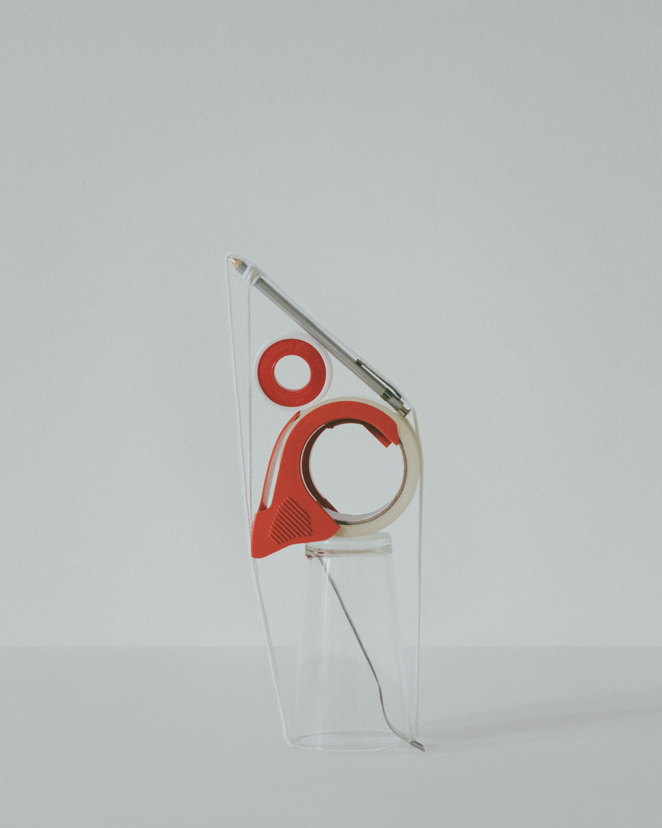
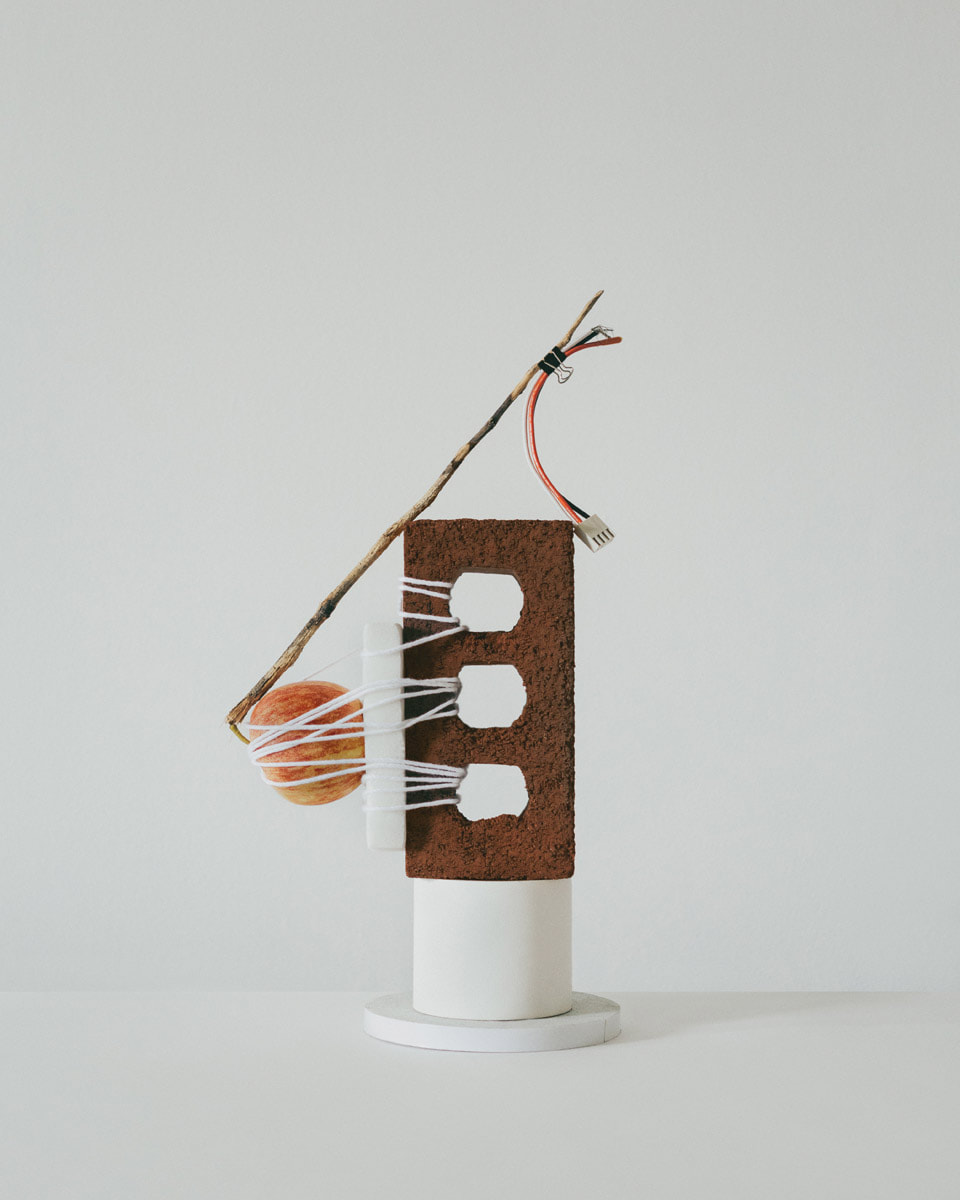
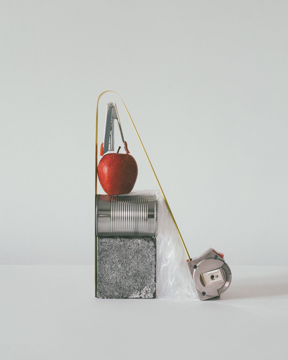
Lockdown Sculptures - Sharon Radisch

Sharon Radisch, the NYC and Paris-based photographer, art director and artist, circumvented a traditional path to a career in the arts. She initially graduated with a biology/pre-med degree before moving to Paris to study the French language. Intending to stay for six months, Sharon remained in France for three years while completing a master's degree in biology and cellular physiology. This unique educational background lent Sharon an eye for abstraction. As she witnessed the cohesive nature of organic life, she felt drawn to the minute mechanisms of cell in isolation.
For several years, Sharon applied this interest in interaction to her work in the medical field. After long days in laboratories, she sought solace in creative practice and began assembling sculptural still lifes to photograph. Soon her creative practice blossomed into a full-time career as her unique compositions resonated with a growing social media following. Now with over eight years of professional photography experience, Sharon sees a parallel between her biological and artistic work. Just as organisms depend on individual interactions between cells, Sharon’s sculptural still lifes emulate the organic— integrating disparate elements to compose an unexpected harmony. Lockdown Sculpture - Sharon Radisch
For several years, Sharon applied this interest in interaction to her work in the medical field. After long days in laboratories, she sought solace in creative practice and began assembling sculptural still lifes to photograph. Soon her creative practice blossomed into a full-time career as her unique compositions resonated with a growing social media following. Now with over eight years of professional photography experience, Sharon sees a parallel between her biological and artistic work. Just as organisms depend on individual interactions between cells, Sharon’s sculptural still lifes emulate the organic— integrating disparate elements to compose an unexpected harmony. Lockdown Sculpture - Sharon Radisch
In response to lockdown as a result of the COVID-19 emergency, New York based photographer Sharon Radisch created a series of still lives using found objects around her home and neighbourhood to keep her artistic temperament active.
|
|
|
First Response
Within this response I was required to create a selection of photographs inspired by Sharon Radisch and her work in the covid-19 pandemic on making sculptures out of household objects.

|

|

|
Feedback (self)
WWW:
EBI:
- Random arrangements of objects
- Wide range of objects - wide range of textures e.g. metallic
EBI:
- Framing was improved
- Sculptures fit within the white backdrop
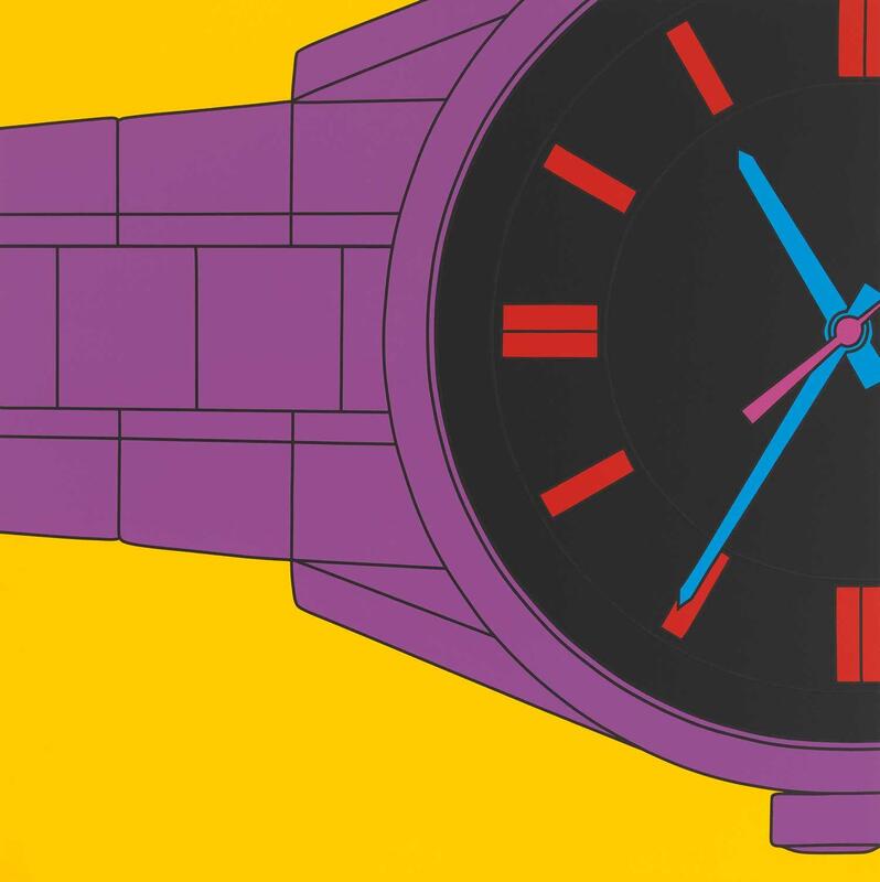
Simplified Images - Michael Craig Martin
Sir Michael Craig-Martin (born 28 August 1941) is an Irish-born contemporary conceptual artist and painter. He is known for fostering and adopting the Young British Artists, many of whom he taught, and for his conceptual artwork, An Oak Tree. He is an Emeritus Professor of Fine Art at Goldsmiths.
Craig-Martin's earliest work combined minimalism and conceptualism. His sculptures and installations focussed on ordinary, mass produced functional objects altered or assembled in ways which drew attention to relationships between form and purpose.
Craig-Martin's earliest work combined minimalism and conceptualism. His sculptures and installations focussed on ordinary, mass produced functional objects altered or assembled in ways which drew attention to relationships between form and purpose.
|
|

|
Response
In this response, I was tasked with simplifying the photographs I had previously taken of the sculptures inspired by Sharon Radisch in Adobe Photoshop CC. This was to be in the style of the artist Michael Craig Martin who was known for his colourful pictures of everyday objects.
To achieve this I used a similar method to that of my responses to Paul Eis, I followed the list of steps below:
To achieve this I used a similar method to that of my responses to Paul Eis, I followed the list of steps below:
- Open Photoshop
- File > Open image
- Mask around selected object using pen tool
- Click CMD J to duplicate the mask onto a new layer
- Create a solid colour layer
- Add clipping mask between the solid colour and the mask of object
- Change solid colour blend mode (color)
- Repeat steps for all objects in sculpture as well as background

Feedback (self)
WWW:
- Use of vibrant colours - more true to the artist's style
- Use of tools - grungy and dirty, industrial vibe
- Use of blend mode (color) - adds realism in texture while sustaining simplicity
- Masks were more precise
Kitchen Still Life - Jan Groover
Jan Groover is well known for her formalist still life photographs of household utensils. She attended Pratt Institute in Brooklyn, New York and graduated in 1965 with a bachelor of fine arts in painting. Groover taught art in public school before enrolling in a master of fine arts program for art education at Ohio State University. Before she developed an interest in photography, Groover devoted much of her time to painting minimalist abstractions.

|

|
Response (home)
In this response, I was tasked with creating a collection of photographs of kitchen utensils in the style of Jan Groover. This task again links back to the themes of form over function as well as ordinary to extraordinary, as it is advertising viewing ordinary objects as something more.
However the difference between Groover's work is that he does not arrange the objects in a particularly interesting composition, rather just leaves them in their natural habitat (the kitchen) and hopes that through the use of creative camera angles the viewer will be able to draw some beauty out of his photographs.
As I was responding to this task I quickly realised It was essential to have mix of metallic utensils such as knives, forks and spoons as well as some decorative objects such as the patterned china plates. This creates a nice contrast even when saturation levels are low between the industrial look of the utensils and the detailed plates. I also decided for some of photographs that the utensils should be wet, increasing texture within the scene as well as exploring another environment the utensils would usually experience when being washed or cleaned therefore making the photographs more authentic.


Feedback (self)
WWW:
EBI:
- High zoom - objects look less like there natural form
- Low aperture - high depth of field
- Warm and vintage/monotone colouring - true to artist's style
- Added water - increases texture within image
EBI:
-
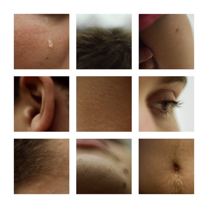
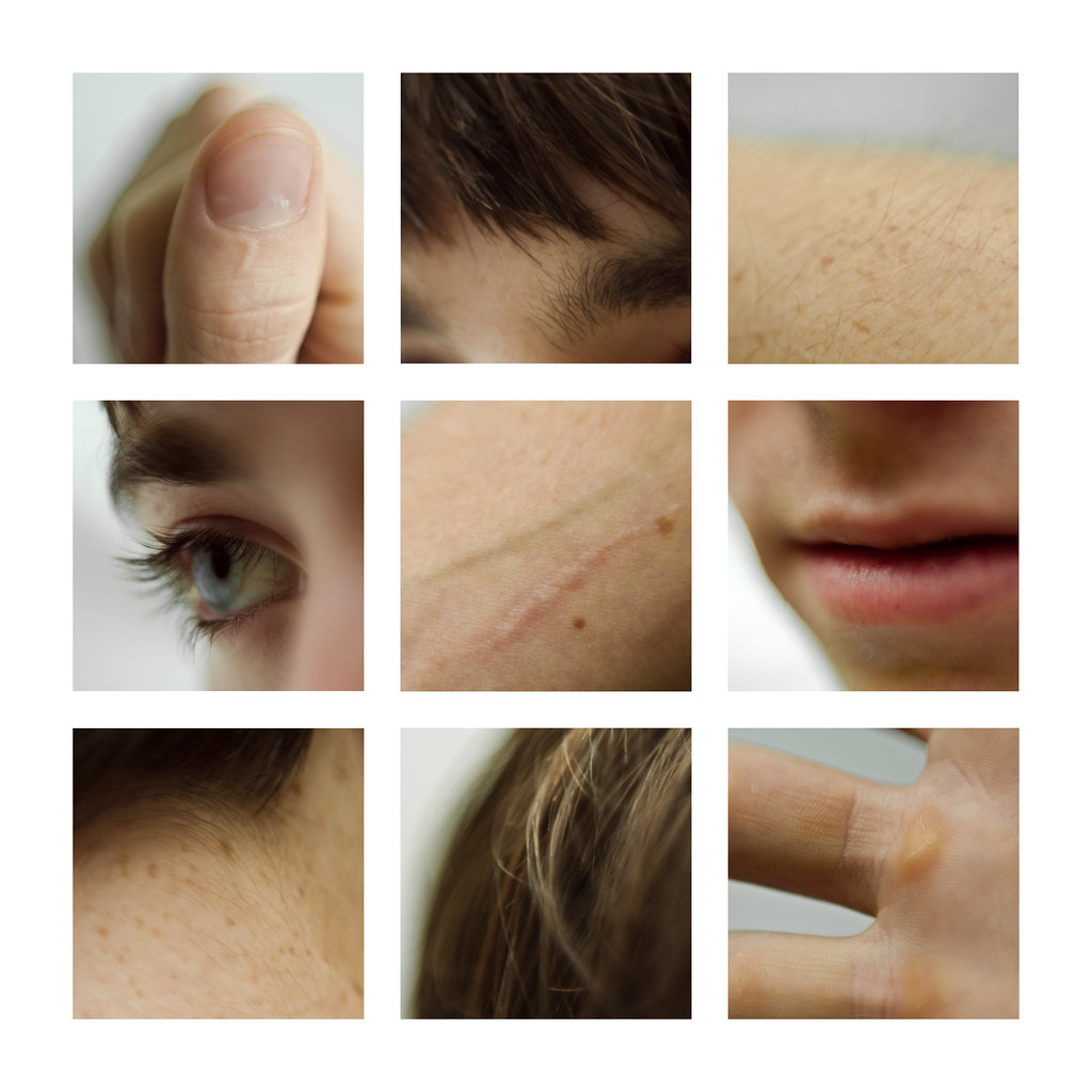
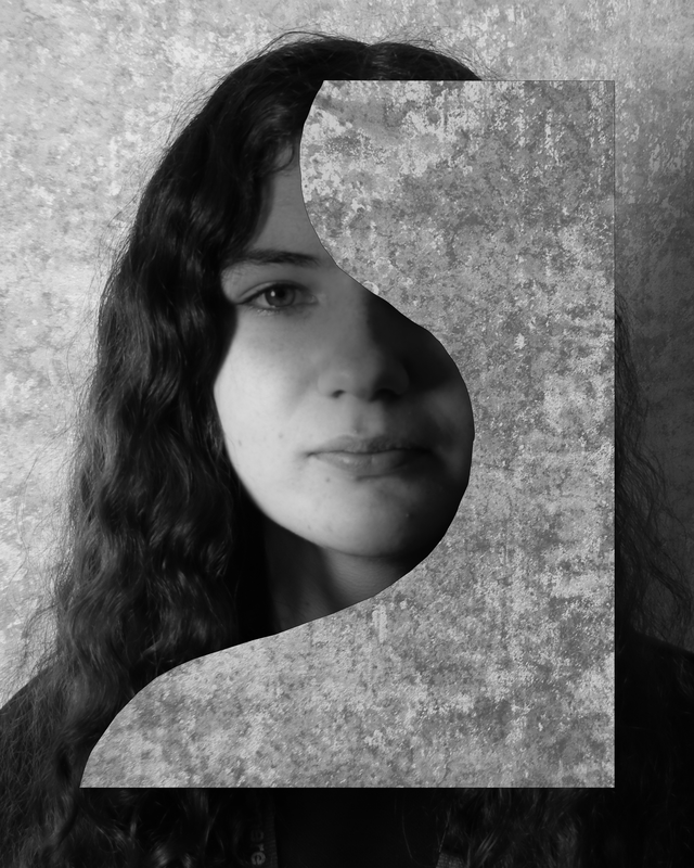
Different Views of a Person - Lauren Marek
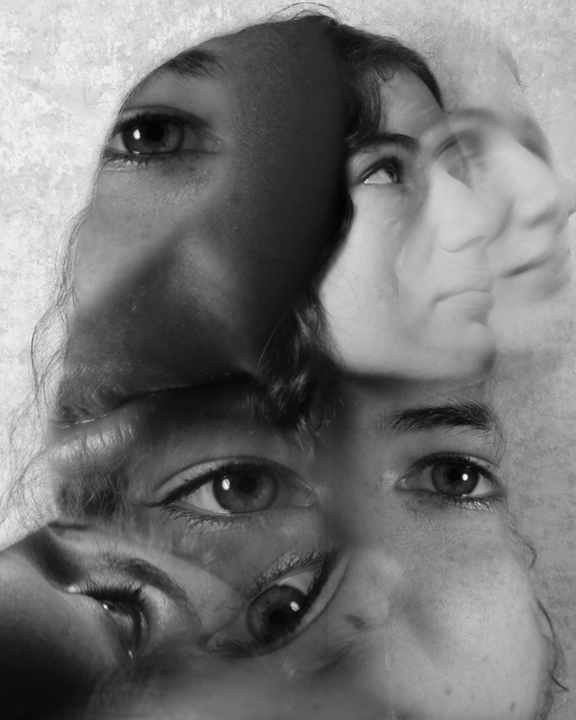
Lauren Marek in her series "Pieces" create's similar work but her work focuses even closer to the person and creates an even more abstract representation of the figure. Inspired by Picasso and his cubism portraits she uses 9 images alongside each other to create her abstract representations of a person.
|
|
Chad Pitman
Chad Pitman discovered his interest in image making at an early age through his father's photography. He went on to study colour theory and photographic arts in Boston after which he moved to New York, where he established himself as a photographer. His trademark style includes the application of paint to photographic prints and high sensitivity to colour. Pitman has contributed to a number of fashion magazines including i-D, GQ Style, Numero, Vogue, POP, W, AnOther and 10 Magazine amongst many others. He has also photographed advertising campaigns for clients including McQ, Diane von Furstenburg, Levis, Replay and Kurt Geiger. Pitman has also made films he has done for Vogue, McQ, Levis, BCBG and Herve Leger.

|
|
First Response
In this response, I was tasked with creating a grid of photographs exploring the human body in the style of photographers Lauren Marek and Chad Pitman.
Their abstract approach to photographing a person allows for the viewer to see many different features of the body in the same image, meaning we can form our own view of the person as a whole and what their past and personality may be like considering what clothing, jewelry, piercings, and scars etc. that person possesses.
When responding to this task, I noticed how similar this type of photography really was to David Hockney's photo joiners. Displaying many different images from many different angles in a collage/grid format to create an in depth 3D view of an object/person is the main characteristics of all these photographers works. Again, the theme of ordinary to extraordinary is dominant too. By showing something we all find ordinary (a human) and photographing them in such a way that we admire these features and differences between everybody's individual appearance, is something extraordinary.
Before I started to respond, I analysed what I needed to create a successful set of photographs from Chad Pitman and lauren Marek's work. The first thing I understood was to use a high zoom lens at about 100mm to get that up close and personal feeling to the photos. I ensured my that my aperture was as low as it could be at about f4.2, this allowed for me to focus on the feature I wanted to focus on and allow the rest of the background to softly roll out of focus. It was also vital for me to use many different angles to allow the face and hands to be viewed as fully as possible.
With all this in mind I started to create my photographs.


Feedback (self)
WWW:
EBI:
- Nine photographs were taken
- No body part shown twice
- High zoom + range of angles - abstract
- Images of features laid out differently to usual face - more abstract
EBI:
- Particular images - sharper focus
- Wider range of body parts and features
Fireworks in a Jar - Alberto Seveso
illustrator & Digital Photographer Alberto Seveso was born in Milan, he grow up in Sardinia but is now working and living in Bristol (UK) as a freelancer. His passion for graphic art started when he was in a young age and he was really fascinated by the graphic of skate decks and the cover of music CD of metal bands in the early ‘90s. From this passion he started to create his artworks.

|

|

|
First Response (home)
In this response, I was assigned with creating photographs inspired by Alberto Seveso's ink in water collection. This collection of photographs include how certain inks, dyes, and colourful paints react with water visually to create unique and fascinating shapes as well as textures.
The setup I used to create these photographs was a transparent glass container, digital monitor as a backdrop, and mixture of vibrant food colourings for the ink. I favoured for this approach as it was much easier to interchange backdrop colours on a monitor as well as the screen adds additional backlight to the ink in the water.
As I began to photograph the ink, it was instantly very hard to gain a balance between my ISO, Aperture, and Shutter Speed. This was due to the fact it was very difficult to achieve a sharp focus on the ink since it was always moving. To counteract this problem I increased my f-stop value on my aperture up to 22 to make the image appear much sharper and focused however and gain deeper depth of field. Another way to help get a sharper focus was to place an object such as a straw into the container before hand to focus on that, therefore when the ink is dropped in it will retain a sharper focus due to the camera already understanding the focal point of the frame.
I also realised that my shutter speed would have to be reasonably high (about 120) if I wanted a clear image, due to the quick movement of the ink.
However, by applying both these steps my image became very dark and underexposed meaning I had to increase my ISO value to about 6400 to increase exposure. However, this created lots of grain within the frame. To resolve this issue slightly I repositioned my light source closer to the glass container meaning I could reduce my ISO value to 3200 therefore reducing grain, but not all of it.
Final Edits
Feedback (self)
WWW:
- Wide range of coloured inks used
- Unique shapes created
- High zoom - view details easily
- Increased highlights and whites in Photoshop - background purer white - endless effect
- Removed most bubbles from container surface - cleaner image
- Continuous shooting mode used
- High shutter speed - reduced blur
- Higher f-stop used - get focus sharper easier
- Light source intensity increased - lower ISO needed - less noise and grain
- Purer water was used - less visible particles
Sequences - Luke Stephenson
One morning while eating a bowl of cornflakes I noticed that every cornflake within my bowl was unique some what like a snow flake. I decided to photograph every cornflake within a 500g box to show off their individuality and also answer a nagging question in my mind “ how many cornflakes are in a box of cornflakes?
Over the course of a week I photographed every single cornflake within a 500g box, my original estimate was around 3000 but I soon realised this was way off and the final count came too 7122 cornflakes. Here are a small selection of the cornflakes I photographed, but I created a stop frame animation of all 7122 cornflakes for you to enjoy.
Over the course of a week I photographed every single cornflake within a 500g box, my original estimate was around 3000 but I soon realised this was way off and the final count came too 7122 cornflakes. Here are a small selection of the cornflakes I photographed, but I created a stop frame animation of all 7122 cornflakes for you to enjoy.
First Response
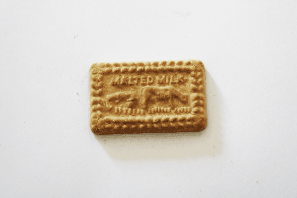
In this response, I was tasked with creating a sequence of photographs of a biscuit that disassembled over time laid out on a grid as well as GIF. By creating this sequence I understood the basics of how to make an object look like it was changing in real time.
When attempting this task, I layed out a large white sheet of paper, placed down the biscuit, then proceeded to draw around it in pencil. My thought process behind this was that as I removed the object to alter its appearance I would then how a positional guide of where to place it back again. However, as the biscuit disassembled the outline became visible causing an issue within the image.
I also enabled the grid option in the camera's settings, this allowed me to frame up the image with the biscuit placed within the middle box allowing me to understand where I would need to once more place the biscuit back again in order to retain consistency throughout the sequence.
When it came to creating the GIF, I favoured the Photoshop approach. To achieve this i used the steps below:
- Open Photoshop
- Drag images into workspace
- Window > Timeline
- Click create frame animation
- Menu > Create frames from layers
- Reorder images to correct order
- Alter timing between each frame
- Export as GIF
|
|


Feedback (self)
WWW:
- Biscuit stayed relatively in the same position
- Biscuit disassembled in pieces
- Lighting was constant
- Position marker wasn't visible
- Tripod used - reduces change between images
Second Response (home)
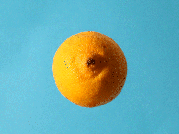
In this second response, I wanted to incorporate my self-feedback from response one as well attempting a more interesting object.
This time around, my setup was slightly more DIY. For my backdrop I used an A4 sheet of light blue card and stuck it using double-sided tape to my wall. Next, I grabbed an old shoe box and stuck a screwdriver through the centre of the lid poking out. Finally, I placed the lemon onto the screwdriver by impaling the fruit. I placed my camera on a tripod meaning there would be less changes between images keeping a consistent sequence. I then lit the lemon from the left side in order to allow a shadow to appear on the right of the fruit creating a more appealing image.
When disassembling the fruit i pulled it off the screwdriver onto a cutting board where I then sliced the lemon and placed it back onto the screw driver ready for the next image. I took about 12 photographs which I later reduced to 9 to allow the sequence to fit on a 3x3 grid.
In Photoshop I then removed the screwdriver from all the images using the clone stamp tool. The clone stamp tool is a tool that allows the user to removes objects from within a frame by painting over it with another section of the same image. As my background was relatively simple it wasn't hard to gain good looking result that goes unnoticed unless examined closely. Whilst in photoshop I also altered the transform settings for position, scale, and rotation for certain images to enhance consistency between frames. When creating the GIF I used the same method as response one however this time I added a fade between each frame to give the effect that there were more frames creating a smoother animation.
|
|


Feedback (self)
WWW:
EBI:
- Lemon dissembled in slices
- Fading between frames in GIF - made animation smoother
- Lighting constant
- Lemon remained in a static position
- Tripod used - reduced change between images
EBI:
- Blue background remained constant
- More pictures were taken - smoother GIF
- Clone stamp tool - more precise
Development
Throughout this Domestic Objects section of the GCSE Photography course I have explored many different artists, all who are passionate about their pieces of work and the underlying themes deep within them. However the most dominant theme held behind all these artists is the act of showing something ordinary but making it seem extraordinary, to show an object in a way it wouldn't usually be viewed through the use of the abstract camera angles and intriguing composition.
Within this development assignment I want to build upon the work I have created responding to all these extraordinary photographers as well as adding to their themes and ideas by differentiating their photography style into something different.
Within this development assignment I want to build upon the work I have created responding to all these extraordinary photographers as well as adding to their themes and ideas by differentiating their photography style into something different.
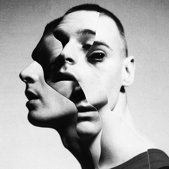
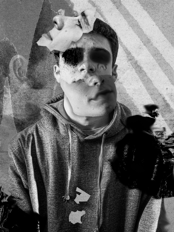
Different Views of a Person - Jesse Draxler
Jesse Draxler is a mixed media and multidisciplinary artist, and his pieces combine painting, photography, collage, typography and digital painting. Among their characteristics are distorting the human form, working in grayscale, and abstract landscapes. Writer Kyle Fitzpatrick described his portrayals as "a person mid-question...
Everything is abstracted just slightly, just enough to unnerve and entrance... [It] feels as if his subjects are slowly focusing and refocusing, trying to become clearer", while artist Mike Carney said that it "is an authentic look into the transitional stasis of a technologically saturated existence, and the lapse of connection, far from bridged within its void."
Everything is abstracted just slightly, just enough to unnerve and entrance... [It] feels as if his subjects are slowly focusing and refocusing, trying to become clearer", while artist Mike Carney said that it "is an authentic look into the transitional stasis of a technologically saturated existence, and the lapse of connection, far from bridged within its void."

|

|
|
First Development
In this first development, I wanted to explore some of the techniques needed to achieve a photograph/picture in the style of Jesse Draxler.
When Jesse builds the artistic work he physically alters the photographs on a canvas, however, I wanted to take a different approach and channel the digital Adobe Photoshop skills I have learned over the course so far. By creating my work in Photoshop it would be easier for me to edit and reverse adjustments if mistakes are made, making this method more beneficial when experimenting with different techniques.
Before shooting, I positioned the model in front of a white backdrop, this was to increase the contrast between the foreground and background for ease of compositing later. I made sure to set my picture profile to monotone to fit Jesse's style further. Within interviews, Jesse talks about his colour blindness and how it affects him making this black and white style a vital part of his works. When shooting I shot in a RAW format to have additional CR2 files that retained the photographs' original information without a set picture profile allowing me to view them in colour if necessary.
When lighting the model, I positioned my light source so it was facing from the left at about a 45-degree angle (with no diffusion) to cast a large shadow across the right side of the model's face; gaining a mysterious, contrast-packed image adding to the gothic vibe seen within Jesse's photographs.
Once I had achieved this setup, I began photographing.
Full Shoot
Final Edits
When editing the photographs, I scouted through many different artworks Jesse had previously made and attempted to bring across particular elements that intrigued me and place them into my work.
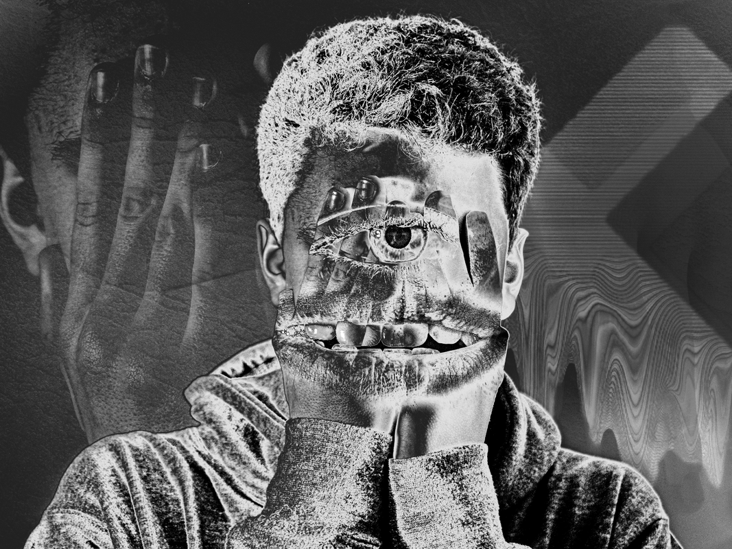
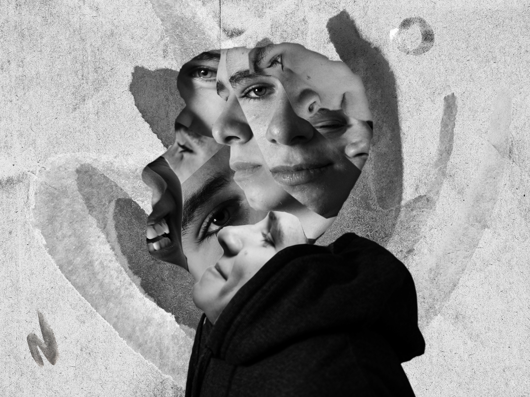
With the first image, I wanted to have a collage of different photographs of the model's face within a constricted outline of the model's head and shoulders, similar to those of Jesse's.
To do this, I opened an image of the model to act as a base layer, I then cut around her with the pen tool and duplicated the mask onto a separate layer. Next, I brought in several other images of the model which I then masked parts out of using the pen tool and set each of the individual layers clipping masks to the base layer cutout. I then altered the blend modes for the other photographs of the model to overlay, multiply, and color, to make the images translucent and interact with each other further.
For the front of the face, I created another mask and duplicated it onto a separate layer. I then positioned it in front of the original face and to add the final adjustments I decreased the opacity and fill values of the layer, as well as adding a radial blur adjustment from the filters panel.
For the background, I found a grungy texture online and composited it into the frame by placing the grunge layer above the original base layer and then changing its blend mode to overlay.
For the second image, I wanted to have a floating shape/object casting a shadow onto the model, inspired by a similar photograph by Draxler.
To do this, I opened a photograph of the model and cut her out using the pen tool, then placed the mask onto a new layer.
After that, I brought in the same texture I used in the first edit and again set its blend mode to overlay making sure the layer was positioned directly above the base model layer.
Next, I drew out a unique shape using the pen tool and filled it with black. I then duplicated the texture layer I used for the background however this time keeping the blend mode at normal and selecting the clipping mask to the shape layer. This displayed the texture over the shape layer. Finally, I added a drop shadow to the shape layer in order to cast a shadow onto the model making the image more three-dimensional as well as increasing realism. I then rasterized the layer and using the eraser tool, erase any parts of the shadow that was spilling onto the background.
Development Feedback (self)
WWW:
EBI:
- Monotone picture profile - true to artist's style
- Background texture - composited
- Clipping mask worked correctly
- Drop shadow on object
EBI:
- Person outline more visible & precise
- More variation between overlayed photographs - less eyes
- Different blend modes used
- Images don't blend together as much
- Masks were not feathered
- More varied photographs were taken
Second Development
Before anything else, I identified the major mistakes I made in development one. These include the lack of variety of photographs taken when shooting in companion to overusing digital assets such as Photoshop blend modes. Both these mistakes took away from the images visually and didn't add to achieving the results I was hoping for.
When approaching this second development, it was key to incorporate feedback from the previous development, as well as build upon themes with my own personal style.
This time around when shooting, I kept the same basic setup as I did before but instead proceeded to take many more photographs, with the model facing many different angles and directions, expressing a range of different emotions with different body languages. Doing this instantly made the editing process a lot easier as there was much more choice when choosing photographs to composite together.
Full Shoot
Final Edits
|

|

|
The largest part of this assignment is editing, that's why it was apparent to me that this time around I needed to have a clear direction I wanted to follow when editing these images. I settled for a grungy, grainy type vibe making the edits look as if they were created on paper but in reality made digitally. The edits I created in development one were too glossy for Jesse's style, in this development's edits I wanted to add more elements within the frame e.g. paint strokes and splatters, to fit with the style further.
When building up layers, for every new photograph of the model I added to the composition, I increased the clarity and texture values to increase this grungy effect I was going for. The tool I used the most when editing these images was most definitely the pen tool. This again highlighted to me how much this style of art relied on cutting and slicing parts of images together. |
Editing Process Timelapse
|
I found myself using the burn and smudge tool much more than in development one, these were key tools in adding to the abstract style of the images and creating mysterious shapes and textures within the frame.
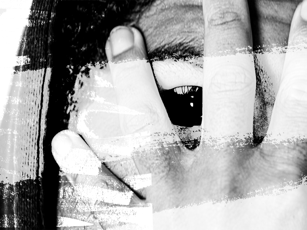
When editing masks of photographs of the models I made sure not to go overboard with the use of blend modes, only using them in situations where necessary such as when I placed the eye and mouth over the front of the hands. However blend modes were a vital part of the editing process for me when layering up backgrounds or making paint markings look realistic for example when I placed them around the outside of the eye in one of the images.
I also used the curves tool frequently in order to add or decrease contrast within images to correct exposure between images as well as giving stylistic effects such as an inverted effect within the first image.
Development Feedback (self)
WWW:
EBI:
- Monotone picture profile - true to artist's style
- Wide selection of photographs - model facing many angles
- Background textures
- Use of clipping masks
- Drop shadow on objects - three dimensional
- Masks weren't heavily feathered - more precise
- Use of blend modes e.g color, overlay, soft light, multiply
- Increased contrast values
- Increased clarity & texture values
- Photographs shot in RAW - more photo manipulation possible
- Person outlines were precise
- Use of burn & smudge tool
EBI:
-
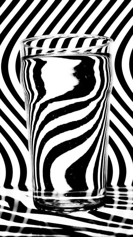
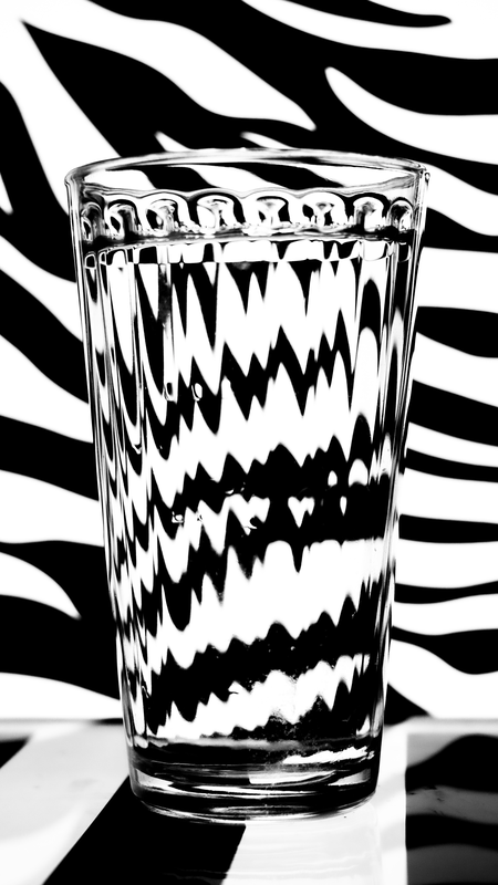
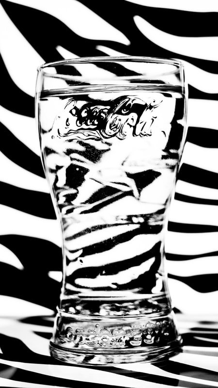
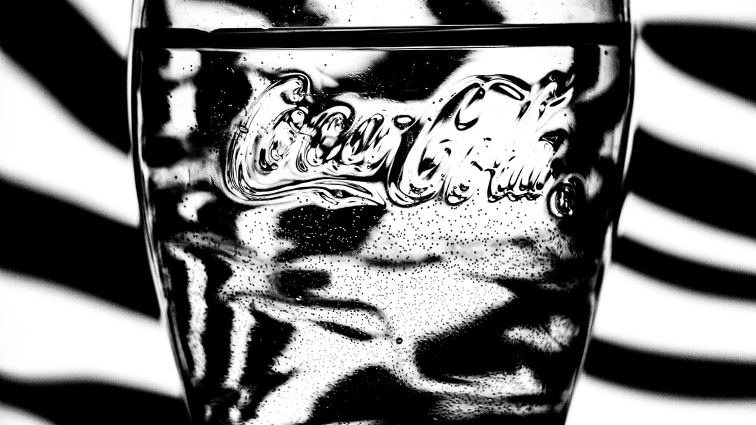
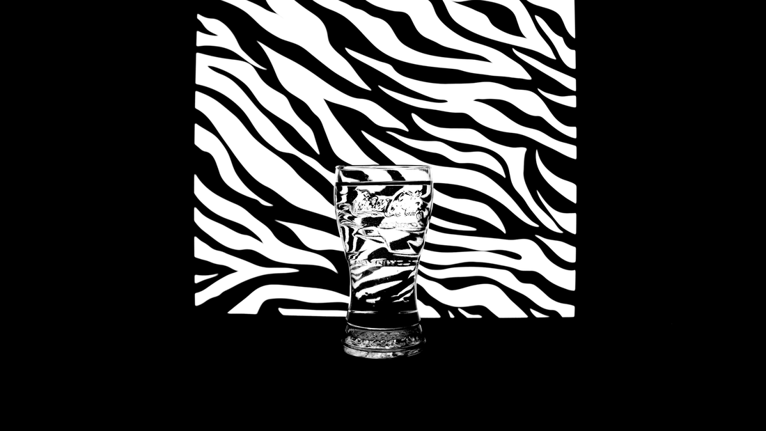
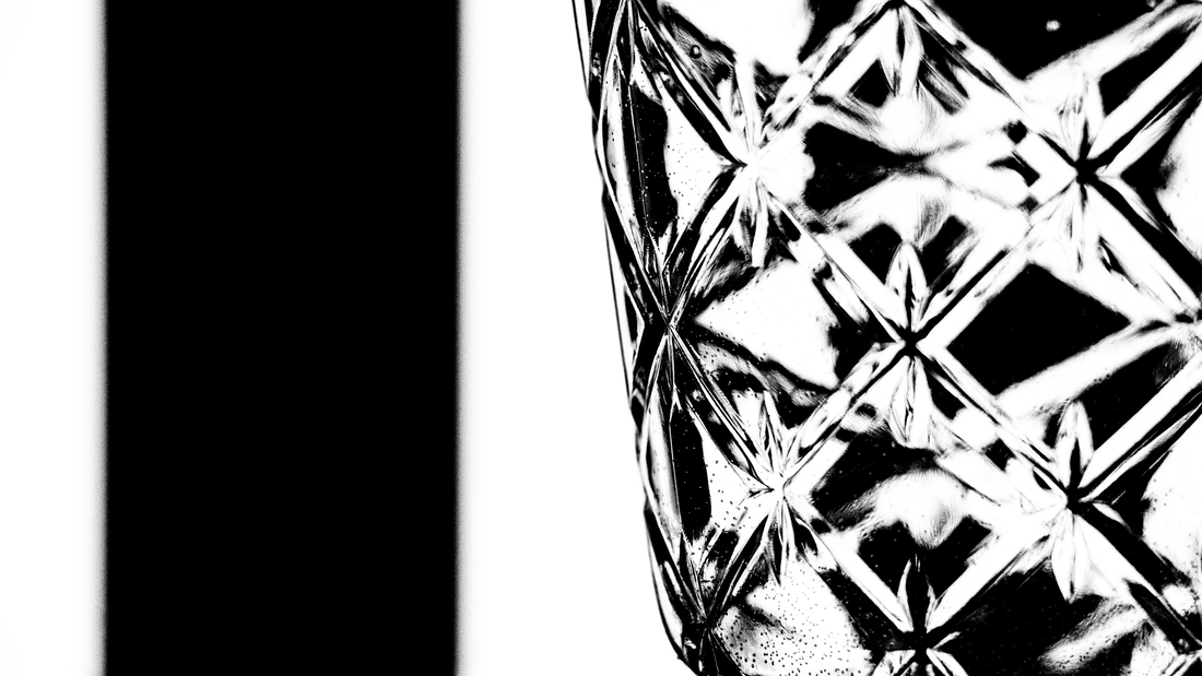
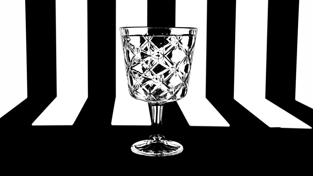
Distortion in Glasses - Steve Purnell
Steve Purnell is a photographer who explores many different genres of the art form from distortion to landscape and portrait photography. Based in Rhymney Valley in South East Wales, Purnell continues to create stunningly creative shots leaving viewers wondering how he puts these abstract compositions together.
His work with glass distortion is very much inspired by Op art, a movement of visual art that makes use of optical illusions. Within these images he displays said optical illusions and then distorts them through water within a glass or bottle.
His work with glass distortion is very much inspired by Op art, a movement of visual art that makes use of optical illusions. Within these images he displays said optical illusions and then distorts them through water within a glass or bottle.

|

|

|
First Development
Within this first development, I wanted to create a selection of photographs in the style of Steve Purnell, exploring his work on glass distortion.
When deciding a method to use to achieve this effect, I was instantly drawn towards the idea of using a digital screen as a way displaying the optical illusions for the background. By using this method it was easier to interchange backgrounds along with the fact that a digital screen (monitor) also acts as a lightsource removing the need for additional lighting, this also significantly reduces the shadows produced by the glasses onto the backdrop resolving a major problem I would of had if using printed paper backdrops.
For some of the shots I also placed the glasses onto an IPad also displaying the illusions, this created a more three dimensional image as I was able to photograph the base of the glass yet still make it look part of the scene. The positioning of the glass was also important to create a big enough distortion. I found that the further the glass from the screen, the larger the distortion within the water in the glass.
When choosing camera settings I made sure to keep my aperture value as high as possible to reduce blur of the background and make the transition between the background and distorted water more seamless, making the glass look closer to the screen that it was in reality. This counter acted the cons with moving the glass further away from the screen to increase distortion, allowing me to reap the benefits from both these decisions.
Full Shoot
Final Edits
When editing the images I realised that my images were under exposed, to resolve this issue I added an exposure adjustment layer and heavily increased the exposure values.
I also wanted to increase the contrast between the whites and blacks as much as possible. I added a levels adjustment layer and crushed the whites and blacks to increase the contrast. Through shooting in a monotone picture profile it wasn't difficult to achieve a pure white and black shade to make the backdrop look more like what it it did originally.
By adding all these adjustments the photographs became much more comparable with those of Steve Purnell himself and achieved the effect and look I intented to create.
|
|
|
Development Feedback (self)
WWW:
EBI:
- Monotone picture profile - reduces moire effect
- Glasses distorted illusions well
- Wide range of glasses - different distortions
- Photoshop adjustments - increased contrast, exposure - made pure white
- Use of digital screens - backdrop
- Use of bottled water - less particles in liquid
EBI:
- Coloured lighting uses - alternative style
- Wider range of illusions
- More unique glasses - more unique distortions
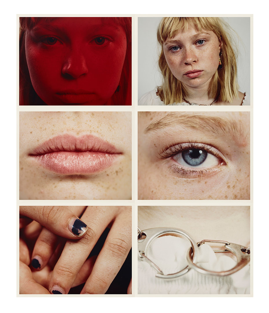
GALLERY
View my personal favourite photographs from across this Domestic Objects section of the GCSE Photography course.
